| Image |
Comment |
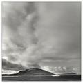
| 01/18/2003 08:37:31 PM |
Tranquilityby greenem2Comment: I think this would have been a better photograph in color. The mass of gray cloud in the upper right quarter of the picture is too undifferentiated in tone to make an interesting black and white photo. |
 Photographer found comment helpful. Photographer found comment helpful. |
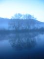
| 12/05/2002 10:26:54 PM |
Misty Severnby scoombeComment: I like the quiet misty feeling of this photo and the composition is good. But somehow I feel it lacks a little something that would give it more impact or make it more interesting. Having something, maybe the tops of the trees? in focus would probably achieve this, but it might ruin the mistiness. It would have been great if you could have gotten a small redish rowboat or even maybe just a couple dead leaves floating on the water in the foreground. Or, maybe just a little higher contrast between the trees and the hills in the background. 8 |
| 12/05/2002 09:07:52 PM |
|
| 12/05/2002 07:23:02 AM |
Blue Sphereby LanSnakeComment: Awesome macro. Good choice for the surface (is that a paper towel?). The round patterns work well with the marble without detracting attention from the focus. I really like that the pattern is reflected in the marble. It might be just a touch over sharpened. |
| Photographer found comment helpful. |
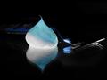
| 12/05/2002 07:17:04 AM |
Smooth as ice, Gillette Mach 3 Blueby f0rceComment: Love the lighting on the foam. The razor merges into the background too much. It would be better if there was a little light along the top edge of the razor to outline it. As it is, without the title, I would have a very hard time figuring out it's a razor. |
| 12/05/2002 07:09:54 AM |
Flower in Blue'mby connieComment: I like the gradation in tones from the pale blue shadows on the petals to the dark blue base. Very good control of lighting and exposure. 9 |
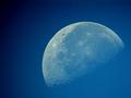
| 12/05/2002 07:07:18 AM |
Blue Moonby vtruanComment: Good job. That's a lot of detail on the moon. I'd be curious to know how you took this photo. |
| 12/05/2002 06:12:59 AM |
The blue Prairie on which my mouse resides.by emilyComment: This isn't a bad idea and the lighting is decent, but it would be a lot more successful if you had taken the time to clear everything that is not important to the picture like the towels and such off the table so that they don't distract from your main subject |
| 12/05/2002 06:08:36 AM |
Still got the Bluesby PtmanComment: I think the lighting could have been better. It would give the photo more impact if there were some highlights somewhere on her skin. |
| Photographer found comment helpful. |
| 12/05/2002 01:32:39 AM |
Landscape Portraitby GordonComment: I like the idea and the use of the hands to frame the eyes. The top hand though is a little too blurry for me. It's hard to even tell it's a hand, so I think a slightly larger depth of field would have helped. |
Home -
Challenges -
Community -
League -
Photos -
Cameras -
Lenses -
Learn -
Prints! -
Help -
Terms of Use -
Privacy -
Top ^
DPChallenge, and website content and design, Copyright © 2001-2024 Challenging Technologies, LLC.
All digital photo copyrights belong to the photographers and may not be used without permission.
Current Server Time: 04/24/2024 11:56:07 PM EDT.