| Image |
Comment |
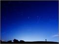
| 10/24/2005 08:11:02 PM |
Starry Nightby elsapoComment: This is great! Open, anchored, and wondrous. Were you and the foreground lit by moonlight in this shot? |
 Photographer found comment helpful. Photographer found comment helpful. |
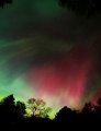
| 10/24/2005 12:52:09 AM |
Aurora_7780.jpgby kirbicComment: What a beautiful shot! Casseopeia, Perseus, Auriga, Taurus and Orion swept up by that incredible auroral blaze. |
| Photographer found comment helpful. |
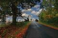
| 10/17/2005 12:32:18 AM |
Country Roadby Judith PolakoffComment: Nice lines leading up to the silo! Great color differentiation and crispness in the green foliage and blue sky. |
| Photographer found comment helpful. |
| 10/17/2005 12:21:17 AM |
Night Falls by elsapoComment: Very nice capture of Mars, the Pleiades, and Hyades. Nice work capturing the sense of false dawn from the city lights to the east. Collapsing the horizon right to the bottom of the frame gives a great sense of wide-open-ness. I really like your use of the sillouetted phtographer/astronomer as a catch. Bummer that noise smoothing ended up cancelling out some of the fainter stars that were likely evident. But I know how the "too much noise" responses can be an incentive. |
| Photographer found comment helpful. |
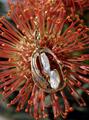
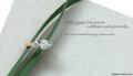
| 05/01/2005 11:37:44 PM |
Exotic Beauty in Gold & Pearlby CantiqueComment: You've got nice light, focus and reflections in the gold and pearl. It's really a beautiful work of art, and I'm pretty sure you were trying to reinforce its exotic nature, but the complexity of the flower you've set it on is really distracting to me. It camoflauges the interesting contours of the piece. |
| Photographer found comment helpful. |
| 05/01/2005 11:22:38 PM |
Writing a Love Poemby admart01Comment: Very nice composition and typography. You've done a great job capturing sparkle in the diamonds without going nuts with diffraction spikes. Having the ring face the camera so perpendicularly seems to flatten it though. This is an awesome layout. (8) |
| Photographer found comment helpful. |
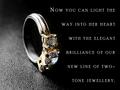
| 05/01/2005 11:18:27 PM |
Round Brilliant Two-Tone Ringby mocabelaComment: This is a very striking image and layout. I like the use of the strong light/dark division to emphasize the two-tone silver and gold. You've captured great detail in the gems and settings. Excellent. (9) |
| Photographer found comment helpful. |
| 05/01/2005 11:11:32 PM |
Iceby bruskiComment: I really like the layout of this as an ad. The two-tone color scheme is perfect. I'm sure the narrow depth of field, keyed on the stone is intentional, but I feel like having just a bit more of the ring in stronger focus would be helpful. I do agree that having the back of the ring softened is a good call for the feel of the ad. (7) |
| Photographer found comment helpful. |
| 05/01/2005 11:00:53 PM |
Foreverby BobsterLobsterComment: I really like the layout, color, and amazing background. The rings seem to suffer a bit from either glare or soft focus--in all likelihood that's intentional, it's just that my eye wants to see just a bit more crispness in some part of them. Still a beautiful photo. (7) |
| Photographer found comment helpful. |
| 05/01/2005 10:56:24 PM |
Gruenby graphicfunkComment: This has such a pleasant, warm feel to it. The strong right-angle structure of the layout seems to contradict the "curved...contour" description in the text, but visually, the image and text make for a very strong graphic. (8) |
| Photographer found comment helpful. |
Home -
Challenges -
Community -
League -
Photos -
Cameras -
Lenses -
Learn -
Prints! -
Help -
Terms of Use -
Privacy -
Top ^
DPChallenge, and website content and design, Copyright © 2001-2024 Challenging Technologies, LLC.
All digital photo copyrights belong to the photographers and may not be used without permission.
Current Server Time: 04/19/2024 02:09:36 PM EDT.