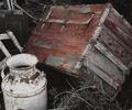
DPChallenge: A Digital Photography Contest You are not logged in. (log in or register
 
Browse Settings
Currently viewing:
Registered Userjoezl

Show comments:

Per page:

Order:

Comments:


Comments Made by joezl
Pages:   ...
Showing 1 - 10 of ~189
Image Comment
~Me~
05/26/2006 12:40:18 AM
~Me~
by HBunch

Comment:
wonderful. well done
Photographer found comment helpful.
January Sales Circa 2006
01/11/2006 10:44:09 PM
January Sales Circa 2006
by kevrobertson

Comment:
Congratulations. Great shot which captures the mood so well.
Photographer found comment helpful.
Icy
01/10/2006 06:18:49 PM
Icy
by basia03

Comment:
GREETINGS FROM THE CRITIQUE CLUB

This is a very appealing image as many of the commentors have said. The different shades of blue from dark to light make for a very soothing pattern of light and dark. The diagonal composition also works well making the image almost mesmerising. I keep moving along the diagonal back and forth.

I am surprised it didn't score higher in the challenge. I suspect that that's because voters were interpreting pattern very narrowly to mean 'repeating pattern' of some sort. I guess if the challenge called for repeating patterns then it would have been called Repeating Patterns - but what can you do!

Technically, the image is let down in a few areas. The blue mottling in the darkest part of the image is distracting. At the top end the mid-blue is indistinct and the light blue is also mottled and fades into white. I think tyhat all this detracts from the overall impact of the picture. Don't know if more could have been done to correct some of this in post-processing. Certainly much could have been improved if it were an advanced editing challenge - but it wasn't.

Overall, an effective and impactful image which should have scored better. Well done.
Photographer found comment helpful.
Christmas Stockings
12/21/2005 02:58:50 PM
Christmas Stockings1st Place
by idnic

Comment:
Very well done. What fun.
Photographer found comment helpful.
Last Depot
11/20/2005 05:24:57 PM
Last Depot
by madison461

Comment:
Greetings from the Critique Club

Well done on a splendid image.

This image has scored well reflecting its many merits. It is well composed with a nice balance of elements. The milk churn and trunk clearly stand out as the main subjects but the other, peripheral elements also contribute to the feeling of being abandoned, almost a junkyard feel. The partial de-saturation and grain all help the feeling of "old and abandoned".

Needless to say, the grain would not have pleased everybody and may have held it back in scoring. The link to the subject of the contest is there but is not obvious and again may have held it back a bit in voting.

To me the crop looks a bit tight. I would have liked a bit more space to the left of the churn and maybe a tiny bit more at the top. As it is it feels a bit hemmed in. You may have done this simply to crop out stuff you wanted to exclude but I don't think a little bit more clutter would have hurt this picture.

I would like to see a more saturated, sharper and less grainy version of this just to see what the comparison would have looked like. I actually like this execution but I suspect the more literal version may, alas, have scored a bit better on DPC.

Finally, the subject matter itself. While the subject creates interest in an intellectual, observational sort of way, it is not a subject that grabs much attention or generates a lot of emotion. This is a picture which makes you look at it and admire the composition and execution but does not make you draw breath or say WOW. The subject matter does not have that sort of strong appeal.

Great shot overall and well done on the good performance in the challenge.
Photographer found comment helpful.
To The Bottom
11/18/2005 02:06:43 PM
To The Bottom
by fplouffe

Comment:
Hello from the Critique Club

Well done on a great image. This is a well put together image that fits the theme as several commentators have said. The lighting is great, the background is clear and the lighting is well done, particularly the warm glow below the bottle.

Why did such a good image not perform better in the contest?

The multiple reflections are an obvious potential issue. I'm sure some people liked them while others did not. My overall feel is that the image is a bit too cluttered. I'm not sure the cork top adds much to the overall effect (in itself, it's not really an object of beauty) and yet it's quite intrusive in the foreground. Further experimenting with lighting, maybe more side-lighting with the creation of some darker shadows, would have given this a different mood.

As matters of detail, the glass is not a whiskey glass and the liquid in the glass is a different colour to the liquid in the bottle. These are not major points but would probably matter if you were submitting this for stock or something similar.

I suspect that the reason this did not do better is that, while being a very clean, well-executed image, it lacks something to give it an emotional punch as soon as people look at it (for instance, the stronger lighting as suggested above). It's almost too clean - nearly sterile. That may be part of the objective here as you don't want to romanticise drinking in the context of this challenge. But I suspect that this may have held it back leading commentators to say 'nice image' rather than 'WOW'.

Overall a great image which probably should have scored higher.
Photographer found comment helpful.
Model in Training
11/03/2005 08:16:56 PM
Model in Training
by danica22

Comment:
Nice shot. Lovely boy. Those eyes are great. I bet they would have looked awesome looking into the camera. Like teh toning. Maybe slightly too many highlights and I don;t think that cap adds much - I find it just an irritating distraction from the lovely portrait of the boy. Great job overall.
Photographer found comment helpful.
Chulo
11/01/2005 08:02:38 PM
Chulo
by ajschel

Comment:
I voted it a 5. I felt it was a very well taken photograph with a cute subject and good dof. The grain worked well. However, it didn't strike me enough to lift it beyond being "a good photograph". A number of things could have done that - lighting, expression, unusual pose, humour, etc. but there is none of that.

What bear has done lifts the image and gives it more oomph but IMO still does not endow it with that special something to lift it above the crowd.
Photographer found comment helpful.
picture it red
10/31/2005 10:34:27 PM
picture it red
by mandyturner

Comment:
Very nnicely done.
Photographer found comment helpful.
Nap Time
10/31/2005 10:29:49 PM
Nap Time
by jjbeguin

Comment:
First photo to come up on my screen for voting and it's marvellous. Well done.
Photographer found comment helpful.
Pages:   ...
Showing 1 - 10 of ~189


Home - Challenges - Community - League - Photos - Cameras - Lenses - Learn - Prints! - Help - Terms of Use - Privacy - Top ^
DPChallenge, and website content and design, Copyright © 2001-2024 Challenging Technologies, LLC.
All digital photo copyrights belong to the photographers and may not be used without permission.
Current Server Time: 04/16/2024 09:27:22 AM EDT.