| Image |
Comment |
| 07/22/2005 11:35:11 PM |
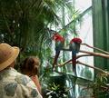
birdwatching.jpgby mlhop05Comment by mlhop05: Thank you, your right about the windows in the background.. this was just a candid shot I really wasn't going for anything other than father daughter together but your suggustions make me want to try it agaun!
m |
| 07/19/2005 11:27:30 AM |
birdwatching.jpgby mlhop05Comment by 2Shay: I agree with bananashay (no relation) about moving farther to the right for this shot. I think the light background from the windows behind the birds has too much glare. It makes the birds "dull" If you moved further right and used the palms for a background, you would have more light on your subject and less behind it. I think the colors in the birds would really "pop" with a darker background. |
| 07/19/2005 01:28:31 AM |
birdwatching.jpgby mlhop05Comment by megryan: Hi
Firstly with birds and in your case here, I would defintely come in a lot closer and make the bird fill the picture and make it your main subject. However that's entirely upon how close you can get and the zoom on your lens. That way will bring out so much more detail and make it a serious contender for challenges. While this is a nice photo for the family album there is too much space and distractions which take away the focus on the birds. They're a bit lost in this picture. Sometimes though you can use a backdrop(background) to enhance your subject in a positive way. Patience is the key and keep practising on any subject and if you have a good software program you're on your way, you'll only improve. Don't forget there is plenty of helpful people on this site if you have questions.
Feel free to browse my porfolio as I shoot many nature shots, it may give you some ideas on composition.
-Lisa |
| 07/19/2005 01:24:31 AM |
birdwatching.jpgby mlhop05Comment by bananashay: I like the focus on this, and the fact you got the lighting to work. I also like where left edge falls.
To improve it, I'd probably shoot from a little farther right. Create more space between the watchers and the birds, and eliminate part of those somewhat ugly sticks the birds are sitting on. It would also allow us to see the faces/reactions of the people. You could maybe also do without a little of the space on top. Unless you're attached to this particular composition, I don't see how it adds anything to the photo.
Overall, a very good idea that with a few minor tweakings could be an excellent shot. |
| 07/17/2005 11:41:07 PM |
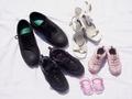
In our shoesby mlhop05Comment by pidge: I like the idea for this picture. I think a different angle would help make the picture more exciting, as it is a bit flat right now. I also find the white overexposed and the detail on the dark shoes is lost. Maybe a fill in flash would help to bring out the detail in the dark shoes. |
 Photographer found comment helpful. Photographer found comment helpful. |
| 07/16/2005 10:13:21 PM |
|
| Photographer found comment helpful. |
| 07/15/2005 07:48:25 PM |
In our shoesby mlhop05Comment by bfox2: I think this is one of the better shoe entrys, but I feel it would have been helped by a closer crop on the right and left. |
| Photographer found comment helpful. |
| 07/15/2005 01:40:26 PM |
|
| Photographer found comment helpful. |
| 07/15/2005 12:24:43 PM |
|
| Photographer found comment helpful. |
| 07/15/2005 12:12:03 PM |
In our shoesby mlhop05Comment by Artifacts: Creative method to express the idea of family. Perspective is fine. Your choice of shoes and colors complement each other.
This almost looks high key but might not be the effect you were after. The background either has to much or not enough wrinkles in it. Seems like the sheet should be completely flat so that there are no wrinkles at all or you should include more and strategically placed wrinkes to add texture and visual appeal to the image. |
| Photographer found comment helpful. |
Home -
Challenges -
Community -
League -
Photos -
Cameras -
Lenses -
Learn -
Prints! -
Help -
Terms of Use -
Privacy -
Top ^
DPChallenge, and website content and design, Copyright © 2001-2024 Challenging Technologies, LLC.
All digital photo copyrights belong to the photographers and may not be used without permission.
Current Server Time: 04/19/2024 09:15:03 AM EDT.