| Image |
Comment |
| 05/29/2007 06:21:40 PM |
Shapelyby BrinComment: This one I like. I think you have a winner. Good comp, good exposure, good focus. Great photo. |
 Photographer found comment helpful. Photographer found comment helpful. |
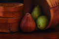
| 05/28/2007 07:11:38 AM |
Pear Shapesby stevieianComment: I like the low key colors but I think just a touch more light would have been better. Also, the pear being right in the center sort of ruins the composition. I would try framing it different so that the pear is in the lower and right hand 1/3 of the frame. |
| Photographer found comment helpful. |
| 05/27/2007 08:16:18 AM |
|
| Photographer found comment helpful. |
| 05/27/2007 06:35:49 AM |
|
| Photographer found comment helpful. |
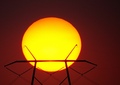
| 05/26/2007 12:17:37 PM |
Solar Powerby MelonMusketeerComment: The sun is overpowering the picture. If you could have pulled back some and left the subject on the left 1/3 of the frame, I think it would come across more powerful. |
| Photographer found comment helpful. |
| 05/26/2007 12:11:09 PM |
|
| Photographer found comment helpful. |
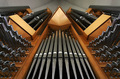
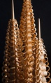
| 05/26/2007 12:09:27 PM |
Sharp Chisel.by zhgandynComment: I'm impressed by the wood work. This would have looked better if you could have got some light to the left side and cut down on it a little bit on the right side. The middle spire is exposed the best and shows the great texture that this holds. |
| Photographer found comment helpful. |
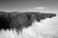
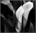
| 05/26/2007 12:03:25 PM |
Two Conesby admart01Comment: I think the B/W hurts the overall picture. The contrast between the white and the green is usually what makes these flowers stand out. You've taken away some of the 'punch' by choosing to go B/W. |
| Photographer found comment helpful. |
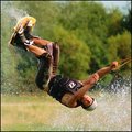
| 08/06/2006 07:22:04 AM |
Dude! by zardozComment: This will be the only high scoring photo that I comment on (I've been concentrating on those that need critiquing). Your shot IMO should be a ribbon winner. I really can't find anything wrong with this shot . . . well, maybe if you would have had more lake in the picture, it would be better. Sort of looks like he's skiing on grass. Congrats on such a great photo. |
| Photographer found comment helpful. |
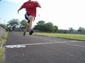
| 08/05/2006 09:17:18 AM |
And the winner is...by yomanComment: Wait . . . who's the winner. You chopped their head off. The photo really doesn't work without the head (sorry). |
| Photographer found comment helpful. |
Home -
Challenges -
Community -
League -
Photos -
Cameras -
Lenses -
Learn -
Prints! -
Help -
Terms of Use -
Privacy -
Top ^
DPChallenge, and website content and design, Copyright © 2001-2024 Challenging Technologies, LLC.
All digital photo copyrights belong to the photographers and may not be used without permission.
Current Server Time: 04/24/2024 03:39:39 AM EDT.