| Image |
Comment |
| 07/27/2005 11:33:31 AM |
|
| 07/27/2005 01:01:13 AM |
|
 Photographer found comment helpful. Photographer found comment helpful. |
| 07/26/2005 02:19:44 PM |
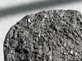
Mineralsby KatheComment by thomaspeople: The texture is good. I find the shadow in the background distracting. I wonder if you could heighten the contrast a little and bring out more of the variations in the surface. |
| Photographer found comment helpful. |
| 07/25/2005 02:37:57 PM |
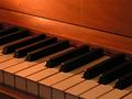
Tempoby KatheComment by Riponlady: wood too flat, metronome is sharp, perhaps would have preferred to see more of this and less of the case. |
| Photographer found comment helpful. |
| 07/25/2005 01:46:04 PM |
Tempoby KatheComment by _Io_: The line in the top right is distracting, and the edge at the front of the metronome is out of focus. Whilst you've given us some nice detail here, I would have preferred to see more/all of the metronome. I can't help feeling that a slow shot of the whole hand sweeping out part of its arc would meet your title better, and give some movement to the shot.
|
| Photographer found comment helpful. |
| 07/25/2005 09:07:12 AM |
Tempoby KatheComment by Jutilda: I think I'd pan back a bit so you could see more of the metronome. Or maybe crop out the brass ring on the right and show more of the other aspects of it. I find that ring a tad distracting. You did shoot it from a good angle though - not straight on. I hope this helps. |
| Photographer found comment helpful. |
| 07/25/2005 08:28:09 AM |
Tempoby KatheComment by NathanWert: I can't decide if I like the focus where it is. I think I'd prefer it if the whole thing was in focus. |
| Photographer found comment helpful. |
| 07/22/2005 08:11:46 AM |
|
| 07/21/2005 10:34:18 PM |
|
| 07/21/2005 10:17:46 PM |
More Alternativesby KatheComment by muur88: good crisp focus. unfortunately, it brings out alot of what appears to be dust issues. i would have liked to not have the main subject upside down as it makes it hard to look at for me. he looks like he staring off in a longing sort of way. perhaps you could have used that in a composition to more inhance your point, other than just all of the currency itself |
| Photographer found comment helpful. |
Home -
Challenges -
Community -
League -
Photos -
Cameras -
Lenses -
Learn -
Prints! -
Help -
Terms of Use -
Privacy -
Top ^
DPChallenge, and website content and design, Copyright © 2001-2024 Challenging Technologies, LLC.
All digital photo copyrights belong to the photographers and may not be used without permission.
Current Server Time: 04/25/2024 03:15:12 PM EDT.