TIME to buy new jewelryby
mischffComment by HBunch: *Critique Club*
With 400+ entries, it's almost a miracle that you happen to get a crit club comment 3 times in a row...it's inconceivable that I would happen to get all 3. Wow.
This is the best of the 3 I've done in my opinion.
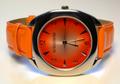
I really like the color, very nice oranges.
Lighting is very nice on the subject. If I had to change one thing it would be the surounding color. In the 'white' background, there are traces of orange and blue. I think that it might put more focus on the watch without added color in the surroundings.
I personally like the way you have it tilted. The 'no boundaries' label seems to indicate that something needs to be different here, and you did just that.
Excellent job concealing reflections on the watch face.
The small bit of bright orange wristband which is sort of in the background near the upper part of the watch face is a tad distracting, however, it doesn't have a major impact on the photo, but the photo would lose nothing if it were removed. If that makes sense.
Very nice shot. Look forward to seeing what comes up next. :)
~Heather~