| Image |
Comment |
| 04/01/2007 08:36:03 AM |
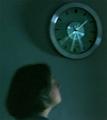
Insomnia: Watching the clockby saiphfireComment: One of my first ever photos! Please don't judge me too harshly... I've gotten better, I swear! :) Message edited by author 2007-04-01 08:39:44. |
| 03/08/2007 04:26:49 PM |
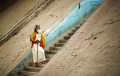
The Prophet by Joey LawrenceComment: lol, I JUST searched for the Cannon 85mm 1.8 lens and then read the last comment you got from Mark Simms... The pictures are amazing. |
 Photographer found comment helpful. Photographer found comment helpful. |
| 01/03/2007 12:09:16 PM |
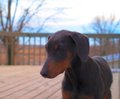
My Beautiful Belleby TheStickComment: Awww, looks just like my dog Bryher when I got him! Now he's 2 1/2. See him here: www.dogster.com/?67522 (he's also featured in many of my portfolio pictures).
As for technical comments - the picture is a bit out of focus, the background is distracting, and there are a few color problems. I'd lighten shadows, darken highlights, and increase both midtone and overall contrast. Then turn down the saturation a bit (you might even desat the magenta channel completely). The background isn't great - I personally often like backgrounds in shots to give them context, but by and large the DPC voters don't (I've been bashed many a time) so it might be better to take a lower angle and get only the sky behind the dog or put the dog in front of something more neutral (like a wall). Even though I like stuff in the background, this one is problematic because it's so much brighter than the dog that it steals attention - you might want to burn it to make it less noticable, or apply a blur effect to it (but select out the dog first so the dog doesn't get more blurred). Then the photo needs some sharpening - it would probably be most effective to sharpen just the face and chest, but USM over the whole thing would be okay, too. In the future, this type of picture would work best when the dog is looking at the light rather than backlit because you lose his/her features (you could also use a reflector, but if your dog is like mine, who has time to set one up when the dog's running all over). |
| Photographer found comment helpful. |
| 12/21/2006 04:05:12 PM |
|
| Photographer found comment helpful. |
| 12/21/2006 04:05:03 PM |
|
| 12/21/2006 04:04:52 PM |
|
| Photographer found comment helpful. |
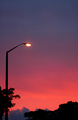
| 12/21/2006 04:03:50 PM |
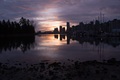
"Goodbye Blue Sky"by FleaNZComment: Why include the streetlight? Was there anything you could have done that was not lit that would have given a silouette (sp?)? |
| Photographer found comment helpful. |
| 12/21/2006 04:03:17 PM |
|
| Photographer found comment helpful. |
| 12/21/2006 04:01:49 PM |
Echoesby adineComment: Nice idea. I would have liked to see the same amount of space on either side of the window, though... i.e. a tighter crop on the right and possibly a vertical orientation. |
| Photographer found comment helpful. |
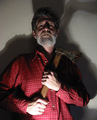
| 12/21/2006 04:00:56 PM |
Wish You Were Hereby terjeComment: To me the sky is a little bit overexposed, but I understand why in order to catch a few details on the man. This might have been fixable with tone mapping, but I don't know how to do it, so I'm not sure. |
| Photographer found comment helpful. |
Home -
Challenges -
Community -
League -
Photos -
Cameras -
Lenses -
Learn -
Prints! -
Help -
Terms of Use -
Privacy -
Top ^
DPChallenge, and website content and design, Copyright © 2001-2024 Challenging Technologies, LLC.
All digital photo copyrights belong to the photographers and may not be used without permission.
Current Server Time: 04/23/2024 11:35:12 PM EDT.