| Image |
Comment |
| 05/05/2005 01:12:37 PM |
nightshift on the railwayby trainComment: If you would like a tip on improving contrast, set your aperature down (f8 to f13, etc), and give a much longer exposure time (10sec, 15sec, etc.) It will clean up those lights that bleed all over your trains, and make a neater and more interesting image.image |
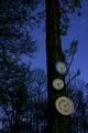
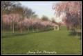
| 05/05/2005 01:10:42 PM |
Time flies when there's no sunby krazyComment: Love the clocks, love the exposure time, not crazy about the trees. And, its not that I'm not crazy about trees being in this shot, I'm just not crazy about the way it is set up here in particular. |
 Photographer found comment helpful. Photographer found comment helpful. |
| 05/05/2005 01:09:07 PM |
County Courthouseby BudComment: The courthouse is a beautiful building and the color here is fantastic, but you could have captured those two elements without the cars. They really take away from the shot. Also, had you been closer to the building, you would have been further away from those very bright street lights, and would have ended up with even better lighting, and less or no lens flares. Not sure if you used a lens hood, but if you didn't, they really eliminate a lot of flares, and improve on the contrast of the photo. |
| Photographer found comment helpful. |
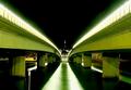
| 05/05/2005 01:04:00 PM |
Bridge + Lakeby stphwComment: i've seen this bridge in another challenge. I liked it then and I like it now. I never vote down for corner cropping, but if I could make a very nit-picky suggestion that might make for a better print...Rotate the image slightly clockwise, and re-center the image so that both the edges of the bridge bleed off directly in the corners. It is close now, but an extra step will give it a much nicer look and improve on the geometric symmetry that you have here. Nice job. |
| Photographer found comment helpful. |
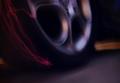
| 05/05/2005 12:42:33 PM |
Southern Crossby storytellerComment: These types of star shots are tough to pull off in these challenges, especially against some of the other submissions. I keep scrolling up and down to try and make some sense of the image, but it really doesn't seem to have any appeal other than white dots on black space. There also seems to be a tinge of blue around the edges of the stars, which makes it seem like blurry dots. I wish I had more good things to say, but I'm having trouble. I like your idea though, so maybe you'll have better luck if you try the shot again. |
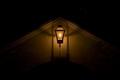
| 05/05/2005 12:37:55 PM |
Lamp and Shadowsby Zed PobreComment: Nice job on the lighting, and cropping, though I'm not entirely crazy about the subject. |
| Photographer found comment helpful. |
| 05/05/2005 12:36:50 PM |
|
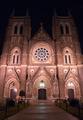
| 05/05/2005 12:34:50 PM |
Beautiful at Nightby ebertdjComment: Excellent shot! And...This looks eerily familiar. Is this off of Broad Street in Philly? I think the lighting here is absolutely perfect. |
| Photographer found comment helpful. |
| 05/04/2005 06:54:39 PM |
|
| Photographer found comment helpful. |
| 05/04/2005 05:44:55 PM |
|
Home -
Challenges -
Community -
League -
Photos -
Cameras -
Lenses -
Learn -
Prints! -
Help -
Terms of Use -
Privacy -
Top ^
DPChallenge, and website content and design, Copyright © 2001-2024 Challenging Technologies, LLC.
All digital photo copyrights belong to the photographers and may not be used without permission.
Current Server Time: 04/23/2024 10:19:46 AM EDT.