| Image |
Comment |
| 02/07/2005 05:02:48 PM |
|
 Photographer found comment helpful. Photographer found comment helpful. |
| 02/07/2005 05:01:51 PM |
|
| Photographer found comment helpful. |
| 02/07/2005 05:01:11 PM |
|
| Photographer found comment helpful. |
| 02/07/2005 05:00:26 PM |
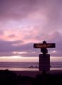
Ocean Avenueby ZoomdakComment: fabulous colors, and the sign is just light enough to read. It doesn't feel like it was touched-up (if it was at all, which I can't tell). |
| Photographer found comment helpful. |
| 02/07/2005 04:59:19 PM |
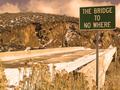
Road to nowhere?by okiesisiComment: conveys a sense of oppression, like beyond is death. Interesting, certainly. Why not use vertical composition, however? |
| Photographer found comment helpful. |
| 02/07/2005 04:55:06 PM |
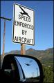
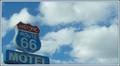
"Get Your Kicks..."by tfarrell23Comment: Part of the sign is cut off. The similar colors are accentuated by the red part of the sign, though it may have been more noticeable if brighter. |
| Photographer found comment helpful. |
| 02/07/2005 04:53:53 PM |
"nowhere"by real_ndnComment: The low angle actually makes it look like the bridge ends in the rocks. The bridge gives perspective and leads the ege to the sign. Very interesting |
| Photographer found comment helpful. |
| 02/07/2005 04:50:52 PM |
No parkingby mannjuditComment: I like the sunlight silloughetting them, though overall, I think it is underexposed. |
| Photographer found comment helpful. |
| 02/07/2005 04:48:34 PM |
Roadblockby RulerZigzagComment: unrealistic, I think, and too much touch-up. Otherwise, it effectively communicates the true purpose of the sign. |
| Photographer found comment helpful. |
| 02/07/2005 04:47:39 PM |
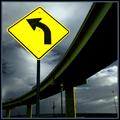
Good advice by BrennanOBComment: I like the contrast of the sign, though the touch-up may be too much. The overpass curve adds a lot to composition. |
| Photographer found comment helpful. |
Home -
Challenges -
Community -
League -
Photos -
Cameras -
Lenses -
Learn -
Prints! -
Help -
Terms of Use -
Privacy -
Top ^
DPChallenge, and website content and design, Copyright © 2001-2024 Challenging Technologies, LLC.
All digital photo copyrights belong to the photographers and may not be used without permission.
Current Server Time: 04/23/2024 03:52:45 AM EDT.