| Image |
Comment |
| 03/19/2003 02:07:29 PM |
Bouquetby AleciaComment: Nice shot. I like the color effects of the blue and yellow. The front does seem a bit underlit though. I might like to see it lit with a bit of soft white light from the front to see if it pulls more highlights off the metal peices. Would probably have to be quite diffused.
Score: 7 |
 Photographer found comment helpful. Photographer found comment helpful. |
| 03/19/2003 01:56:09 PM |
Clay Teapot by mcmurmaComment: This is really nice. Great effect of the pot and background being the same tones while the shadows help define the pot. Good job! Love the crack (?) in the corner too.
Score: 10 |
| Photographer found comment helpful. |
| 03/19/2003 01:53:05 PM |
|
| Photographer found comment helpful. |
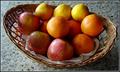
| 03/19/2003 01:48:15 PM |
Basket of Fruitby daysezComment: Nice focus and clarity. For my tastes the DOF might be a hair to shallow because the front apples and the basket facing the camera looks a bit out of focus. It's not a big thing but for a still life shot like this where the subject occupies the entire frame and at such an angle, my eyes look around for uniform focus. (hope you don't think I'm being nitpicky)
Score: 8 |
| Photographer found comment helpful. |
| 03/19/2003 01:39:37 PM |
From Scratchby karmatComment: Very nice compostion. Having the ingredients and the measuring spoons only partially on the outskirts of the frame while the bowl is completely shown is an excellent way to draw the eye around the various pieces of the photo while keeping you focused on the overall image itself. Wonderful, and it's making me want to make some cookies!
Score: 10 |
| Photographer found comment helpful. |
| 02/21/2003 09:31:29 AM |
A New Beginning by YomiComment: Wow! That is a really nice shot. Congrats. A closer shot of the couple's upper bodies and heads (leaving the gown to flow through the bottom of the frame) would look really nice too. Plus that could eliminate the snow chunk. The exposure is excellent too.
Courtenay |
| Photographer found comment helpful. |
| 09/19/2002 01:47:00 PM |
Morning Mistby spillerComment: I really like this shot for its simplicity and quiet feel. Good detail on the faraway boat too. Good job. Score: 9 Courtenay |
| Photographer found comment helpful. |
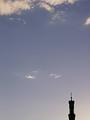
| 09/22/2002 12:30:00 PM |
Evening Prayerby stephanComment: This suffers from something that I've noticed in other submissions this week, that's relying too heavily on the notion of "negative space". From your title, I'm assuming this is a church but that's the only clue I have because otherwise all I see is a frame full of empty sky and the top of a building with what looks like a lightning rod. This image would have been more clear and had more impact if you actually put the church in the frame so we can identify it and just used enough sky as a background to allow the eye to wander. If the building were still thrown into shilouette your sky, as negative space, would still be quite successful but you would also have a defined subject. Score: 6 Courtenay |
| Photographer found comment helpful. |
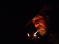
| 09/19/2002 12:50:00 PM |
Burnin' Oneby LindaLeeComment: a.k.a. The Marlboro Man. This is an interesting photo. Well exposed for the amount of light put out by the match/lighter. I'm trying to get more emotion from the photo but I really can't and I think it's because of the lack of any level of ambient lighting to pull some detail out of the other parts of the model's body. It seems like a nighttime shot of a cowboy except that it is literally pitch black with nothing else. It works as it is but for me it could have more impact if there were at least a little bit of ambient light for more detail and shadow. Score: 8 Courtenay |
| Photographer found comment helpful. |
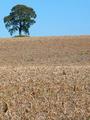
| 09/19/2002 10:13:00 AM |
Oasisby floydComment: Very nice composition. I like this better than some others because your "negative space" isn't all uniform (i.e.: one solid color) which a lot of people seemed to do this week. It probably would have worked equally as well if you shifted prspective and filled most of the frame with the sky instead of the field. Score: 8 Courtenay |
| Photographer found comment helpful. |
Home -
Challenges -
Community -
League -
Photos -
Cameras -
Lenses -
Learn -
Prints! -
Help -
Terms of Use -
Privacy -
Top ^
DPChallenge, and website content and design, Copyright © 2001-2024 Challenging Technologies, LLC.
All digital photo copyrights belong to the photographers and may not be used without permission.
Current Server Time: 04/19/2024 09:23:19 PM EDT.