| Image |
Comment |
| 08/06/2002 11:17:00 AM |
And This Too My Eyes Have Seenby sheyingshi88Comment: Nice photo. Good composition leaving some of the green foliage to contrast against the weathered building. Plus, I like the speck of purple in the lower right corner for a touch of additional color. If equipment would have allowed, it would have been interesting to see if some of the reflections off the windows could have been eliminated through filters. |
| 08/06/2002 01:51:00 PM |
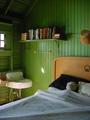
old hotel roomby shutterflyComment: This is nice. I could see it in Better Homes & Gardens or something similar. Good use of natural light to illuminate and convey mood when a flash isn't necessary. Nice symmetry and balance too with the large areas of flat color (green ceiling and grey/blue sheet) at the top and bottom surrounding the more colorful, busy area in the center. Just a small note: You may have wanted to have the entire bear on top of the sheet instead of leaving just its head showing if you set this shot up. Might be a nitpicky thing but I think it would have made the photo feel more inviting or 'home-y'. |
 Photographer found comment helpful. Photographer found comment helpful. |
| 08/07/2002 06:08:00 PM |
|
| 08/06/2002 04:50:00 PM |
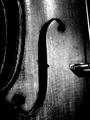
Portrait of an Old Violinby paganiniComment: Nice. Simple yet bold elements. Subject fills the whole frame with nothing extraneous to distract your attention. Seems to lose focus farther down the photo though as if focused on the light source at the top. |
| 08/06/2002 04:32:00 PM |
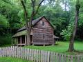
The Tipton Place by indigo997Comment: This is really nice. Greens are nicely sturated as are the reds in the wood of the house. The fence running through the foreground provides a nice break from the mostly green frame around the house. |
| Photographer found comment helpful. |
| 08/06/2002 04:41:00 PM |
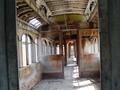
passengerby CheetahComment: This is cool. Everything has that faded, washed out look. Framing it at an angle helps so it doesn't have a pristine feel which wouldn't really fit something this aged. I'm wondering, though, if it might have a more dramatic feel if shot vertically instead of horizontally. |
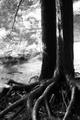
| 08/10/2002 05:05:00 PM |
perseveranceby oniComment: This is a good composition and being in black and white helps it I think because of the trunks and roots being in shadow and the foliage behind the tree being bathed in sunlight shows a huge contrast difference that may have been understated if in color. Initially, I couldn't decide if the branch in the upper left added or detracted from the overall photo but I think it does belong there and breaks up the bright whites of the background foliage. Nice job. |
Home -
Challenges -
Community -
League -
Photos -
Cameras -
Lenses -
Learn -
Prints! -
Help -
Terms of Use -
Privacy -
Top ^
DPChallenge, and website content and design, Copyright © 2001-2024 Challenging Technologies, LLC.
All digital photo copyrights belong to the photographers and may not be used without permission.
Current Server Time: 04/24/2024 04:44:03 PM EDT.