Octoberby
KaveyComment by Artyste: Hello from the Critique Club! Maybe you'll get mine to critique, lol.
Oh, and I hope you don't mind that I've "borrowed" your critique pattern that you posted in the forum :)
Initial Thoughts
Nice, simple photo that is pretty effective.
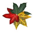
Composition / Content
I really like the composition here. Nicely centered, circular, and simple. (I'll be using that word a lot.) I think only Halloween (for many people) says more about October than colored leaves, so your content is also very nice.
Background
I don't know about anyone else, but I think the white background works very nicely for this piece. It sets the subject apart and helps focus your attention on it. To me, the open area in the middle of the leaves helps ground them as well.
Camera Work - Technical
Focus seems a *little* soft to me, but it could just be an effect of the bright background. Your exposure is wonderful for what must have been a difficult metering.
Digital Processing
I'm not too big on the burned edges of the leaves myself, especially on the red leaf against the yellow. Your levels work is very good, giving the leaves quite colorful presence.
Fits the Challenge
Well, I honestly think it's a little bit of a stretch. You fit the *month* perfectly, but as a calender it takes a little bit of imagination for me. Still, I *can* picture a calender that has various formations of leaves or other flora to a monthly theme. You may have lost some points in that area from other voters though.
My Opinion of the Photo
I love the simplicity of this. It's effective, has a good monthly tie-in, and was shot beautifully. A refreshing change from many of the usual Fall landscapes in the challenge, so good work. Love the creativity, and keep it up :)