| Image |
Comment |
| 08/12/2005 09:29:25 AM |
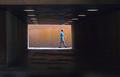
(No) Room for Movement Assignmentby KaveyComment by dahkota: Kavey, I think this works. It has an odd sense of...I don't know - the only word that comes to my mind is lyrical. Not sure if this breaks the rule in the assignment but the image is compelling none the less. The lines are 'off' creating an inbalanced feeling in me, the viewer. The round lights contrast with all the straight lines (even the multi-toned paint on the background) providing another dynamic. This was timed perfectly as a row of lights leads right to the subject. I like the way the box is off center, lending more depth to the image. I am drawn to his arm and his forward leg - the angles lead me onward out of the image and I think that works. The only thing I am not crazy about is his blue shirt. No clue why. It would be interesting to see this in black and white. |
 Photographer found comment helpful. Photographer found comment helpful. |
| 08/09/2005 10:04:18 AM |
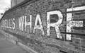
101_0160 bw.jpgby KaveyComment by Skyarcher: B/W Group -
Am glad you tried this in B/W, I like it better than the color. The B/W adds more 'character' to it and to me the subject matter just begs to have character... I mean, it's a wharf! Think of all the stories that it could tell, if able.
With that though, I would love to see this image pop a little more in the darker areas. I know the original blended in too, but wonder what this would look like with maybe a tinge more contrast. Think I will add this to my DPC_BWGroup_todo list, if you don't mind, just to test it and see what I come up with.
Why can't my town have cool places, things to image?! :D
-Christine |
| Photographer found comment helpful. |
| 07/14/2005 11:11:53 AM |
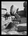
The Thinkerby KaveyComment by Balko: This one is "bland" for lack of a better work. Not enough real contrast as the tonal range seems too narrow. |
| Photographer found comment helpful. |
| 07/14/2005 11:10:29 AM |
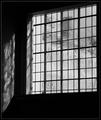
Old Panesby KaveyComment by Balko: B&W Club
OMG, I forgot to comment on this one! I really like this, especially the patterns on the window, forcing the viewer to try to interpret it. AS to "blownout" areas. B&W is ok with some blowouts to attract the eye and make it connect-the-dots, as it were. And that blowout in this pic looks like a wall, the casement of the window on which the sun is shining. It's perfectly fine in this image. |
| Photographer found comment helpful. |
| 07/12/2005 05:28:11 PM |
Across the Riverby KaveyComment by RonBeam: The bright whites in the FG fight with the bright whites of the 2 boats and the strips along the far bank as well as the horizon line tones. In a good B&W, white is used to lead the eye along the composition. The whites in this piece have the effect of a ping pong ball bouncing inside a clothes dryer. |
| Photographer found comment helpful. |
| 07/11/2005 11:28:07 PM |
Old Panesby KaveyComment by Falc: B/W Mentor Group.
Hi Kavey,
I think you are correct in the fact that this is a classic subject for monochrome, the lines are stark and contrast very well against that textured glass. Its the lines which provide the structure, whilst the whites and greys provide the detailed infill, and its these areas which the eye drops onto and explores.
I can't decide whether I would like to bump the contrast in those swirls and textures in the window, I'd be scared of losing too much detail. If you look through the window at the left hand side you can see that there is no grey in that section becasue of the window jamb on the outside. That area would need some special treatment to not simply blow out.
Do you know what this image calls out for?
Something in silhouette on the window cill at the right hand side. A candle maybe, just something simpe to balance those textures.
Falc |
| Photographer found comment helpful. |
| 07/11/2005 06:07:47 PM |
The Thinkerby KaveyComment by Skyarcher: B/W Club
I'm going to agree with muckpond on this. Your image is great, but kind of... the same all over, if that makes sense. I looked at mp's version, and I do like that there is more a difference within the blacks, whites and greys. More definition. However, I'm not sure I like the starkness of the shadows.
I'll come back to this one, after I finish my exams tonight, see if I can show what I mean.
-Christine
|
| Photographer found comment helpful. |
| 07/11/2005 05:59:32 PM |
Old Panesby KaveyComment by Skyarcher: B/W Club
Forgive me Kavey if I do this wrong. :)
First, I love the texture of the panes, it reminds me of brushed ice. I also think that it did lend itself to B/W. I think it would have lost some of it's WOW factor otherwise.
Not crazy about the 'whiteness' to side of panes, but read your comments, so understand why it's there. I do however, like the reflection of the textures onto the wall.
I'm not sure how well it would do here, but to me, this could pass for a low-key image.
The textures obscuring what is on the other side, just make me want to keep looking to see if I can figure out what is there. Without reading that it is buildings, I get to use my imagination as to what is hidden.
-Christine |
| Photographer found comment helpful. |
| 07/11/2005 04:17:08 PM |
Old Panesby KaveyComment by Kavey: Oh my goodness, Elvia, I can SEE HIM!!!
To answer some questions:
The white area to the left side of what one sees through the pane is the outside half of the very, very thick wall that this window is in. I don't think it's blown out (though I may be wrong) so much as the fact that it is one of the palest areas within the image. It's one of the points I like least about the shot.
The reflection on the interior wall to the left is the whole of the reflection, I haven't cropped any out, it reflects the thickness of the wall. Just outside of frame to the left is a 90 degree corner turning into the interior wall of the chapel.
What one can see through the window are various buildings that form part of the naval college estate. |
| 07/11/2005 03:51:26 PM |
Old Panesby KaveyComment by elvia: Great Shot. Does everyone here not see the picture in this?? Let your minds eye see an old man with long wind swept hair and beard blowing across his face. The eyes and nose are in the third row from the top,eyes are in the 4th and 7th pane left to right. His head is tilted slightly to the left. His mouth is in the 4th row and 6th paneI I love this shot... |
| Photographer found comment helpful. |
Home -
Challenges -
Community -
League -
Photos -
Cameras -
Lenses -
Learn -
Prints! -
Help -
Terms of Use -
Privacy -
Top ^
DPChallenge, and website content and design, Copyright © 2001-2024 Challenging Technologies, LLC.
All digital photo copyrights belong to the photographers and may not be used without permission.
Current Server Time: 04/25/2024 02:02:44 PM EDT.