|
|
| Image |
Comment |
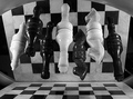
| 01/04/2006 02:07:24 PM | Check-eredby shaverComment: *Critique Club*
Well, it looks like you received some very nice, very helpful comments after the challenge already. I didn't see the thread asking for opinions, so I don't know what other opinions you may have gotten there, so I'm not really sure what to add to that other than my personal opinions.
Per your request, here's your Critique Club comment...
The image seems to me to be lacking contrast. It's quite grey. I'd like to see some brighter whites. You could play with the contrast and brightness a bit, this usually gets me to where I want. I tried it with this image briefly and it seemed to take away some of the detail in the black pieces. So maybe curves adjustments would work better?
The image to me seems a bit small. Try to take advantage of the full 640 pixel limit on photos. This will help us to better see what we're looking at and give us more of a sense of details.
Focus does seem a bit soft. I have photographed chess pieces and ran into the same problem. I got VERY few photos that actually came out looking generally focussed. Not sure how to clarify 'fixing' that problem, except to take lots and lots of pictures, playing with focal settings often and find out which works best for the situation you are working with.
The image also lacks lingering interest. The first reaction is 'oh neat' and then when you figure it out, there's nothing else to hold my interest in the photo.
Another minor picky detail is that the reflection seems to be reflecting back on the board creating black squares on some of the white squares. This breaks up the patterns a bit in my opinion by placing dark squares where white squares should be.
Overal a definately creative idea for the challenge, but lacking that special element that makes me say 'oh wow'.
~Heather~
|  Photographer found comment helpful. Photographer found comment helpful. |
| 01/03/2006 03:13:59 PM | Dishabillophobia - The Fear of Undressing in Front of Someoneby fotomann_foreverComment: *Critique Club*
This definately fits the challenge to me. Without even knowing what the fear was, I could look at this photo and say that this woman was afraid to come out from behind the door because she's naked. To me, that is what this challenge was about. SHOWING the fear. Great job.
Focus and clarity appear good. I like the detail we can see in the woman's hair and face.
Lighting is alright. I wish almost that the man were a bit more brightly lit, but maybe since he's not suposed to be the main subject, that it's best to have him darker lit. Something it's hard to judge without seeing it for comparrison, but definately something to try.
The thing that I'm really drawn to in this shot is the lighting on her hand. I think it's really neat how it stands out from the dark side of the door, almost as if it's saying 'ok, I've made it out from behind the door', but that's it, nothing else makes it out from behind the door.
I wonder what this looked like in color. Black and white is ok, very nice tonal range, but it's just lacking 'something' to make it stand out. Not sure, but maybe color is just that 'something'.
Overall great idea for the challenge.
~Heather~ | | Photographer found comment helpful. |
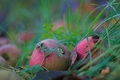
| 01/03/2006 01:44:38 AM | for the birdsby visaksenComment: *Critique Club*
In response to your request for an in depth critique, due to the lack of photogrpaher's comments, I can only offer my critique based on my own personal opinion alone, since I do not know what your personal intentions were for this photograph.
I really like this. At first, I wanted to say 'I wish the one green leafy thing wasn't ON the apple, but then I tried to picture it without the green leafy thing and it seemed a little boring, so I'm thinking that maybe you made a good choice by leaving it in.
The one distraction that I do see is the dark leaf in the forground. It doesn't seem to fit with the bright colors of the rest of the photo and kind of draws attention to itself.
The focus on the apples is nice in my opinion, and also the DOF really makes this photo. Very nice for the challenge.
The color and lighting really make me want to look at this for a long time. So why did it finish in the lower 1/2 of the entries? Cause it doesn't jump out and slap you in the face. There was a lot of strong competition in this challenge, and it seems like the more outrageous shots took the top. I really do like this though. It's a very relaxing image.
~Heather~ | | Photographer found comment helpful. |
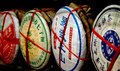
| 01/03/2006 01:17:03 AM | Hong Kong Tea Shopby jimboneComment: *Critique Club*
In response to your request for an in depth critique, due to the lack of photogrpaher's comments, I can only offer my critique based on my own personal opinion alone, since I do not know what your personal intentions were for this photograph.
I see you didn't receive any comments during voting, so I hope my comment here will be able to help you out in some way.
Technically, the photo is quite good. Good focus, good DOF, good color.
So why did it score in the lower percent? I think first off, there was a lot of tough competition in this challenge. Lots of photos that just say 'wow'.
Which leads me to this photo. It's lacking something to push it over the edge from being a good shot, to something that is 'wow'.
The crop, in my opinion is too tight. Back it up a bit. Give the subject a little room to breathe.
The background works well, dark background with nothing distracting there.
I like the angle at which you chose to photograph the subject. It does create some nice depth and lets our eyes flow nicely through the photo.
I'm wondering what this would look like with even more of an angle. Were there more bottles? Could you have made the bottles just dissappear into the background? That could have been interesting as well.
Overall well done, but lacking wow factor.
~Heather~ | | Photographer found comment helpful. |
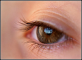
| 01/02/2006 11:13:31 PM | A window to the Soul.by MattOComment: *Critique Club*
In response to your request for an In Depth Critique.
I have pondered this image now for a whole day. Picking it apart, just trying to find something that isn't right. But I'm just not seeing it. If I HAD to pick something, it would be the light reflection in the left side of the eye. I wish this were toned down a bit or simply no there. I think being so close to the window, that it distracts slightly from the reflection in the eye.
Focus is great. Love the detail in the eye. DOF is perfect and works great for the challenge.
I like the cropping/framing of the subject and placement within the frame is good as well. I like the negative space to the left.
The colors are great, very nice warm tones.
Wish I could offer more, but I really don't see much that could be improved in my opinion.
~Heather~ | | Photographer found comment helpful. |
| 01/02/2006 12:02:58 PM | Aaaah, I Love My Wife!by climbin2thetopComment: *Critique Club*
In response to your request for an in depth critique, due to the lack of photogrpaher's comments, I can only offer my critique based on personal opinion alone, since I do not know what your personal intentions were for this photograph.
I think this is pushing it for the challenge. While it represents bokeh very well with use of DOF, I'm not convinced that it represents SHALLOW DOF, which is usually a very small portion of the photo being in focus.
The focus is very good. Subject is nice and crisp, while the background is out of focus.
I have no personal attachment to the subject, and am just not drawn into the photo and held there. It's lacking some wow factor that would make this something other than a lady flipping the bird.
Lighting apepars good on the hand, but a little odd on the face. I don't know if this is what you intended,but I think I would prefer a bit more light on the face in the background. Maybe a dim side light to make her seem like more of a whole person.
The placement of the objects within the photo is also a bit odd. I like the finger off to the right, with the face off to the left, but the finger overlays the ear at a point where it almost blends in, making the finger look like it has an odd growth coming from the side of it.
Overall, focus and DOF are good, but not my cup of tea.
~Heather~
| | Photographer found comment helpful. |
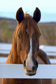
| 01/02/2006 03:46:41 AM | Nearly Night Mareby lynnesiteComment: *Critique Club*
This is in response to your request for an in depth critique.
I opened this up and thought it was for the Phobia challenge. Seeing as that I'm afraid of horses.lol Then, I see that it's for the shallow DOF challenge, and I think to myself that while there is DOF creating BOKEH, I don't really find that this fits in with the SHALLOW DOF category. Oh well...I'm not voting, so on to the image...
The very first thing I notice is the slight right tilt of everything. The white fence in the forground, the white fence in the background, the horizon line in the far background and the horses body.
I realize that due to the strong vertical line of his nose, that you probably lined the photo up by his head, and under normal circumstances, this might be fine, but I'm finding it hard to look at the photo and not want to tilt my head to the right to view it 'properly'.
Focus is really nice on the subject. This photo shows personality and that's very important in photos of animals in order to make them more than just snapshots.
the background is rather plain and boring, especially being out of focus for the challenge. Not really much you can do about that except lead the horse around looking for just the right background, which isn't really logical, so no big deal, just an observation.
The centered composition is ok, but I can't help but wonder if we had a bit more space to one side or the other what it might look like. He's looking straight ahead, so it might not work, but definately something to play with anyway.
I have made it a habit to stay away from horses my whole life, and don't know much about them, but this photo makes them look not so scary, and I actually enjoy looking at this image. Overall it's a nice image, but had I voted, I would have liked to see a bit more shallow DOF for the challenge.
~Heather~ | | Photographer found comment helpful. |
| 01/02/2006 03:30:55 AM | H2O H2O H2Oby deepfrog17Comment: *Critique Club*
In response to your request for an in depth critique, due to the lack of photogrpaher's comments, I can only offer my critique based on personal opinion alone, since I do not know what your intentions were for this photograph.
That being said, I think that this fits the challenge perfectly. Great DOF, forground and background are both nicely blurred putting the focus on the main subject, which is the bead in the center. The center bead is in nice focus and we get a lot of great detail in the bead. I particularly like the tiny white specks.
I see your comment suggesting that you feel this should have scored higher.
One thing that I notice about this photo, is that while it is technically a well done photo, it is a little difficult to tell exactly what it is we are looking at, and it does have a bit of a dark feel to it. I think that had this maybe been on a brightly colored background, it might have had more visual appeal to the majority of the voters, and might have gotten a bit more 'wow factor'.
I'm wondering if maybe the oof drop in the front might just be a bit too large in comparrison to the drop that is in focus. Maybe just a bit overpowering.
I like the angle and the diagonal positioning of the objects. Creates nice flow through the photo.
Overall, technically well done, but missing something that draws me in and holds me there. Possibly color.
~Heather~ | | Photographer found comment helpful. |
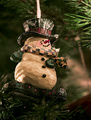
| 01/02/2006 03:10:15 AM | Hanging Out On The Treeby shankswareComment: *Critique Club*
You didn't receive many comments on this, so I hope I can help out a bit. In relation to the challenge, I do see background and forground elements that are properly out of focus, creating a shallow DOF, which in my opinion fits the challenge. That being said, I do think that a SHALLOWER DOF might have done better score wise in this challenge.
Focus is very nice on the subject, and the subject is pleasant to look at. There is a lot of visual appeal here. I like that that the tree is in the background, and out of focus. I like that the snowman is off to the left side of the photo and looking to the right of the photo, with some negative space in front of him. This is technically 'proper', and it works.
The lighting is very nice as well, and I think that although it's a bit dark in places, that that doesn't hurt the overall impact of the photo.
The background works, but there is a lighter area of the background that creates somewhat of a distraction due to it being a similar color to the subject, and being so close to the subject.
I really do like all the elements of the photo and think that it was only harmed by some tough competition and maybe being slightly not shallow enough. Still cute though.
~Heather~ | | Photographer found comment helpful. |
| 01/02/2006 01:12:29 AM | Bubblesby Meridian SageComment: You'll have to forgive me if I completely miss the connection to the challenge here. I have thought of 'mother' in every sense I can think of, and not once do bubbles cross my mind. The shot is neat. I like the bubbles, and the color is amazing. Focus on the bubbles is nice and crisp, and DOF is appropriate. The photo just says nothing about Mother to me. Sorry. ~Heather~ | | Photographer found comment helpful. |
Home -
Challenges -
Community -
League -
Photos -
Cameras -
Lenses -
Learn -
Prints! -
Help -
Terms of Use -
Privacy -
Top ^
DPChallenge, and website content and design, Copyright © 2001-2024 Challenging Technologies, LLC.
All digital photo copyrights belong to the photographers and may not be used without permission.
Current Server Time: 04/19/2024 11:55:13 PM EDT.
|