|
|
| Image |
Comment |
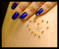
| 01/15/2006 11:50:31 PM | Blue Over My Heartby JudiComment: *Critique Club*
Per your request, here is you in depth critique from The Critique Club.
First impression is that I'm not really sure what the point is, and your lack of comments doesn't help me to figure out what your intent was for this photo, so my critique is based solely on personal opinion since I do not know what your intent was.
I cannot tell what part of the body this is, and why your hand is there. Is the jewel heart over the actual heart? The only purpose I see for the hand is that there are 2 little jewels on it, which kind of ties it in with the little jewels of the heart, but still, the hand seems to serve no purpose and doesn't add to the 'shapes' theme for the challenge either.
The focus seems soft, but I wonder if that's a biproduct of the neatimage? The skin just seems to have no texture whatsoever and appears quite odd.
The freckles on the skin distract slightly from the subject due to the similar shape, size and color.
This would have been more effective if the heart were symetrical. There are more beads on the left side than on the right side.
Lighting is very uneven. It's darker on the left side (shadow of hand) which gives the skin an unnatural green tint on the left side of the photo. Also, the light reflections on the nails distract from the jewels on the nails.
Overall, I think this fits the challenge properly, but leave me saying 'huh?'. |  Photographer found comment helpful. Photographer found comment helpful. |
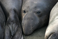
| 01/13/2006 03:00:19 AM | That Only a Mother. . .by cycleboyComment: *Criitque Club*
In response to your request, here is your in depth critique from The Critique Club.
I read your comment, and do think that the image was probably voted lower due to challenge relevance. When looking at the shot, the first thing I think of is animals, ocean, sad. I don't think in a million years, I would have thought 'mother'.
That being said, on to the image itself.
First thing I notice is focus. I think it's the texture of the seals that makes them look soft focus, cause when I see the wiskers, they appear to be in focus, but not much else does. This may have been a trickier shot than it originally appeared. She is shiny, and reflecting light and color, and I think that throws off the appearance of the focus. Not really sure if there's an easy fix to that, but I sure couldn't come up with one.
Next is the lighting. Doesn't seem like the most flattering lighting conditions. Not sure what thos conditions were, but seems a bit flat. Notice there's nothing in her eyes. Her eyes are just blank holes in her head. Would love to have seen some depth to them. Maybe some kind of front light? Again, might be trickier than it sounds, due to the reflective surface of the seals, but non the less, I think the eyes need something.
Composition is lacking. We have a seal butt to the left, and 1/2 an overturned seal to the right. Subject seal, smack dab in the center of the photo. No negative space.
I'm not sure why, but the 'rule of thirds' seems to be popular, and it works. Visually cut your photo into 9 squares, those lines are your 'thirds'. Then, when you take your photo, place your subject on one of those thirds, leaving negative space or background for the rest of the photo. Check out the Rule Of Thirds challenge for examples of how this adds to the visual appeal of an image.
She's an interesting seal, but I don't think the photo captures that interest. overall, lacking visual appeal and 'wow' factor.
It's a great start though, and keep trying. You can learn a lot from DPC. ~Heather~ | | Photographer found comment helpful. |
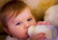
| 01/13/2006 02:16:40 AM | maternal instinctby thehitterComment: *Critique Club*
In response to your request, here is your in depth critique from The Critique Club.
I've read your comments, I think the problem was that if a person were to look at the image, the first thing that jumps to mind is baby, or child. This would have been lovely for a baby or child challenge, but for a mother challenge, I think it might be a bit of a stretch.
As for the photo itself, the focus seems just a bit too soft for my taste. Would love to see some detail in her eyelashes and hair. The eyes are lovely, nice bright blue. The really draw the attention and make her face the main attraction, however, then they seem to be in soft focus, so it's almost as if it's a let down. I like that the background is blurred, but see her left (our right) cheek? It's blurred almost INTO the background. Otherwise, I like the DOF.
The background is soft, nice colors, and nothing distracting there. It adds interest because it's not just a plain background, but it's not too much that it distracts from the baby.
I like the position of the baby within the photo, very nice composition.
The red tips of the fingers on the bottle seem a bit odd to me, and being right there in the front, it's somewhat of a distraction, but nothing major.
Overall, I think the image is lovely, and only suffered for challenge relevance. Congrats.
~Heather~ | | Photographer found comment helpful. |
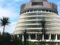
| 01/12/2006 02:56:27 PM | The Beehive Shapeby KiwiShotzComment: *Critique Club*
In response to your request, here is your in depth critique from the Critique Club.
The first thing I notice is the most commented on aspect here. The cropping. I would like to see all of this building, but I like the position of the building within the photo. I like having it off to the right of the photo, with space to the left, however, wish that the whole building was in the picture. Maybe if you just took the photo from the same spot, and just zoomed out a bit, or took a few steps backward if possible. That would help show all of the building, but also keep the composition as is.
Focus is spot on. I love the detail you show us in the building, and the trees really add a little burst of contrast, which is really nice.
The colors are nice, and that sky is just beautiful.
The shape is definately in interesting one for the challenge. I certainly have never seen anything like it. Thanks also for the background/history of the building, interesting facts.
~Heather~ | | Photographer found comment helpful. |
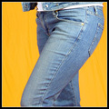
| 01/11/2006 03:40:08 AM | Hip 2b²by fotomann_foreverComment: *Critique Club*
As you requested, here is your in depth critique from The Critique Club.
The first thing I noticed before reading your comments was the pink reflections on her pants. It is most clearly down the back of the left leg, the zipper area and her left knee. I figured there must have been some red lighting coming from somewhere, but upon reading your comments, realize that this is probably reflection from the (once) pink background. The pinkness stands out (at least to me) a lot and seems quite odd given the photo as a whole.
That being said, I like the yellow background, it's bright and attention getting and adds a bit of wow factor. There is a lot of visual appeal in this photo.
Focus and clarity are great. I like the texture it brings out in the pants.
I like the angle and the cropping as well. I think that it accentuates the 'shape' and makes it a very nice shot for the challenge as well.
Lighting is very nice, the only little shadows I notice are under the bottom of the jacket, and (while the one shadow also has the pink tint) I don't find them distracting at all.
Very nice shot, I really have no complaints or suggestions, other than the pink reflections on the pants where there is no apparent reason for the pants to be refecting pink. Not really sure how to fix the situation. Maybe if you did a saturation adjustment and desaturated all reds? Not sure if that would affect the rest of the photo, but worth a shot anyway.
~Heather~ Message edited by author 2006-01-11 12:13:52. | | Photographer found comment helpful. |
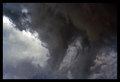
| 01/09/2006 03:40:44 AM | Mother Nature - The birth of a tornadoby SDWComment: *Critique Club*
In response to your request, here is your in depth critique from The Critique Club.
You got 20 comments during the challenge, 2 after the challenge, 8 in the thread asking for opinions and you want an in depth critique too. Not asking for much are ya. *wink* That being said, there really isn't much I can add since it seems that everyone really seemed to cover things pretty well.
Your big downfall obviously was not using the traditional meaning of 'Mother'. When a person thinks of mother, what do they think of? Moms, the person who gave birth to someone. Next I think of Step mom, god mother, fairy god mother, a physical person. Mother Nature is in there, but not high on the list. A photo of a stick wouldn't cut it for me either, but I guess technically would fall into mother nature as well.
Anyway...About the photo itself, it's a photo of a tornado. Not something you see every day for sure, and definately not something you want to get that close to EVER. So it does have interest.
I like the diagonal of the light sky meeting the dark sky and think the photo has nice balance.
Hard to judge focus since it's clouds, but the clarity is really good. I like the detail you show us in the tornado.
There are some aweful cloning marks in the bottom left corner all the way to the tip of the first downward peak. Looks like sloppy editing there.
I would also like to see more of this formation, but I wonder if that would hurt the 'balance' I talked about. I guess it would depend on your positioning and surroundings if you could have gotten a different angle or crop and if it would have worked, but definately something to try.
A neat phenomenon for sure, and only suffered for the challenge interpretation in my opinion.
~Heather~ | | Photographer found comment helpful. |
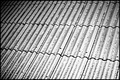
| 01/08/2006 11:18:30 PM | two patterns, maybe more :-)by gocComment: *Critique Club*
In response to your request, here is your in depth critique from the Critique Club.
While this certainly meets the challenge of patterns, I feel that it's lacking visual appeal. It seems to have a very flat tonal range, and nothing that really stands out to me as a main focus of interest.
Being a photo of snow (thank you very much for the photographer's comments, it makes giving the critique much easier and accurate) this might have been difficult to get a great exposure. The photo in itself seems greyish. There is not much black, and what my eye says should be white, is actually grey. Like i said, this might have been difficult simply due to the fact that it's snow.
the patterns are nice, but the pattern needs something to back it up. Maybe color, maybe contrast.
Focus seems a little soft, but again, that could just be the texture of the snow. Hard to say. It seems noisy or grainy. Was this taken at night with flash? The lighting seems uneven and as Maya stated does fade away to the left.
I wonder if you took the photo from a lower angle if that would add some depth. Worth trying anyway. Maybe try a shot in the daylight from a lower angle. Or maybe a shot at night using a colored light source to add some color to the photo.
Something to play with anyway. I hope you find this helpful. ~Heather~ | | Photographer found comment helpful. |
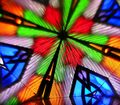
| 01/08/2006 08:59:53 PM | color glass and mirrorsby AzCKellyComment: *Critique Club*
In response to your request, here is an your in depth critique from the critique club.
This looks like a fun abstract photo. Definately fits the challenge of patterns.
The colors are awesome, very vibrant. This makes the photo very eye catching and definately gives it a measure of wow factor.
I can't decide if the focus works for me personally or not. One side of me likes how it's blurred around and almost appears to have motion, the other side of me wants to see a little bit more in focus. Right now, the crist focus is in the lower right portion of the photo and that's about it. The area that is in the most focus contains what looks to be some oversharpening, see the white lines. If this is part of the image, it still looks like oversharpening.
I like that you did not put the meeting point directly in the center of the photo. This creates some visual appeal as well. I like the way it kind of bursts out from the center point. The photo has real nice balance.
Overall, nice to look at and technically well done abstract.
~Heather~ | | Photographer found comment helpful. |
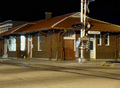
| 01/06/2006 02:33:38 PM | Awaiting the Arrival of "nlghttrain"by rayg544Comment: *Critique Club*
Per your request, here is your in depth critique from the Critique Club.
Without the title, I don't think this fits the challenge at all. It's more like 'nighttrainSTATION'. By looking at the image alone, I would never have guessed this was nighttrain.
The focus looks very sharp, which is good, but there's a lot going on in the photo and the clarity of it all almost gets lost. The bricks, the roof, the ground and the large pole near the center makes for a lot to look at, especially with the clashing textures and patterns. Not your fault, but maybe not the most photogenic building if you know what I mean.
Lighting is ok. Seems that there must have been a lot of light around in order to get the entire building in the light like that, but we don't see the source of the light or many shadows. The sky being totally black is not distracting.
There are a couple of window that seem very very bright and are a bit of a distraction. While I think you did a good job with focus, the subject just doesn't hold my interest well. I really think the busy-ness of the photo hurts it in my opinion.
~Heather~ | | Photographer found comment helpful. |
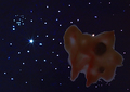
| 01/05/2006 02:40:21 PM | space amoebaby BeetleComment: *Critique Club*
I see you received some nice comments after the challenge, as well as during the challenge, so I hope I can offer something new here.
Per your request, here is your in depth critique from the Critique Club.
While being a very clever shot for the challenge, it's just not that visually appealing to me. The amoeba looks more like one of those fake vomit things you buy at gag stores. You know what I'm talking about? That was the first thing I thought of when I saw this photo. You did do a nice job capturing the similar look of the amoeba (//www.3dham.com/microgallery/amoebab.html for those who don't know what amoeba's look like) and it definately represents spaceamoeba's name for sure. It's too bad that you couldn't somehow get a clear amoeba. That might have been interesting as well.
I like how you did the background. When I saw this in the voting, I had assumed that it was taken above a computer monitor or something similar. Very creative photography in my opinion.
Now, why didn't it score what you had hoped for? For me, it would be the lack of visual appeal. The amoeba looks a bit out of focus, and (while my monitor is just fine) I wish there were a bit more light on the amoeba. The focus seems to be on the stars rather than on the amoeba, and I wish it were the other way around at least, or have everything similar focus.
I like the placement of the amoeba in relation to the stars. The 'negative space' to the left works nicely composition wise.
Overal neat idea for the challenge. ~Heather~ | | Photographer found comment helpful. |
Home -
Challenges -
Community -
League -
Photos -
Cameras -
Lenses -
Learn -
Prints! -
Help -
Terms of Use -
Privacy -
Top ^
DPChallenge, and website content and design, Copyright © 2001-2024 Challenging Technologies, LLC.
All digital photo copyrights belong to the photographers and may not be used without permission.
Current Server Time: 04/20/2024 12:13:44 AM EDT.
|