|
|
| Image |
Comment |
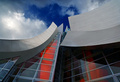
| 06/06/2006 01:34:48 PM | A Frank Gehry Masterpieceby bvoiComment: *Critique Club*
My first impression is that this has beautiful color. I love the red against the blue of the sky. Very great job with the color. I think you achieved what you were trying to do there.
I keep drawing the top scoring shots here, and don't have much to add in the way of improvement. I can't see anything I would have changed here. It's a nice abstract image of an abstract building. Maybe I would have had the point at the top be not directly in the center of the photo? Or maybe put some kind of dramatic spin or angle on it? Nothing really wrong with the way you have presented it here, but just some things to try anyway.
Focus is right on. Great crispness and sharp lines throughout. Beautiful sky.
Maybe the shadow on the left could have been slightly smaller somehow? Maby taken at a different time of the day, but the shadow does not distract from the overall shot in my opinion.
Nice shot, nice score, nothing more to add.
~Heather~ |  Photographer found comment helpful. Photographer found comment helpful. |
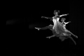
| 06/06/2006 04:24:12 AM | Perfect Take Off by sigrun_thComment: *Critique Club*
Hi there. The fist thing I notice is the negative space. I think it works very well here to enhance the visual appeal of the image. They are leaping into the photo...very nice. I do notice a couple light areas in the background/negative space, right in front of the dancers. Not sure if this was something in the background that was slightly illuminated, or what it is.
This is really a beautiful image, proven by the score and placing in the challenge.
I like the simplicity of it really. Very nice crisp focus helps us to get a lot of detail in the dancers, and that is great.
Also, the lighting works well too. I like how they are almost outlined by light. Nice black and white. I find that it works very well here.
Not much more to say, I think you hit the nail on the head with this shot. My only suggestion/complaint are those light areas of the background. They do appear odd. Not sure if some contrast/curves adjustments might help that...but outside the challenge, you could definately do some cloning on them.
~Heather~ | | Photographer found comment helpful. |
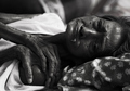
| 06/06/2006 03:26:53 AM | Desolate by davidus428Comment: *Critique Club*
This image is so very dark. The 2 areas of interest to me are the face and hands, and they both seem to be hidden away in the darkness. I would have preferred to see some extra lighting or something in those areas. The eyes for example are too dark for me to really gather an expression from her.
One thing for me that is a distraction is the thing hanging out of her mouth? It's so much lighter against the darkness of the photo in that area that it stands out a lot and is definately unappealing.
Now, I would expect a photo of 'failure' to probably not be very attractive, but non the less, it doesn't make it any more interesting for me to look at.
The shot evokes emotion. I feel bad for the lady and am saddened by her situation, but at the same time, it's just not appealing to look at as an image.
Maybe a good photojournalism shot. Focus is dead on. Nice crisp lines throughout, with a properly blurred background to eliminate background distractions.
I like the positioning of her, and the framing you chose. He hands confuse me. They are at a very awkward angle, almost like there is another person's hand in the pic.
Overall, powerful image. Not much else to add.
~Heather~ | | Photographer found comment helpful. |
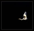
| 06/06/2006 02:59:49 AM | SUCCESS: The Ability To Soar Above All Othersby manic35Comment: *Critique Club*
It just became apparent to me that it's difficult to find a lot to say about sn image as simple as this.
The background works. Nothing distracting in the background. There are the little dots that are his feet I think, but we can't really see his legs, so they are a little odd, but then yous top to think that 'hey, those are his feet' it all makes sense. If this were advanced though, not sure if I'd prefer you clone out the feet...or make the legs more visible.
I don't really see much detail in the bird. I mean, I can see that it's a bird...but no eyes, no feathers, no legs, and a large dark spot where his wing is suposed to be.
The bird itself is not very interesting at all.
HOWEVER, the idea behind the photo is great. I like the bird where he is, I like the negative space, and I like having the bird positioned exactly where he is.
It's just not the most interesting bird, I guess. Not really your fault. I mean, maybe some extra detail would have helped the visual appeal, but really he's not an attractive bird to me.
I think you made all the right choices that YOU could have made with this shot. (I've seen the original) Just really wish there was something 'more' to that bird.
~Heather~ | | Photographer found comment helpful. |
| 06/06/2006 02:45:17 AM | Making the targetby AghrisComment: *Critique Club*
The very first thing that comes to mind when I see this is the thumbnail. It's a strange dark color and it looks like it's been smashed in the car door or something. Very odd look, and it draws my attention right away.
Next, is the selective color treatment. Very effective in drawing the attention to the color parts (money) and taking the attention mostly away from the hand/arm.
This does look like it meets the challenge. I don't know how much money that is, so I cannot determine how much success it represents, but i'll take your word for it that it's a good amount of money and the person was successful in something.
Focus is soft on the hand, and crisp on the money. I think I might have preferred the entire photo to be a crisp focus. Then again, it might just be the grainy look that causes it to look less crisp. I would prefer more uniform focus.
I like the angle and framing/cropping. The hand in the center of the photo does not bother me here. A lot of times it doesn't work, but I think with the money coming out of both sides of the hand, it works to have the arm coming from the center of the photo.
Lighting looks a tad bright in some areas, especially on the sleeve, but nothing serious. I might have preferred that toned down a bit, but really not something that HAS to be done.
Overall, I think the image is technically good, but lacking on the interest. It doesn't really draw me in and hold me for much longer than a minute. Interesting, but low visual appeal.
Good shot for success.
~Heather~ | | Photographer found comment helpful. |
| 05/28/2006 10:44:03 PM | Distintoby DirtypainterComment: *Critique Club*
I simply LOVE the comments you got on this shot.
Nice job on the lighting with this one. -- the reflection on the glass is a bit distracting.
Too bad your back drop is wrinkly. -- great background
needs better lighting -- you really did do a great job using the lighting
So, what have we learned? Not a darned thing. lol Beauty is subjective, and that is screamed in the comments you received. I'll throw in my subjective advice too.
My very first impression of the photo was that the background had creases, and I wished that I could see the label a bit better.
The focus on the photo is very nice, but off just enough to make the small lettering look a little fuzzy and hard to get much detail out of. Even if I couldn't read it, I would like to see it crisp.
Now, lets talk about the background for a sec. I personally like the color. the darkness is good and goes well with the ground cloth and helps show the color of the subjects well in my opinion. The creases bug me to death. There is a crease horizontally through the photo and also one coming straight out the top of the bottle. Very distracting. I do not so much mind the wrinkles, I think actually, I would prefer a wrinkled/textured background to a solid dark one, so that doesn't bug me, but the creases are too much.
I like the set up. One thing that the commenters who mentioned it all agree on is that they wish the rose were real. To me, it's not a huge deal, but fake flowers remind me of funerals, real flowers remind me of love/romance/elegance. This, would in the end, be more effective with a real flower, but probably only matters to people who sit here analyzing these things.
Overall, great shot for the challenge, nicely set up, but needs a cleaner background. (but not too clean)
~Heather~ | | Photographer found comment helpful. |
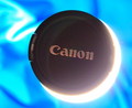
| 05/28/2006 09:53:42 PM | Seaclipseby Mal37Comment: *Critique Club*
My first impression of this photo is that the focus overall appears quite soft. This shot, however, was probably pretty difficult to get with the harsh lighting effect. The words look to be in the best focus, with the C being the most crisp. This part of the photo, to me, isn't the most appealing aspect, so would have preferred the crisp focus to be located in another part of the photo.
I love the blue swirling background. This is very appealing to look at and adds much visual appeal to the photo overall, however, the main subject is lacking in interest to me. I realize that the requirement of the challenge was to include a lens cap in the photo, and while this screams creativity, it just doesn't draw me in and hold me there. The background however, would make a great abstract something or other.
I wonder if this could have worked with the lens cap being a smaller part of the photo, and not dead center within the photo? A little different composition to try anyway.
The white part of the eclipse seems just a bit blown out to me. The whtie area in the upper left area looks great, but the half moon shaped white area looks just a bit too bright. I realize that this is how it looks 'in reality' but I think as a photo, it might have had more appeal had it been toned down just a bit, as it, it almost turns a yellowish color.
The color of the background is great. The lens cap comes out looking not blackish, especially near the white area where the white kind of bleeds over the subject. I wonder if some simple contrast/brightness adjustments would have helped to darken the blacks a bit.
Overall a nice idea, very creative and meets the challenge well. Just needs a little something to make it stand out in a crowd.
~Heather~ | | Photographer found comment helpful. |
| 05/27/2006 11:28:08 AM | Nuts About Golfby MTPixelsComment: *Critique Club*
First impression is that this suffered because of the way people were interpretation the challenge.
Second impression is that is hurts my eyes. There is so much different texture the whole thing seems really busy. The Texture of the squirrel clashes horribly with the texture of the grass.
Focus is GREAT, which only enhances the textures, so in a way, it might be a bad thing with the squirrel against this background.
It's a fun image for sure. Definately not something you'd see every day.
I think the colors are great, and lighting appears ok as well. I don't know how well squirrel's eyes do catchlights, but I wonder if maybe some fill flash might have added a little depth to his eyes?
I think the negative space to the rear of the squirrel seems odd. Generally, we see negative space to the front of the subject, and I think that would have been a better choice for this image as well. With the negative space to the right, my attention is drawn to his rear, and I think it would be more beneficial to be drawn to the face, and the 'action' of the photo.
Overall a fun image, with maybe too much clashing textures, but suffered for challenge reference.
~Heather~ | | Photographer found comment helpful. |
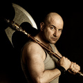
| 05/27/2006 02:48:17 AM | Barbarianby kiwinessComment: Ok, I was totally taken off guard here. I have no clue what I pictured you looking like...But it sure wasn't this large hunk of man. Nice shot for sure. Congrats!!
*goes to tell all her friends 'I work with this guy!'* haha | | Photographer found comment helpful. |
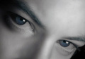
| 05/25/2006 01:35:17 PM | Io Stessoby stare_at_the_sunComment: And I thought my hair dying antics were way out there...this guy goes and dyes his eyebrows blue! Crazy. Na...I'm sure you didn't do it on purpose, but there is definately a blue tint to those eyebrows that strikes me as odd. Don't worry...I'm not voting since I entered, but wanted to point it out anyway. The only other thing bugging me in this shot is the angle/crop. over 1/2 of the photo is forhead, and with the slight forward angle of the head, it makes your forhead look larger in comparrison to the botton 1/2 of your head. Almost misproportioned (is that a word?)
Still a darn good shot and one that draws me in. I could stare at this for long periods of time. Good work.
~Heather~ | | Photographer found comment helpful. |
Home -
Challenges -
Community -
League -
Photos -
Cameras -
Lenses -
Learn -
Prints! -
Help -
Terms of Use -
Privacy -
Top ^
DPChallenge, and website content and design, Copyright © 2001-2024 Challenging Technologies, LLC.
All digital photo copyrights belong to the photographers and may not be used without permission.
Current Server Time: 04/23/2024 12:35:51 PM EDT.
|