|
|
| Image |
Comment |
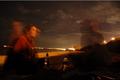
| 07/06/2006 04:59:07 PM | night conversationby latidaComment: *critique club*
What I'm seeing is a photo that is entirely out of focus. I'm not seeing anything at all in focus and that is what bothers me about this image. The motion blur doesn't add to the photo in my opinion either. In this image, I would prefer to see everything in focus, even the people, which unfortunately makes this a bad choice of image for the challenge.
Not sure how to explain it, but in this instance, having the people blurred doesn't make a lost of sense. You didn't offer any hint as to your purpose of the photo in your Photographer's comments section, so I'm not sure what you intent for the photo was. I don't know if you purposely made everything in the entire photo out of focus or if it was just an accident or whatever. So my critique can be based only on personal opinion.
My advice would have been to set the camera down on something, and use the timer if available. That way, it will eliminate any chance of blurring due to camera shake.
The image seems quite dark as well. It's really hard to see what's going on. Ok, there's a conversation, but since you can't capture the conversation in a photo, we only get to see 2 people sitting, moving a little and they were drinking water by a beach? I'd like to see a main focal point. Something that draws us in and hold us there. The photo lacks interest to anyone who wasn't there to experience it.
The angle and framing are ok. Having the people one on each side of the photo is good. I think that creates balance as far as that goes. However, your horizon is tilted and with those lights in the background, it is blaringly obvious. Pay closer attention to your background when there is such a strong horizontal line.
Overall I think the entire shot needs work, starting with lessening the items that are out of focus.
Fits the challenge though.
~Heather~ |  Photographer found comment helpful. Photographer found comment helpful. |
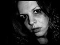
| 07/02/2006 11:17:15 PM | Broken Dreamsby xXxscarletxXxComment: *Critique Club*
Well, I think this definately fits the Desolation theme. I like the black and white treatment, I think it enhances the textures and details of the photo, which are also very nice. I think the lighting on the skin is a little unflattering, however, it's not suposed to be a glamor image, so maybe that works just fine in the end.
The set up is great for the theme. I like the smeared makeup look. She looks sad. I did a shot similar a loooong time ago and used 'posterize' to enhance the appearance of crying. Wonder if that could work her as well? Something to try anyway. Since you didn't give any editing details, I can't really offer much advice in the way of editing, only my personal opinions.
The darkness works for me to help give this a sad/hurt feel.
Focus and clarity are really good, I wonder though if the strange texture on the face might be from over sharpening? Again, I can only offer my opinion on what I see, since I know nothing about the image for sure. If you want more detailed advice on things like this, my suggestion would be to offer more details so that the CC may know more of what's going on with your images.
Overall, it fits the challenge, and I think technically you did a good job. As you already know, not really a 'wow' image, and lacking something that just holds our attention for long.
~Heather~ | | Photographer found comment helpful. |
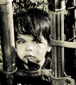
| 06/23/2006 03:00:29 PM | sebastianby arsenalComment: I took a very similar photo of my son for some challenge. Didn't enter it though. I really love the black and white treatment and the look on the child's face is priceles. Love the background/surroundings. Focus is right on and this is just an amazing capture. Congrats. I could stare at him forever.
~Heather~ | | Photographer found comment helpful. |
| 06/13/2006 01:58:37 AM | Dune Jumping IIby ZoomdakComment: *Critique Club*
Alrighty, my first reaction is that if you were trying to redo this shot for the motion blur challenge...you failed miserably. HOWEVER, the challenge didn't specify that you had to improve the shot for the original challenge it was entered into. SO...that being said, there are a few things I notice when comparing this to the original.
First off, the focus and clarity of this are much better. Granted, the motion blur WAS the challenge last time, but I have to admit that it improves the shot 10x's for me having the guy in focus.
Secondly, the tilted horizon. You straightened it up in this sequel and it does make a great difference.
I like the grass better in the original though. I think it's because in this shot, the grass is dark, and not very green. I really do prefer the grass from the original.
I notice that you DID improve the score, but not by much. My theory behind that is that while it's a much better image, in my opinion, it simply fit better in the other challenge.
Now, to pick this apart without comparing it to the other one...
Focus and clarity are great. I love the stopped motion of the person.
The background is stunning. Very beautiful.
Lighting conditions do not seem to be ideal. The sky is bland and makes other colors appear dull, as well as the grass seeming dark. Not sure how to improve upon that without taking the shot at a different time of day, or different day all together.
Nice cropping/framing. I like where you have placed the subject within the photo.
Visual appeal for me is high. Love the hair. You could come hang out with US sometime. (me on the left)
Anyway, to sum it up, needs more light. That's all. everything else is wonderful.
~Heather~ | | Photographer found comment helpful. |
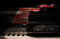
| 06/09/2006 02:09:10 PM | Waiting in the yardby CVetteComment: *Critique Club*
What a cute idea. I think this works well for the challenge. The lighting really does make the shot in my opinion.
I think that the moving train in the background works well to give the stationary train some added interest, without being distracting.
Focus and clarity on the train is good. There seems to be a little oversharpening in the metal below the train (not the tracks, but above the tracks, not sure what that's called). The little white reflections look a little odd there, which I assume is from sharpening. Couldn't be positive though.
I almost wish that the train the in the background were a different color so that it didn't run into the forgroud train, but it still is not distracting.
I like the color, nice and vivid and not overdone.
I think that the processing works well.
If I HAD to make a suggestion, I might liked to have seen a little more lighting on the side of the front train. It seems like there's just too much in shadow there. Then again, it might not have the same effect. Something I guess I'd just have to see to determine.
Overall a nice shot and good for the challenge.
~Heather~ | | Photographer found comment helpful. |
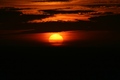
| 06/08/2006 09:32:22 AM | Sunset doesn't last all eveningby mystardreamComment: *Critique Club*
This seems more abstract to me than anything. It's hard to comment on focus. It looks soft all around, but really it's mostly clouds, so how sharp would it be? The color is nice. I like the orange and yellow together. It looks good that way.
Having the subject dead in the center of the photo works sometimes, and sometimes it doesn't. This is one of the times where I think it doesn't. Since there really isn't anything else in the photo to hold our interest but the colors, I think some kind of nice arrangement is a must in order to add some kind of additional visual appeal.
I wonder if a very nice thin orange inside border might look good on this as well. It would be worth checking out anyway.
Overall, I think it's a neat looking sunset, but as far as a photo goes, it is just lacking a little something extra to really give it that added interest to draw my attention and hold me there. Not really sure what that little extra could be, but I feel that it needs something.
~Heather~ | | Photographer found comment helpful. |
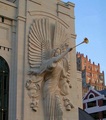
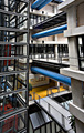
| 06/06/2006 02:52:56 PM | Bass Performance Hallby bgslawComment: *Critique Club*
You've got what appears to be some distortion going on here. The buildings on the right lean to the left, and the main building on the left is leaning right. Some distortion correction might help this a bit. It's not major, but distracts some for me.
Focus and clarity are really good. We get to see lots of the detail in the angel.
I'm seeing this as more of a photo of the angel than a photo of the building though. I mean, it is part OF the architecture, but I'd like to see more of that building.
The lighting on the front of the building looks to me to be a bit too dark. The color is muted and I'd like to see just a bit more contrast in the front. I wonder if some extra adjustments to the brightness/contrast might have helped enhance the look of the lighting there.
The door on the left is a bit of a distraction since it is so dark against the rest of the photo which is all lighter colors.
The sky is a nice blue, not blown out or too bright.
Technically, it's a good shot, it's just lacking a little something to make it 'great'.
~Heather~ | | Photographer found comment helpful. |
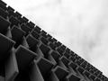
| 06/06/2006 02:29:27 PM | _ _ _ _ _ _by electinaComment: *Critique Club*
This is definately different. I'm not sure it appeals to me on a personal level. Just not my thing.
The first thing I notice is the horizontal divide of the photo. I'm thinking that in my opinion it might be just slightly TOO perfectly divided. It's got a good balance of light and dark, but the part that really draws the most attention from me, is the horizontal meeting line between light and dark, and that is not really where I'd think the main focal point would be.
I think the angle is good. I like that it's kind of got a mysterious feel to it, like we are really unsure of exactly what we're looking at.
Focus seems soft overall. I think this might be better with a crisp focus and sharp lines.
Not sure WHY you chose black and white since you didn't state your intentions for the photo in your details. But I think this could benefit from some color. Was the sky blown out or bland? Maybe shooting at a different time of the day might help?
Again, I'm only going on personal opinion and assumptions since you have not left me anything more in the comments.
Overall interesting shapes, but I'm just not feeling it.
~Heather~ | | Photographer found comment helpful. |
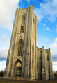
| 06/06/2006 02:16:34 PM | House of faithby marvinComment: *Critique Club*
First thing I notice is the strange angle of the building. Without you stating in your photographer's comments what your intentions were, I can only offer my personal opinion, and that would be to have straightened up the building. I also don't know what software you used for editing, but would suggest using a distortion correction tool of some sort. A quick google search will come up with lots of solutions.
It just looks odd leaning like that for no apparent reason. I realize that sometimes it's nice to have a dramatic angle on a photo, but when 1/2 is dramatic angle and the other 1/2 is normalish looking, it seems awkward.
Focus appears good, but it looks oddly sharpened. The vertical lines that are all close together are jagged and almost hurt the eyes.
It is an interesting building, and would love to see more detail in the building. Maybe closer up? Instead of the entire building get just a part of the building?
The color seems bland. I mean, the sky is bright, almost too bright, but there is just nothing that really stands out to me in this photo. It doesn't draw me in and hold my attention for long.
Were you figing with the lighting conditions? The almost too bright sky and the dullish colors make me think that it wasn't ideal shooting conditions. Not your fault, but maybe could have tried at a different time of day?
Overall, interesting building, but just not sucking me in.
~Heather~ | | Photographer found comment helpful. |
| 06/06/2006 01:52:25 PM | Dazzling Designby ajschelComment: *Critique Club*
My first impression of this photo is that it is very busy. Too much to look at with my eyes not really finding a main resting point. Not YOUR fault, just maybe not my choice of subjects.
The distortion only adds to the confusion in my opinion as well. It almost smooshes the photo toward the center, making for a smaller area for all the factors of the photo.
Focus and clarity are great. I think you did a great job getting nice crisp lines and sharp edges.'
Color is also good. Nice blues, yellows and reds, without going overboard and oversaturating.
I think going with the vertical crop was a good choice here as well.
You scored well, and I think that was on technical aspects. In my personal opinion, the reason it did not score even higher was simply on visual appeal. The chaos hurts it a bit for me.
Overall though, a technically good shot.
~Heather~ | | Photographer found comment helpful. |
Home -
Challenges -
Community -
League -
Photos -
Cameras -
Lenses -
Learn -
Prints! -
Help -
Terms of Use -
Privacy -
Top ^
DPChallenge, and website content and design, Copyright © 2001-2024 Challenging Technologies, LLC.
All digital photo copyrights belong to the photographers and may not be used without permission.
Current Server Time: 04/25/2024 03:59:57 PM EDT.
|