|
|
| Image |
Comment |
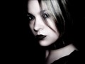
| 05/26/2006 03:03:19 PM | ~Me~by HBunchComment: Originally posted by ursula:
Congratulations, Heather, on a great finish and a great score. Normally you'd probably have a ribbon for it.
But .... you don't quite look like a kindergarten teacher to me :) |
Not the 'teacher', I am a teacher's assistant or sorts. The kids get a kick out of my hair. I'm like a science project. "what color IS that?" and "name the newly discovered color". lol They love me.
Thanks again everyone for your kind words. |
| 05/26/2006 03:14:47 AM | ~Me~by HBunchComment: I've waited for this moment for FOUR LONG YEARS people!!
Top 10 baby!!
So this is how it feels.
Thank you all for the comments.
About the lighting, I'm afraid it wasn't as impressive as some of you thought. Totally dark room, with, get this...FLASH! Ewww, I know.
Anyway, Thanks again.
~Heather~ |
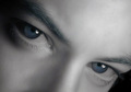
| 05/25/2006 01:35:17 PM | Io Stessoby stare_at_the_sunComment: And I thought my hair dying antics were way out there...this guy goes and dyes his eyebrows blue! Crazy. Na...I'm sure you didn't do it on purpose, but there is definately a blue tint to those eyebrows that strikes me as odd. Don't worry...I'm not voting since I entered, but wanted to point it out anyway. The only other thing bugging me in this shot is the angle/crop. over 1/2 of the photo is forhead, and with the slight forward angle of the head, it makes your forhead look larger in comparrison to the botton 1/2 of your head. Almost misproportioned (is that a word?)
Still a darn good shot and one that draws me in. I could stare at this for long periods of time. Good work.
~Heather~ |  Photographer found comment helpful. Photographer found comment helpful. |
| 05/20/2006 02:11:49 PM | Portrait of a Self Portraitby cresusComment: I wish the painting looked more like a painting rather than a photoshopped picture that's been edited to death. Great focus, good lighting. Only issue with lighting is that the pallette is a litte too bright in my opinion, but still a very creative portrait, and deffinately not just an ordinary face shot. ~Heather~ | | Photographer found comment helpful. |
| 05/20/2006 01:53:46 PM | Surf Photogby gliphixComment: I realize under the circumstances, that this might have been a difficult shot to get as is, but The focus is very soft throughout the entire photo. There are some harsh highlights on the face, and the horizon line isn't horizontal.
I do like the composition though, with the person off to the left of the photo and not in the center. That works well here. Not sure if I like the 'I held the cam in front of my face and snap' look though. Nice to meet you non the less!
~Heather~ | | Photographer found comment helpful. |
| 05/13/2006 01:40:07 PM | The Wall Comes to Townby spreadpanicComment: *Critique Club*
I have to wonder how this would look with the classic 'desaturate everything but yellow' trick. I might look neat, but then again, it might just look cliche. Something worth playing with anyway.
I think that the candles add a little clutter that I feel the photo would benefit without. Not sure if crop would have helped, or maybe a different placement of the flower, but I don't feel that the flowers are adding positively to the photo.
Focus and clarity are great. Nice crispness in the flower, and the wall. I feel that the DOF works as well.
Lighting is also good. No distracting hot spots or shadows.
My eyes are drawn down the stem of the flower to the bright red of the little flag. This is where a desaturation technique might have been beneficial, as I feel the bright red placed at the bottom of the stem draws the attention away from the 'subject' to a lesser interesting part of the photo. As well, a different crop could also eliminate that.
Overall, I think that it's a very nice image with the only issues I can find to improve upon are the 'background clutter'/distracting elements.
Very nice shot. I feel it works it's way into the challenge too.
~Heather~ | | Photographer found comment helpful. |
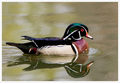
| 05/13/2006 12:22:24 AM | Wood Duckby docurrieComment: *Critique Club*
The first thing that stands out to me in this photo is that the colors are quite dull. Since your details are very limited, and tell nothing of the purpose of the photo, nor any editing steps used, my critique will be based on opinion alone, as I have no clue what you were trying for here.
With a duck with this many neat colors, my brain tells me that they should stand out and be 'wow'. However, I do not get this from your photo. I think it might also be that the water is muddy and bland brown. Not appealing at all.
Focus seems soft on the duck. I would like to see crisper focus to help bring out details. Especially in the wings and face. The surrounding water, being wavy, I think only magnifies the look of being out of focus/soft.
At first I felt that the crop was off, but looking further at it, I think you did a good job where you placed the duck within the photo. I like the small bit of negative space at the top, and in front of the duck as well.
The reflection is very nice.
Overall, I think it's an ok image. It just seems to be missing something to give it that wow.
~Heather~ |
| 04/30/2006 08:13:47 PM | ITCH !!! Whats a Super Model to DO??by kiwinickComment: *Critique Club*
Per your request, here is your in depth critique from the Critique Club. :)
The first thing that comes to mind from viewing your collection of images in your portfolio and this image is that this was a last minute, quick shot. Since you have provided no Photographer's Comments or any photograph information, my critique can only be based solely on personal opinion since I have no clue what you were trying for here. For the Critique Club to be more detailed in their jobs, when requesting a critique, it would be most helpful to include these sections for a more detailed critique of your image.
The lighting looks very flat and dull in this image, which is something I do NOT see in your other images. Your other images appear well lit, for example, your fashion entry titled Beautiful in basic black There you have a clean, background (although not completely even) and here the background is dull grey. There are no catchlights in her eyes at all making her stare seem blank and dark as well.
Focus and clarity appear good. Nice detail in the dress and skin.
The pose isn't what I'd expect in a Studio portrait, it seems more candidish.
I think the composition might benefit in my opinion from a little negative space on the left of the photo. She seems almost squished within the frame of the photo.
She's an adorable model for sure...get some extra lighting on that girl and take LOTS of photos of her. What a cutie.
~Heather~ |
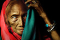
| 04/30/2006 07:49:16 PM | Unveiledby librodoComment: *Critique Club*
Good grief. I am not sure what you want me to add, that the other 80 commenters have not already said. I guess the biggest most helpful advice that I can really give is that if you feel that you have received the appropriate feedback during voting, you CAN uncheck the box requesting a critique club critique.
About the photo:
I think it looks just like all your other portraits. Scarf on the head, person off to the left of the photo, blank background. Focus is great, lighting is great, the photo contains lots of character.
There is no reason this should not be technically perfect, you've done it a zillion times.
The colors are very nice. I like the red and green. she is an old lady, and looks frail, however, the lighting on her arm makes her appear thinner than I think she really is judging by her other photo showing her arm. See the shadows on the arm? It blends in with the background making some parts of her arm seem almost invisible. That would be my only real 'complaint' of the photo.
You've proven you can do the portraits...why not try something else? This IS a learning site after all. I had to go all the way back to LAST YEAR to find a photo that did not contain people. Next challenge...Do something special for me. No people. It's time. Show us what else you got!
Very lovely portrait of an interesting character. Nothing more to add.
~Heather~ | | Photographer found comment helpful. |
| 03/21/2006 01:29:03 PM | Stare into the lightby pellemannenComment: *Critique Club*
I almost missed the girl near the bottom. I was sitting here trying to figure out how this met the challenge, then read your comments and only then noticed the girl. I think the problem was that she is too close to the door and a similar shape and color to really stand out as obvious in the photo. Now that I know the girl is there she is obvious to me.
I like the photo, and I think that it does show afterlife quite well with the semi transparent girl. I like how she looks to be staring at the star to the left of the photo.
The perspective of the photo is good, taken from low like this, but I don't like the way the building is leaning to the left. It's got a funny angle to it.
There is a strange rainbow light to the right of the photo near the center. I'm not sure what caused that. Maybe another light source off to the right? Anyway, it stands out to me and creats somewhat of a distraction since it doesn't add anything to the photo in my opinion.
Focus and clarity are ok, parts look a little soft, but not to the point that it affects the overall photo much.
I think you did a good job on this, maybe lacking some visual 'wow', but overall a great effort for the challenge.
~Heather~ |
Home -
Challenges -
Community -
League -
Photos -
Cameras -
Lenses -
Learn -
Prints! -
Help -
Terms of Use -
Privacy -
Top ^
DPChallenge, and website content and design, Copyright © 2001-2024 Challenging Technologies, LLC.
All digital photo copyrights belong to the photographers and may not be used without permission.
Current Server Time: 04/23/2024 08:11:39 AM EDT.
|