| Image |
Comment |
| 01/19/2006 07:04:46 PM |
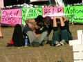
sharing their griefby kerrilynComment by mpeters: Political feelings aside... This could have been a stronger image with a little more cropping. My suggestion would be eliminate more of the foreground, and zero in on the clasped hands with the signs as BG. The bench on the right is also distracting. |
| 01/19/2006 02:06:42 PM |
sharing their griefby kerrilynComment by Artyste: an O.K. political statement, but the photo comes off as being a little staged, and not very technically proficient. The composition is too centered and dull, the neon coloring of the signs is distracting and gaudy, and the grave markers in front are too cut out, and only serve to look out of place (and hard to determine). |
| 01/17/2006 10:14:21 AM |
|
| 01/17/2006 10:11:55 AM |
sharing their griefby kerrilynComment by saintaugust: nice photojournalism... however with advanced editing rules i would have cropped in a bit closer and removed (cloned out) distracting white objects at front |
| 10/04/2005 10:17:47 PM |
|
| 09/29/2005 09:04:36 AM |
|
| 03/06/2005 09:28:38 PM |
|
| 03/06/2005 04:26:18 PM |
|
| 03/05/2005 04:52:49 PM |
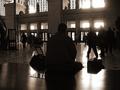
People Watchingby kerrilynComment by Hot Karl: This is a really great capture, the shape and light combination is really effective, I like it a lot. This is the best picture in the challenge in my opinion and I'm adding it to my favorites, good job. |
| 03/04/2005 09:30:11 PM |
People Watchingby kerrilynComment by LucidLotus: Nice capture. Fits the challenge and has some interesting aspects. I like the drama of the architecture and the action of the photo with the people walking around.
The tone is nice, but I find the extreme darks and the blown out lights from the windows to be a bit too overpowering. Details appear to be lost in the image because of this and I think those details would help make the image even better.
A little more light in the image would add to the idea of watching people as you'd be able to see a few more details of the people being shown. Overall its a great idea and the composition is nice, it just needs a little more light. I gave a 5. |
Home -
Challenges -
Community -
League -
Photos -
Cameras -
Lenses -
Learn -
Prints! -
Help -
Terms of Use -
Privacy -
Top ^
DPChallenge, and website content and design, Copyright © 2001-2024 Challenging Technologies, LLC.
All digital photo copyrights belong to the photographers and may not be used without permission.
Current Server Time: 04/25/2024 05:29:44 AM EDT.