| Image |
Comment |
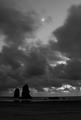
| 06/15/2005 11:53:32 AM |
Belle Lunaby ZoomdakComment: The moon is distracting and take away from the impact of this image. Great shot though I love the contrast in the clouds and the depth they provide. Glad to see the use of thirds with the formations on the left. |
 Photographer found comment helpful. Photographer found comment helpful. |
| 06/15/2005 11:50:46 AM |
|
| Photographer found comment helpful. |
| 06/15/2005 11:34:59 AM |
Deadwoodby marvinComment: Nice theme relationship but a little too busy in the BG. Change focal length to blur more BG. |
| Photographer found comment helpful. |
| 06/15/2005 11:33:56 AM |
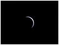
Eclipseby ninjaComment: Just too centered in the frame. Great set up shot. |
| Photographer found comment helpful. |
| 06/15/2005 11:28:29 AM |
|
| Photographer found comment helpful. |
| 06/15/2005 11:23:48 AM |
Pet Cemeteryby JasonComment: nice colors and fitting of the theme. IMO I would have changed position and moved the subject more to the right off center. |
| Photographer found comment helpful. |
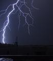
| 06/15/2005 11:20:57 AM |
Dark Lanternby MackFlixComment: too bad u could not spot edit out the bird feeder. IMO I would have cropped more off the bottom up to the bottom of the feeder as the table and the rest is distracting.
EXCELLENT capture of lightning! |
| Photographer found comment helpful. |
| 06/15/2005 11:18:53 AM |
Dark Kindred of Martha Carrierby kiropracticComment: nice portrayal and adhearance to the theme. IMO the lighting on the mother is a little too direct causing hot spot on the forehead and cheek. The daughter looks fantastic. |
| Photographer found comment helpful. |
| 06/15/2005 11:15:34 AM |
is myself...by petrakkaComment: either cropped too much or not enough on the left side. Lighting makes the image appear too flat. |
| Photographer found comment helpful. |
| 06/15/2005 11:11:13 AM |
|
| Photographer found comment helpful. |
Home -
Challenges -
Community -
League -
Photos -
Cameras -
Lenses -
Learn -
Prints! -
Help -
Terms of Use -
Privacy -
Top ^
DPChallenge, and website content and design, Copyright © 2001-2024 Challenging Technologies, LLC.
All digital photo copyrights belong to the photographers and may not be used without permission.
Current Server Time: 04/25/2024 09:40:14 AM EDT.