| Image |
Comment |
| 01/26/2005 04:34:51 AM |
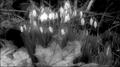
New out of Oldby FalcComment: I love the look of these flowers, like little bulbs lit from within.
I'm not so sure I like the crop though. Seems like it is chopped off at the top and too wide. |
 Photographer found comment helpful. Photographer found comment helpful. |
| 01/26/2005 04:34:42 AM |
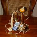
Can You Hear Me Now ??by lovenhate54Comment: Sorry, but yet another old phone vs. cell phone shot. This will suffer because of the number of similar entries.
Will also suffer because it looks like the resize has squashed the image. Make sure you 'Constrain Proportions' when resizing.
Other than that, it is not an inspiring image, The cord just looks messy and contardicts the supposed 'oldness' of the old style phone. Could have been better with a nice background and removing the cord. |
| Photographer found comment helpful. |
| 01/26/2005 04:32:21 AM |
|
| Photographer found comment helpful. |
| 01/26/2005 04:29:19 AM |
Moving up from Push to Power.by kiwinickComment: Nice idea but looks like a snapshot.
The dog doesn't add anything to the theme and the leaves in the foreground are distracting. The highlights behind the fence are way too blown out and there is too much grass at the bottom. One of the mowers is also cropped out.
This may have been better if taken later in the day when the light wasn't so harsh and with more thought given to composition. |
| Photographer found comment helpful. |
| 01/26/2005 04:27:22 AM |
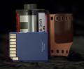
Film Old and Newby kennytComment: Firstly, I think this is going to suffer as people realise this is about the 50th roll of film vs. memory card shot.
Other than that it looks a little noisy to me. The foreground at the bottom is dusty and distracting and the whole setup looks a little flat. |
| Photographer found comment helpful. |
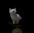
| 01/26/2005 04:25:04 AM |
900grby arnitComment: Cute shot, nicely lit - the kitten is adorable.
I'm guessing the kitten is the new and the scales are the old, which is more interesting than yet another roll of film vs. memory card but I think the link to the theme is still a little weak.
The way the kitten is looking off at who knows what is a great touch, makes you wonder what he's thinking. |
| Photographer found comment helpful. |
| 01/26/2005 02:08:36 AM |
Soft Radianceby NeilComment: Greetings from the critique club.
Firstly I'll start by saying that the score you received is WAY too low. There were many shots that scored above this in the challenge which IMHO didn't break new ground in any way and weren't even as pretty to look at.
This shot is a beauty, it has that impressionist feel to it (it may have done better in the Impressionist challenge for that reason as someone else suggested). I love the way blue in the background contrasts with the yellow of the flower and the sense of movement created by the motion blur.
The cropping is spot on, it is so easy on the eye I could look at it all day.
The only thing I can think to say that I don't like is the title which doesn't seem to go too well with the image. Maybe something related to movement would have been better.
Perhaps some viewers didn't consider this to be 'breaking new ground' which might explain the low score. A lot of people probably thought, 'Big deal, he's just waving a flower around' without actually trying the technique for themselves and realising just what a great capture this is. |
| Photographer found comment helpful. |
| 01/25/2005 07:42:04 PM |
The Silence of the Lambsby notbiscuitComment: Greetings from the Critique Club.
First things first. Photos of lifeless cuts of meat are never going to do well in a challenge.
Now, on to the photo itself.
It doesn't look like any thought has been given to the composition. The angle of the shot and the perspective of the tray doesn't fit at all with the frame. Perhaps a tighter shot, without the edge of the tray in view or moving the point of view higher above the subject would improve the overall feel and make use of the symmetry of the tray, rack and kinfe & fork.
Where is the colour here? You could have upped that saturation of the reds to bring out the colour of the meat more. This would at least make it stand out against the bland greyness of the background. A subtle selective desat may have worked in this shot. The way it is the meat just doesn't look appetising.
The lighting does no favours either. The meat, again, just disappears in to the background because it is so dark whereas the glare from the tray is a little too bright. You can't see any detail on the surface of the meat itself, which is perhaps the most interesting thing going on in this shot.
The link to the movie theme is rather tenuous. It seems like you took a picture of some meat before you cooked it and then tried to think of a movie title to fit.
My advice is to think about what people like to see. Nobody likes looking at a slab of meat on a tray. Have a look at past challenges and try to work out which photos do well and why, then apply that to your next challenge entry. |
| Photographer found comment helpful. |
| 01/25/2005 07:25:53 PM |
The Good Egg (1939 )by gaurawaComment: Greetings from the Critique Club.
I love this shot. The simplicity of the finished product belies the technical brilliance of the setup, which is probably why some scored it low.
The exposure for me (at least on my monitor) is just right and gives just the right amount of 'suggestion' of an egg without being too obvious. I love the way that the egg on the top right merges in with the white background.
The lighting is great with just enough shadow on the egg. Any more and it would have been too harsh, any less and it would have 'lost' the egg in the whiteness.
Good use of thirds and uses the extra white space to draw the eye to the subject. I could look at this all day.
The only thing I can say that I don't like is the title. Seems to me that many people scored others low on this challenge if they didn't know the movie title or it wasn't a famous movie. Also, many entrants took a shot of whatever and then trawled through IMDB trying to find a movie to match, which I suspect is what happened here.
That's a shame because I think this scored much, much lower than it should have for those reasons.
One last thing. People like to see the EXIF data which is missing here. Message edited by author 2005-01-25 19:27:15. |
| Photographer found comment helpful. |
| 01/21/2005 12:08:42 AM |
Inspiration..by grahampComment: Greetings from the critique club.
The first thing that strikes me about this shot is how small the egg in the foreground is. I like the idea of contrasting the big with the small but I would like to have seen more detail in the small egg and a lot less of the thing it is sitting on. Perhaps if the camera was moved closer to the egg in the foreground and shot from lower down the overall composition would be better.
I don't like the shadow on the first egg either. It seems that the overall composition is relying on symmetry but that shadow ruins the symmetry for me as does the dark patch to the left of the larger egg. Maybe a flash would have helped to fill in the shadows here and achieve a more consistent look.
I love the eggs as a subject, the textures are great, but it is a shame that the colours are so drab. With colours like these I think it would have been better to concentrate on the textures more, but again with the first egg so small it is hard to make these out.
Overall, a nice shot that fits the theme well but which might have benefitted from some minor compositional changes. |
| Photographer found comment helpful. |
Home -
Challenges -
Community -
League -
Photos -
Cameras -
Lenses -
Learn -
Prints! -
Help -
Terms of Use -
Privacy -
Top ^
DPChallenge, and website content and design, Copyright © 2001-2024 Challenging Technologies, LLC.
All digital photo copyrights belong to the photographers and may not be used without permission.
Current Server Time: 04/24/2024 01:18:37 PM EDT.