| Image |
Comment |
| 01/28/2005 12:12:07 PM |
|
 Photographer found comment helpful. Photographer found comment helpful. |
| 01/23/2005 08:06:51 PM |
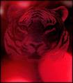
Shadows of Redby ace flymanComment by swagman: The tiger has insufficient sharpness and contrast to pull it away from the background. It looks too much like it is the background, and there's a key element of the composition missing. Then, the bright lights pull the viewer's eye away from the tiger, further alienating the viewer from the composition.
Just my thoughts. |
| Photographer found comment helpful. |
| 01/20/2005 01:11:05 AM |
|
| Photographer found comment helpful. |
| 01/18/2005 01:17:02 PM |
|
| Photographer found comment helpful. |
| 01/18/2005 11:53:52 AM |
Architectural Reflectionby ace flymanComment by claudia26: this looks like a view of too much while nothing really dominates this picture - the colors stand out and the stripes do too - but there is no focal point in this composition , making a choice and showing less would be more effectice |
| Photographer found comment helpful. |
| 01/17/2005 04:26:13 AM |
|
| Photographer found comment helpful. |
| 01/16/2005 11:29:53 AM |
|
| Photographer found comment helpful. |
| 01/15/2005 04:05:35 PM |
|
| Photographer found comment helpful. |
| 01/15/2005 10:30:36 AM |
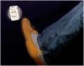
Kick The Habitby ace flymanComment by swagman: Nice colors and balance in the composition. The effect is a bit flawed as the foot doesn't connect, and the package only rotates, but makes no lateral movement in space. |
| Photographer found comment helpful. |
| 01/13/2005 04:46:10 AM |
|
| Photographer found comment helpful. |
Home -
Challenges -
Community -
League -
Photos -
Cameras -
Lenses -
Learn -
Prints! -
Help -
Terms of Use -
Privacy -
Top ^
DPChallenge, and website content and design, Copyright © 2001-2024 Challenging Technologies, LLC.
All digital photo copyrights belong to the photographers and may not be used without permission.
Current Server Time: 04/24/2024 02:56:14 AM EDT.