|
|
|
Showing 2161 - 2170 of ~2518 |
| Image |
Comment |
| 12/09/2002 11:32:15 AM | Longingby jitamsComment: Aaack - This was a 10 for sure!!!!! What happened? |
| 12/09/2002 11:28:40 AM | On Lineby boyte1Comment: What happened??? this was my #1 pick tp be the winner. How did iy end up way down here at 37???11 |
| 12/06/2002 02:01:55 PM | |
| 12/06/2002 01:09:21 PM | |
| 12/06/2002 01:08:00 PM | Lovesongby Brenna KimiComment: Another body wrapped in burlap? Please don't tellme it''s a frog. |
| 12/03/2002 04:20:00 PM | |
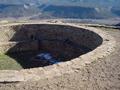
| 12/03/2002 11:57:00 AM | Anasazi Kiva and remnant of snowby kposeyComment: Hi- Critique Club here - I gave your picture a 7 originally. Now I'm coming back to review it. Looks like your score suffered mostly from people not knowing what a Kiva was (or Anasazi, or snow for that matter). I wonder if the title had been more explicit like Native American Ceremonial Yada Yada, you might have avoided the "didn't meet the challenge" comments which were viewer ignorance. That said I think this picture falls into the "Could have been so much better" category. Compositionally it leaves me wanting something more. Like where IS the sky anyways, and what about the other half of the circle. Although I like the half circle so I'm not sure what is missing. The viewers eye follows the circle around but it never comes to rest on any central focal point. The contrast between the pale colors outside the hole and the rich colors inside the hole could have been better, maybe less dark inside, To show that the power of the scene rests inside the circle. Maybe the warmer reds in the hole could have been enhanced to stand out from the hazy blues of the background? You also have a great contrast of texture going on..The small sand in front and the small trees in the back compared to the uniformly sized but varied colored rocks lining the Kiva. Perhaps the sand in the foreground really looked like that but it appears to be a bit over sharpened. Perhaps there is too much forground all together. That forground color and texture are not as interesting as others in the picture. It looks better to me cropped about an inch off the bottom, say where the inside rim touches the left frame. The lighting is soft but the shadows are harsh, maybe repeat the shot on a less-than-unusually nice day. I think that with some cropping and some fiddling with the brightness and color balance this could be a stunning photo. As it is it is a keeper and deserved a much better score than it got. |
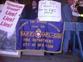
| 12/03/2002 12:25:00 PM | Picket Line!by catpixelComment: Hi- Critique Club here - I gave your picture a 6 originally. Now I'm coming back to review it. This was Almost a great shot. First it is perfect for the photo journalism challenge, capturing a dynamic moment. The mood of tension is evident in the picture. The slightly out of focus placards seem like they are being shaken angrily. The uniformed arm on the far right seems to be putting up a poster as we view him. This picture is happening now! Compositionally it has some great things going for it. Movement contributes to mood. The man on the left looking left, center looking forward, right looking right. Then there is another similar balance created by the posters and the words Lies. Some red Lies on the right, some on the left. In the center, the more human, hand printed "lies". I like that the fireman's patch on his jacket is mirrored by the emblem on the banner. Did you all notice that the colors in the picture are almost exclusively red, white, and blue? That makes the yellow on the fireman's sleeve stand out so well and remind us of all the images of firemen in those black and yellow rescue coats - subtle, clever. Now the negatives (ouch). Given that it is a night shot, in a crowd, avoiding handcuffs, it's pretty good and I suppose the tippiness might have been intentional. However, my personal pet peeve is crooked pictures and it bugs me that it is not straight. Also bugs me that the foreground is overstated, there doesn't need to be that much sidewalk when the guys heads are so crowded at the top. I might have cropped it just below the shiney black shoes and then taken a bit off the left to maintain the required ratio, maybe right next to the A. I don't think the ground zero photograph adds anything. you don't need all the lies because you know what it says if you have one. Guess we both wish there had been more to work with on the top. |  Photographer found comment helpful. Photographer found comment helpful. |
| 12/03/2002 12:49:00 PM | The Great Escapeby anzComment: I love this picture - gave it a 9 originally. Now I'm back to review it a little more for the critique club. Here's a picture that tells the story that the title suggests. Probably we would get it without the title but I love the title as a hint. The cage is open, the dog is gone and the upper dog is thinking "Where'd he go." Great humor. The fact that they are bulldogs and look like frogs adds an extra humorous element. Composition wise, this is also a treasure. The rule of thirds Rules here. Three dogs, (counting the missing one) are each placed in a pyramid at the one third lines vertically and horizontally. The fourth cage disturbs the balance just enough to keep it from being tooo formula. The eye is drawn in a perfect progression from the forward facing dog who makes eye contact with the viewer, up to the brown dog, and following his gaze, down the empty cage and off the frame via the wheel well. Nice. The colors are all perfectly balanced also. All the rusty colors make on think tat this is a shabby place that the dog should indeed escape from. Rust colored cages, rust colored truck, rust colored dogs. Then the green floor mat with it's grooves leading out of the truck suggesting something better (greener) on the outside, See, there is green through the front windshield too, it IS greener outside. But bleak and rusty inside for the dogs. Would I change anything? Nope. Oh, maybe put a dog in the upper left cage? but it would have to be another bulldog..how about a white one? Some people didn't like the "blown out" white window but I think the bars reflected in it add to the feeling of confinement and the sense that the world is brighter in freedom. A lot to like in this picture! You wanted suggestions? Sorry I don't have any except frame this one and keep it up. |
| 12/03/2002 04:59:00 PM | Leonid Morning Moonsetby LindaLeeComment: I gave this picture a 7 originally - now I am back for a second look from the critique club. At first glance the photo is bottom heavy. All that black foreground does not balance well with the lovely sky. But the sky part is extraordinary. First for it's blueness, what a gorgeous blue. Second for it's streaks of light and dots of stars. The way the light shapes match the tree shapes at the left should be emphasized. What if yu crop a bit from the bottom and take off the far right tree? That would leave three tree shapes and three light shapes descending from left to right? Too symetrical? Okay, maybe. But it's a way to get rid of some black and focus on the contrast between the delicate lace of the trees and the smooth smears of the clouds. That texture contrast is so nice. I think the cropping is my only complaint here. Technically it is beautiful, exposure and all that. I hope it wan't as cold at your house as it was at mine. The way you have this shot framed, it doesn't have a compositional focus or direction. It could be more dynamic by either emphasizing where the rays of light are coming from. or where they are going to. try a tighter crop. It is almost a stunning picture, well it IS a stunning picture but it is almost a winning one. | | Photographer found comment helpful. |
|
Showing 2161 - 2170 of ~2518 |
Home -
Challenges -
Community -
League -
Photos -
Cameras -
Lenses -
Learn -
Help -
Terms of Use -
Privacy -
Top ^
DPChallenge, and website content and design, Copyright © 2001-2025 Challenging Technologies, LLC.
All digital photo copyrights belong to the photographers and may not be used without permission.
Current Server Time: 07/19/2025 04:21:13 PM EDT.
|