|
|
| Image |
Comment |
| 09/02/2011 09:04:08 PM | She wears the "hat" in the familyby BEL_ClarkComment: Lovely baby, and cool hat/sombrero ;)
Would liked a bit more light at her? face, instead of being the background the lighter area of the photo.
But.. where is the editing in this one?
Good luck in the challenge. |  Photographer found comment helpful. Photographer found comment helpful. |
| 09/02/2011 09:02:15 PM | Juggling Actby sjhulsComment: This portrait is kind of nice.. I like it. If it werent for the growcery and the vacuum/dust cleaner your life would be better! ;)
a background could be added, but its nice white also.
pd. its hard in this challenge, the "kind" of "Expert Editing" is so different and vast, that they are good images vs. good images, and its difficult to vote correctly.
Good luck in the challenge. | | Photographer found comment helpful. |
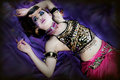
| 09/02/2011 08:45:34 PM | Belly Dancer on the floor...by lobrinComment: Nice colors, and exotic model. But my eyes goes to all the bling bling on her top. Kind of annoying me, cause I dont like that! :P
I miss her eyes are so dark (are her pupils black?) I hope this picture is part of a bigger session!, would love to see other poses, and framing.
Good luck in the challenge | | Photographer found comment helpful. |
| 09/02/2011 08:42:02 PM | The Female Athleteby acoppolaComment: hmm.. this is quite different of the rest. Love the surroundings! but as a portrait I would like to see her face better. Right now is the stone she's on that draws my attention to it. and when I watch at her, are the tan of the legs, and muscles/size of her thighs <-- dont get me wrong! I like them in a posiive and sportly way.
The flexing doesnt look to strong, and the face is the last thing I see in the picture :(
but, is she a bicycle rider, yes?
pd. clean your sensor! ;) that dust mole in the right of the photo, wasnt on my monitor! (hehe.. I checked!) :P | | Photographer found comment helpful. |
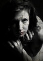
| 09/02/2011 08:34:53 PM | Dianaby franktheyankComment: Someone commented on mine, that my model was kind of scary looking! :P but then, this one must have terrorized him/her :P
I dont like the fact that you just put a wall texture over her, dont know... havent been a fan of this technique, and used very little if any myself. (though this is better than most of the entries and I predict it to be a Top 10 almost guaranteed!)
Will love to see other photos with this model, as I believe she is better looking than what we can see here.
Good luck in the challenge. | | Photographer found comment helpful. |
| 09/02/2011 08:26:07 PM | AAAAAAH... Kids!by FocusPointComment: I like this one.. kind of! :P Even beeing the mouth a point of attention, my eyes goes to her eyes.. so this is good. The HDR kind of effect, is not to bad either, quite spot on between beeing a bit to much, and not beeing enough, so well done on this!
Even with all those good things, I would have taken the photo with the camera straight. not like its now, from a corner. (45g angle?), that makes this photo kind of awkward. And maybe the background I would have preferred it darker (or lighter!) | | Photographer found comment helpful. |
| 09/02/2011 08:18:49 PM | Candlehand and Smokeby rodgers_leComment: This one is cool! how the face is emerging from the smoke. But the fingers as candlelights, looks a bit to bizarre :( Must hurt to get your fingers burned up, doesnt it? ;)
Then there are some minors, on the brushing.. (like at the right of index finger, you can see a black area, that should have matched better the "not so black" around. This, may be cause of your screen beeing a tad darker than it should. (cause I believe mine is kind of calibrated, and I see those places where it should have been better).
pd. try to put more light/luminance on your monitor, and watch again the photo. :) | | Photographer found comment helpful. |
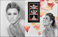
| 09/02/2011 08:12:43 PM | Hannahby BarbBComment: Lovely picture the one at the left, and like how the petal on the center, looks like if its over the photo (but I see this white around, that shouldnt be white.
Then the 3 pictures on black bacground, are cool!, Love those monkeys! ;)
And there is this pic at the right.. kind of unfocused, but amazing smile!
The model gets a 11 out of 10! Gorgeous! ;) but the composition isnt that much of my taste. And the "Expert Editing" isnt there either. (again, the model, just astonishing beautiful!) | | Photographer found comment helpful. |
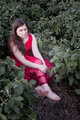
| 09/02/2011 08:05:51 PM | Growthby MyeengunComment: This is a cheapo photoshop effect! ;) Dont get me wrong, it does make some parts of the picture kind of cool: all the green leaves at the higher part of the photo (around her head level) and down there where she has her feet on, where there its brown)
But the effect on the girl (lovely girl btw), doesnt look that good. The portrait in its whole, has lots of potential, if treated differently. | | Photographer found comment helpful. |
| 09/02/2011 07:55:20 PM | Emanuelby ytshuvaComment: Nice portrait of a lovely girl, but can see the "Expert Editing" this challenge was all about. |
Home -
Challenges -
Community -
League -
Photos -
Cameras -
Lenses -
Learn -
Prints! -
Help -
Terms of Use -
Privacy -
Top ^
DPChallenge, and website content and design, Copyright © 2001-2024 Challenging Technologies, LLC.
All digital photo copyrights belong to the photographers and may not be used without permission.
Current Server Time: 04/24/2024 02:44:43 AM EDT.
|