| Image |
Comment |
| 01/17/2004 01:19:43 PM |
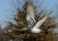
Heading Homeby TerryGeeComment by GeneralE: Excellent capture ... I've been practicing some shots like this recently and it's really hard! (Especially without so high a shutter speed or zoom factor or manual focus :( ) Congratulations on another top-ten finish. |
 Photographer found comment helpful. Photographer found comment helpful. |
| 01/17/2004 10:45:16 AM |
Heading Homeby TerryGeeComment by amsmyth: Greetings from the Critique Club:
There is very little I can say about this image other than that I think it's a terrific capture. I like the motion, the crispness of the head, eye, and beak, and the bird's color is very natural. The focus is good and you have gotten the feel of the beat of the wings and that wonderful "shoulder" motion. Thanks for the image. |
| Photographer found comment helpful. |
| 12/19/2003 11:22:55 AM |
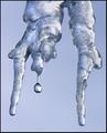
Just a Dropby TerryGeeComment by ellamay: Greetings from the CC, a very appealing shot. Excellent focusing job, managing to get the droplet as a focus as well as the tiny bits on the icicles as sharp clear details. The over shape of the icicle is interesting, the monotone color sheme works well to unite your shot, keeping any distractions away from the viewer. My only possible criticism might be (and this is just an idea), to mirror the image putting the droplet on the right where the eye tends to go more and perhaps leaving a bit more space around the subject, especially on the left and top just to give it a little more breathing room. Overall very nicely done, as agreed upon by most folks giving you a very good score! congrats and keep up the good work. |
| Photographer found comment helpful. |
| 12/13/2003 01:26:28 PM |
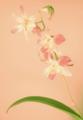
Fading Beautyby TerryGeeComment by dr rick: Greetings from the Critique Club!
Soft focus combine with high key and low contrast to make this image convey a transcendent, tranquil beauty. The background color is perfect for this message. The composition is just right. The leaf is close enough to the bottom of the frame that it doesn't draw undue attention, but provides support and context for the flowers. The bud going to the right at the top nicely balances the left-facing flowers.
Overall, a wonderfully sublime image. I like it very much. My only suggestion is to ignore those who would prefer a more conventional photo, which may indeed be beautiful but would lack the ethereal, spiritual effect you have succeeded in capturing here. |
| Photographer found comment helpful. |
| 12/11/2003 01:14:37 AM |
The Color of Money by TerryGeeComment by angelic: Hey I just love this picture....very creative with the dollar signs and the water. Nice work....How do I go about entering my photo's? |
| Photographer found comment helpful. |
| 12/10/2003 04:46:19 PM |
The Color of Moneyby TerryGeeComment by amazoneea: I want to congratulate you for the ribbon. As I say in my comment during the voting time... I know it was done before. So what? I don't know anything that it hasn't been done before. The photography is judged after all by how was it done... the qualities it has... no by how many times was done before. I want a ribbon too. I know that water drop pictures goes well. If I take a picture of a water drop it will bring me the ribbon? Not likely. Depends how the photo will turn out to be. Not every one of us can take a picture like this one. Not me, anyway. And to end this... I find that a ribbon for this photo is well deserved. |
| Photographer found comment helpful. |
| 12/10/2003 12:32:06 PM |
|
| Photographer found comment helpful. |
| 12/10/2003 12:31:43 PM |
Fading Beautyby TerryGeeComment by GoldBerry: I agree that it's reminiscent of a watercolor..personally, I find it very appealing to see the flowers match the background more obviously, sort of represents how nature fades into the background of our own lives at times. Very creative using a stocking over the lense, it never hurts to step outside the box. Too bad I'm too late to vote! |
| Photographer found comment helpful. |
| 12/10/2003 11:06:43 AM |
|
| Photographer found comment helpful. |
| 12/10/2003 10:38:00 AM |
|
| Photographer found comment helpful. |
Home -
Challenges -
Community -
League -
Photos -
Cameras -
Lenses -
Learn -
Prints! -
Help -
Terms of Use -
Privacy -
Top ^
DPChallenge, and website content and design, Copyright © 2001-2024 Challenging Technologies, LLC.
All digital photo copyrights belong to the photographers and may not be used without permission.
Current Server Time: 04/16/2024 01:53:47 PM EDT.