| Image |
Comment |
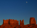
| 12/05/2005 09:12:33 PM |
Monumentsby BethanComment: Aha! Sky colour is a definite improvement since I last saw this... |
 Photographer found comment helpful. Photographer found comment helpful. |
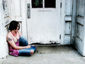
| 12/05/2005 09:02:14 PM |
thoughtsby esdarbyComment: I like this. My only complaint would be that it seems tilted slightly counter-clockwise. Since you're basically square-on to the doorway, and it is more or less symmetric, I'd just set the bottom edge of the door horizontal (since none of the vertical lines are ever really going to be vertical without perspective correction). Other than that... Nice! |
| Photographer found comment helpful. |
| 12/05/2005 08:53:59 PM |
|
| Photographer found comment helpful. |
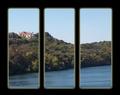
| 12/05/2005 08:51:08 PM |
Heavenly Viewby TheresaAComment: The frames are too much... The photo itself looks like it could use some straightening. All in all, it doesn't do much for me, though tweaking curves, saturation, etc might improve things a fair bit. |
| Photographer found comment helpful. |
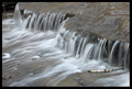
| 12/05/2005 08:47:02 PM |
Nature Untouchedby JEFFJSBComment: The stick in the middle I find distracting, the one in the lower right is not so bad though. |
| Photographer found comment helpful. |
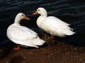
| 12/05/2005 08:45:28 PM |
Ducksby GinaRothfelsComment: I think I would prefer the ducks in the lower right corner, with more water and less ground. |
| Photographer found comment helpful. |
| 12/05/2005 08:43:23 PM |
|
| Photographer found comment helpful. |
| 12/05/2005 08:41:03 PM |
|
| Photographer found comment helpful. |
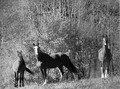
| 12/05/2005 08:34:32 PM |
High Contrast B/Wby DianaComment: I think the horses could be a touch sharper, and either a larger or smaller DOF. The background takes up a large portion of the picture, and I find it frustratingly in between focused and totally blurred out--I can see the detail, but it's not sharp enough to be appealing. I think I would like it best with a large DOF and everything in focus, but smaller DOF to blur the background more could work too. |
| Photographer found comment helpful. |
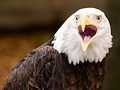
| 12/05/2005 08:27:04 PM |
Sunshine and Prideby CarmelynnComment: Not bad. I can only imagine how difficult it was to get them to cooperate... Focus seems decent on the eyes, but a little too soft on the noses, so a larger DOF might be in order. Some sharpening might help a little though. All in all, there is little to complain about, but among the rest of the photos it really doesn't stand out. A more interesting (or more contrasting), yet not distracting background might help. |
| Photographer found comment helpful. |
Home -
Challenges -
Community -
League -
Photos -
Cameras -
Lenses -
Learn -
Prints! -
Help -
Terms of Use -
Privacy -
Top ^
DPChallenge, and website content and design, Copyright © 2001-2024 Challenging Technologies, LLC.
All digital photo copyrights belong to the photographers and may not be used without permission.
Current Server Time: 04/23/2024 06:07:04 AM EDT.