| Image |
Comment |
| 12/01/2005 09:30:46 AM |
|
 Photographer found comment helpful. Photographer found comment helpful. |
| 12/01/2005 09:25:45 AM |
Roman Numeralsby snsComment: Composition and lighting are nice, but there seem to be quite a lot of jagged edges. Might want to be more careful with your sharpening. |
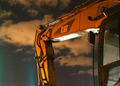
| 11/30/2005 10:47:58 PM |
Industrial Strengthby AllanLComment: I like the composition of this a lot, though if it were possible to back out a little and get the bucket in the shot that might have added something. I'd imagine that would have introduced a bunch of clutter from the background though, so cropping it like this was probably a good choice. Frankly, I think the lighting is terrible in terms of the reflections on the bottom of the arm, and the evidence of the light that has been cropped out in the lower left. The direction of the lighting is pretty good though. The colouring seems a little off, and I'm not sure if that's just because of the nature of the lighting and the fact that it is a night shot, or if has to do with the post processing. I would try it in black and white, as that is an easy way to take care of the strange colour casts you sometimes get in night shots (from sodium vapour lamps or whatever the hell they are). |
| Photographer found comment helpful. |
| 11/30/2005 08:00:45 PM |
Tarnishedby sargeebeeComment: Focus seems off, need to see more surface detail. Feels like it is cropped a little close on the right, and I think a little more rotation (counter clockwise) would help composition. |
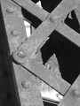
| 11/30/2005 07:49:51 PM |
Iron & Steelby Prof_FateComment: This is my kind of shot (in fact I think I have some very similar ones), but I think your composition could use a little work. It seems a little cluttered in the lower left, and the tree branch in the lower right is a little distracting. |
| Photographer found comment helpful. |
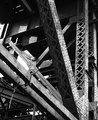
| 11/30/2005 07:44:44 PM |
Steel City on a "CLEAR DAY"by jessieComment: Your highlights seem a little blown out. Nice though. After the challenge I'd like to know where exactly this was shot from. My only day for shooting was Saturday, and it was snowing, so I figured I was better off getting in close than trying something like this, so I went for a five-hour walk down Burlington St. |
| Photographer found comment helpful. |
| 11/30/2005 01:08:58 AM |
|
| Photographer found comment helpful. |
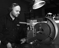
| 11/30/2005 12:40:55 AM |
The Industrial Look!by vikasComment: I'd like to see more of the work piece and machines here (ie not cropped quite as close). |
| Photographer found comment helpful. |
| 11/17/2005 10:49:59 PM |
Ready for Bedby CalliopeKelComment: This is fantastic... My only complaint would be that whatever is in the background looks a little funny behind the dog's head. |
| Photographer found comment helpful. |
| 11/17/2005 10:31:00 PM |
00 juniorby crazyeyeComment: Your focus seems a little soft, and I think not cropping the top of his head and his elbow out would improve this. All the same, I like it. |
| Photographer found comment helpful. |
Home -
Challenges -
Community -
League -
Photos -
Cameras -
Lenses -
Learn -
Prints! -
Help -
Terms of Use -
Privacy -
Top ^
DPChallenge, and website content and design, Copyright © 2001-2024 Challenging Technologies, LLC.
All digital photo copyrights belong to the photographers and may not be used without permission.
Current Server Time: 04/25/2024 05:08:50 PM EDT.