| Image |
Comment |
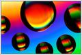
| 06/17/2003 10:00:03 AM |
The Highlighted Area by inspzilComment: Fun image, inspzil. Very creative. Like the silhouette of the paperclips and the colors are indeed scab-labby. Bet lots of us are running out now to buy Castor oil :) Congrats on ribbon. |
 Photographer found comment helpful. Photographer found comment helpful. |
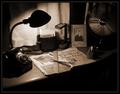
| 06/16/2003 01:35:18 AM |
one for the scrapbook by indigo997Comment: Only saw the thumbs of this challenge and never voted. Very happy you got a ribbon; you deserved one! This is a beautiful picture with gorgeous lighting. It is also very original and well-conceived. Like the nostalgic feel of the toning. Great job and congrats! |
| Photographer found comment helpful. |
| 06/13/2003 08:45:49 AM |
Red Surferby buck4freeComment: That's a nice moody image, buck. I would have cropped out the left to get rid of the red spots and put all the focus on the main event. Would make a much stronger image, imo. I do like the blurred surfer and would have liked it even more if some of the seagulls in front and to the left of him would not have been in sharper focus than the surfer. I notice the banding in the sky and i know from personal experience what a pain in the neck that is. Typically, it only comes about from compression - they look perfect before then! You might want to experiment a little with despeckling or adding just a tad of noise to the entire image. |
| 06/11/2003 11:50:39 PM |
Mongolian Fire Oil on a CDby DavenitComment: Didn't leave comments on this challenge but just wanted to say that it got a high vote from me as i like this image a lot. The colors are rich and it's a great abstract. I notice some banding and struggled with that myself in a few images. Anything one can do about that? |
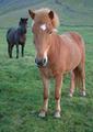
| 06/11/2003 02:23:47 AM |
The Horseby birgirComment: This is such a lovely composition and the foreground horse seems great. The big problem is the image size: wayyy too small and it makes it hard to see the image and evaluate it. Please submit pics closer to the max size allowed, i.e. 640 px. You're hurting yourself scorewise with such small submissions. |
| Photographer found comment helpful. |
| 06/11/2003 01:12:05 AM |
liquid dreamsby grigrigirlComment: I liked your theme a lot. What i didn't like, and therefore didn't score it terribly high, was: the double-exposure arms - they are so blurry that they almost look masculinely hairy :) - the uneven lighting, knee and the left foot that as a result takes on a bit of an gawdy shape. Furthermore, i question the pose of the model. She is obviously very attractive - is that you? - but her ribs (never the most graceful part of the female body - seem very pronounced and also higher than the breasts. Maybe that's the result of the pose or the model just tucking in her stomach too much. Anyway, i liked your effort and was amused by the title. Hope you'll do more nudes and don't let the anti-nudity crowd here get to you :) Message edited by author 2003-06-11 01:13:04. |
| Photographer found comment helpful. |
| 06/03/2003 10:01:42 PM |
Leavingby GordonComment: This is a great shot! I actually like the guy being in soft focus. However, some of the tiles seem in sharper focus (they probably aren't but it just seems that way) and therefore compete with the guy for attention. Imho, this shot would have tremendous power if the whole thing would be very soft (gaussian blur on the tiles maybe? ;)
And you had the guts to submit this to a dpchallenge? Some of the rule-abiding voters must have had a fit. Message edited by author 2003-06-03 22:04:41. |
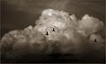
| 06/01/2003 03:01:07 PM |
Three Ducksby DennisFComment: Beautiful clouds, great opportunity shot with the ducks. Personally, would have cropped off most of the dark at the bottom. 8 |
| Photographer found comment helpful. |
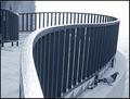
| 06/01/2003 02:58:17 PM |
Pigeonby GolferDDSComment: Nice composition with the curves; the pigeon is a wonderful finishing touch; like the abstraction of the trees behind the curve or the reflection thereof in the water. Too bad some of the lights have been blown out (foreground rail and the water); perhaps you took it on the wrong time of the day? 8 |
| Photographer found comment helpful. |
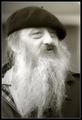
| 06/01/2003 02:54:38 PM |
Oldtimerby kiwinessComment: Good portrait of a great character, nice B&W. Alors, ce mec, est-il français? |
| Photographer found comment helpful. |
Home -
Challenges -
Community -
League -
Photos -
Cameras -
Lenses -
Learn -
Prints! -
Help -
Terms of Use -
Privacy -
Top ^
DPChallenge, and website content and design, Copyright © 2001-2024 Challenging Technologies, LLC.
All digital photo copyrights belong to the photographers and may not be used without permission.
Current Server Time: 04/19/2024 05:06:48 AM EDT.