| Image |
Comment |
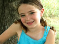
| 02/16/2007 06:20:33 PM |
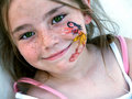
Sydby LucyTComment by Greetmir: Cuter than cute. Very very nice image. I did, however, notice the odd freckle on this face. LOL |
 Photographer found comment helpful. Photographer found comment helpful. |
| 01/31/2007 10:58:51 PM |
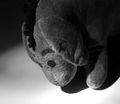
Thanks for noticing me.by LucyTComment by jaysonmc: My wife has a very old Eeoyore also, though maybe not quite as old (eyes are different), but the fabric looks the same.
Anyhow, not sure about the comments below. Frankly that, jbridges, really wasn't complimenting the image...
Okay as for the photo, it is a bit lacking. I see what you were trying to do and it was a good idea. A couple of things, the angle is crooked. Sometimes this works, but the subject is too centered in the frame and just seems a bit contrived. Here I think you might actually want everything in focus, well especially the foot. The shadows, which I think was part of the intent here, is a good idea, but they are a little too flat/down and seem like a mistake. If you elogate the shadows or have an additional light source I think this would help tremendously.
It's not a horrible photo, and the idea is great. I love the way the light is a gradient out to the darkness, very nice. I just think it needs to be staged a bit differently.
I must say though, that I really like your stuff in your general portfolio. These challenges can be tough but a good learning experience (espeically for me). Plus, I'm not expert; I get scores worse than this sometimes, so take it for what it is worth.
Cheers, happy shooting and welcome to the club. |
| Photographer found comment helpful. |
| 01/31/2007 10:50:25 PM |
Smiley Sydby LucyTComment by kenskid: As in others...this one is angled and head cut off a bit. I'd try to get the whole head unless you are trying for a tight "face" crop.
Keep shooting ! |
| Photographer found comment helpful. |
| 01/31/2007 10:48:14 PM |
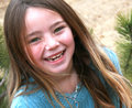
Syd rockby LucyTComment by kenskid: Color is nice and focus is good. I see on several of your shots, you chose an out of the ordinary angle. Although this works at times, I try to keep my portraits straight.
For example, even though the subject is good and the colors are bright ,this photo is "hard to look at" in my opinion. It almost seems to make me not want to look at it long, even though it is a beautiful child!
I'd try some straight on shots and work with the lighting to get the best out of your portraits. Then...later I would experiment with "angles".
I'm far from a "portrait" guy but I hope this helps! |
| Photographer found comment helpful. |
| 01/31/2007 10:44:03 PM |
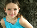
GREEN EYESby LucyTComment by jaysonmc: One of my favorites in your portfolio. I like the background going on here. You seem to have a good grasp of basic composition techniques. Just wish the rest of her head was there in this one. Though it isn't that big of a deal. Great colors, terrific contrast, and wonderful lighting. Good lines. A very natural pose and a terrific portrait. |
| Photographer found comment helpful. |
| 01/31/2007 10:40:32 PM |
claraby LucyTComment by jaysonmc: Cute dog and an adorable face. Just a couple of things on this one. Generally if you are looking down on the animal either you want to capture just the head or the whole body. You have something in between here. Most people would say to get on the same plain as the dog, that works sometimes but there is nothing wrong with taking a picture straight down. The amount of depth of field is terrific. Good place of the eyes and the face in the frame. Might need a bit more contrast and a little added exposure. Really, these are just minor things. It is a great picture. |
| Photographer found comment helpful. |
| 01/31/2007 10:37:19 PM |
Syd-a-rooby LucyTComment by jaysonmc: The pose is cute in this one. In this one though, I don't like the head chopped off. You have most of it anyways, might as well have the rest. The only other distracted thing is the dark left versus the bright right. Usually it does not work very well for portraits. I do like the light hitting the model's left cheeck though. Good control of exposure, contrast and sharpness. Colors pop off very well. |
| Photographer found comment helpful. |
| 01/31/2007 10:33:45 PM |
Sydby LucyTComment by jaysonmc: Adorable picture. The eyes can't be that green, can they? Usually people will complain about cropped heads and what not. As long as it is done right I think it is fine. In this case I think it works really well. The contrast is terrific on the photo. Great placement of the eyes and the sparkle in them. Colors are vivid. I actually like the outfit and the hair because it gives good lines/eye movement to the photo. It is a wonderful portrait. The only thing I am not sure about is the saturation in the eyes, it's on the edge for me (meaning nearly perfect or nearly overdone). |
| Photographer found comment helpful. |
| 04/05/2006 03:55:13 PM |
|
| Photographer found comment helpful. |
| 04/05/2006 09:17:28 AM |
|
| Photographer found comment helpful. |
Home -
Challenges -
Community -
League -
Photos -
Cameras -
Lenses -
Learn -
Prints! -
Help -
Terms of Use -
Privacy -
Top ^
DPChallenge, and website content and design, Copyright © 2001-2024 Challenging Technologies, LLC.
All digital photo copyrights belong to the photographers and may not be used without permission.
Current Server Time: 04/16/2024 04:06:49 PM EDT.