| Image |
Comment |
| 04/25/2005 10:33:29 PM |
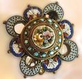
Heirloomby biggood53Comment: Not much i can say about this. First it doesn't really look like a jewel. Lighting is all wrong and the focus is not very sharp. Angle of foto is rather odd and makes the composition off. Strange colours on the 'wall' or background. 3 |
 Photographer found comment helpful. Photographer found comment helpful. |
| 04/25/2005 06:39:43 PM |
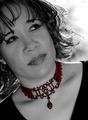
Highlighting Beautyby Travis99Comment: Cool jewel! Very unique and intriging. I'd wished for tighter crop to see the item better. don't need to see the model's shirt. Since this is threated as a portrait, a better focus on the model as well as the item coudl've been appreciated and some sharpening as well. more light as well on the item. ncie work tho. 6 |
| Photographer found comment helpful. |
| 04/25/2005 06:38:22 PM |
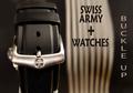
Swiss Army Watchesby TommyMoe21Comment: Quite unique idea i must say. It feels wierd because i've done some test shots of exactly the same idea, but decided against it. My main concern in this shot is the fact that we don,t actually see the product. Its like if you are selling the wrist band instead of the actual watch(?!). Lighting is very good and simply ad i like the DOF. (what's on the right??) Text is interesting. Because of the band's angle, i feel like the whole picture goes sideways, which is a bit disturbing. 6 |
| Photographer found comment helpful. |
| 04/25/2005 06:36:41 PM |
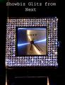
Showbiz Glitz from Nextby benhurComment: Odd composition and lighting. Focus is somewhat wrong and kills the sharpness required for so many jewels. Lighting is interesting, but the mix in colours doesn't really work to give this shot the appealing factor it needs to 'sell'. text is dull and not attractive either. 5 |
| Photographer found comment helpful. |
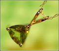
| 04/25/2005 06:33:28 PM |
August - Peridotby dartompkinsComment: Very wierd and unique DOF and composition. I'm not sure which part is in focus and which is not, or what the shape of this item is. I like the colors and the Very strong DOF helps a lot on the wierd focus. Unfortunatly, i do not feel this sells the item a lot and so goes slightly against the challenge's theme (advertisement). Very nice tho. 7 |
| Photographer found comment helpful. |
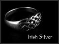
| 04/25/2005 06:32:11 PM |
Irish Silverby banmornComment: Nice ring! I have scotish blood, and this makes me feel right at home! Of course i,d wished for a 'shinner' ring, with less scratchs, but i understand the difficulty in finding something nice to shoot. Lighting is nice, if perharps slightly too strong on the reflections. I think i'd want to see a little more of the set on which the ring is resting. Text is simple and efficient which is very nice and quite rare in this challenge. Frame works perfect as well. Very classic and to the point. 7 |
| Photographer found comment helpful. |
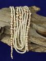
| 04/25/2005 06:30:25 PM |
Natural pearlsby aKiwiComment: not quite sure what to say about this shot. Lighting is stale, composition is off, DOF is not strong enought for the effect you want to give. Blue background doesn't compliment the colours of the jewel at all. The wood on the other hand is very cool, but could've used a lot more contrast and some colour adjustments to the whole picture could've punched this pic some. Sorry. 4 |
| Photographer found comment helpful. |
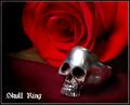
| 04/25/2005 06:28:18 PM |
Skull Ringby pawdrixComment: Nice idea. Sort of creapy with the Rose, but definatly intriging. The frame and composition are very good, but the lighting is a bit off. Too strong on the ring, too soft on the rose. I'm not too keen on the 'set' either, with the brown part of fabric. On an even set, this would've done better. Some water sparkles on the rose trick could've done some good results on this shot. Font is good and not too invasive. Feels like a 'tatoo-shop' picture. 6 |
| Photographer found comment helpful. |
| 04/25/2005 06:26:20 PM |
Suggestiveby mrmorrisComment: I'm not sure i understand the slogan of this shot. Composition is however very intriguing; goes well with the text and item. I'd wish for a better focus on the item, i believe better lighting could've helped in that department. Perharps a colored lighting effect could've helped slightly as well (blue?). Keep at it! 5 |
| Photographer found comment helpful. |
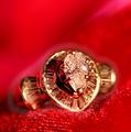
| 04/25/2005 06:25:02 PM |
Fire and Iceby msdoubletroubleComment: I like the idea, unfortunatly, the DOF is awful and the ring is largely blurry and/or out of focus. The Lighting is too strong and washs the ring considerably. With a better sharpening, the reflection on the diamond would've been very nice. The Red colour is very nice and would've done wonders if a better DOF and focus was used. Keep at it! 4 |
| Photographer found comment helpful. |
Home -
Challenges -
Community -
League -
Photos -
Cameras -
Lenses -
Learn -
Prints! -
Help -
Terms of Use -
Privacy -
Top ^
DPChallenge, and website content and design, Copyright © 2001-2024 Challenging Technologies, LLC.
All digital photo copyrights belong to the photographers and may not be used without permission.
Current Server Time: 04/24/2024 11:05:01 AM EDT.