| Image |
Comment |
| 04/28/2005 11:01:03 PM |
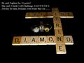
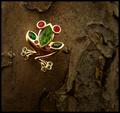
Diamonds Are A Girl's Best Friendby DeniseBernadetteComment: Cute pic. In this particuliar case, i wished the little girl's face would be in focus, which it isn't. Since this shot is threated as a Portrait, its important to have the face in focus (just learning this myself) but in this case, doesn't work very well. Colours are dull and the lighting, especially on the rings, is not very good, which doesn't do any justice to them. 5 |
 Photographer found comment helpful. Photographer found comment helpful. |
| 04/28/2005 10:57:34 PM |
The Gameby mpembertonComment: Funny! Unfortunatly, I'm not sure how this would work in an Advertisement. Colours are interesting but could've been punched a little more. Lighting in itself is uneven and makes it hard to reflect the 'beauty' of the jewels, especially since they take about 10% of the shot. Text is plain and doesn't bring anything special, just tries to help or explain the display., 5 |
| Photographer found comment helpful. |
| 04/28/2005 10:56:06 PM |
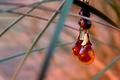
Amber Sunsetby ZoomdakComment: Cool idea! I like the colour reflected at the jewel mixed with the background's sunset colours. Very unique. Unfortunatly, the jewel could'Ve been sharper as it seems to lack a little focus. Also, the composition is a bit off. I wish i didn't have to see the 'chain' part on top, which takes away from the whole concept. 7 |
| Photographer found comment helpful. |
| 04/28/2005 10:54:50 PM |
|
| Photographer found comment helpful. |
| 04/28/2005 03:08:19 PM |
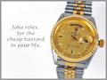
Fake Rolexby alanfreedComment: LOL funny! Composition is good, lighting is good as well. There's a wierd angle on the watch that makes it 2D... i don't see any DOF and since the background is pure white, it makes the whole thing less impressive. All the edges are soften on the watch as well, which is also wierd. Nice tho. 7 |
| Photographer found comment helpful. |
| 04/28/2005 03:06:48 PM |
Take the Leap: Buy Me!by dsidwellComment: Wow! very nice jewel you got here. I'm late in the votes but i'm sure you're scoring pretty high on this one. Composition is very nice. I feel a little unconfortable about the DOF tho. Since the item is so close to the wood, it feels wierd that its so out of focus. Also what i feel a bit wierd about is the change in ligthing towards the bottom, wish there'd be a little more light overall. 8 |
| Photographer found comment helpful. |
| 04/28/2005 02:12:56 PM |
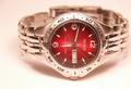
Classic Mens Timepieces on Saleby alien2thisworldComment: I find the composition a bit off, as its not even, but the watch 'wants' to be in the picture. Also the lighting is very yellow for a silver watch (was this shot in RAW?), the colour temperature is too strong and could've been cooled down some. The Time displayed is good but could've been better to be able to read what's writen. Sharpness is good, but could've been slightly better. It also seems the lighting is a bit too strong (or too close?) to the watch. How many spots did you use? I'd suggested more Wattage at a lesser distance, or a Soft-Box. DOF is good. 6 |
| Photographer found comment helpful. |
| 04/27/2005 01:01:35 PM |
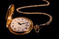
"Timeless" Classicby ZapperzacComment: Nice composition. I like the way the chain goes off-frame. Lithing could've been slightly better, but sharpness is kept on the watch itself. I wish it could've stayed on with the attachment tho. Background is very nice and very dark. The sparkles are interesting as well, but i'm affraid they were added in photoshop(?!). Nice. 7 |
| Photographer found comment helpful. |
| 04/27/2005 12:59:18 PM |
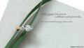
Writing a Love Poemby admart01Comment: Very nice soft lighting (used a soft box or natural?) The text is very subtle and brilliant, the CO. name is very shy and perfect for the look. Colours are nice and the jewel really is nice. 2 things i really don't like tho, is the reflection on the ring (orange) which to my eyes, doesn't fit at all with the restof the picture, and the paper on which the ring rests. The white borders kind of breaks the pattern for me. Also, perharps a little more energy in the colours would've helped. Very nice work! 7 |
| Photographer found comment helpful. |
| 04/27/2005 12:55:57 PM |
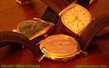
Hamilton Watch Company circa 1958by bcobleComment: First thing, the colour of the text is all wrong., It really breaks the mood of this shot. Composition could use some work as we see little details like the boarders of the watchs beneath the closest watch's bracelet. The tip of the right watch's bracelet. Those are all distracting details which makes this shot less then perfect. The lighting is interesting as it gives power to the gold, but unfortunatly, takes away from the sharpness, making the picture seem out of focus slightly. nice try. 5 |
| Photographer found comment helpful. |
Home -
Challenges -
Community -
League -
Photos -
Cameras -
Lenses -
Learn -
Prints! -
Help -
Terms of Use -
Privacy -
Top ^
DPChallenge, and website content and design, Copyright © 2001-2024 Challenging Technologies, LLC.
All digital photo copyrights belong to the photographers and may not be used without permission.
Current Server Time: 04/24/2024 11:07:06 AM EDT.