| Image |
Comment |
| 05/01/2005 12:04:34 AM |
Gorcon's Fine Jewelryby Dr.ConfuserComment: LOL, well another trekker on DPC, cool. Authentic, that i'd have to see! Cool shot, although there really is nothing 'special' about it unfortunatly. I'd loved to see a very hard 'Klingon Empire' themed setting with the jewel (metal, rust, red, dirty...). 6 |
 Photographer found comment helpful. Photographer found comment helpful. |
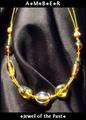
| 05/01/2005 12:03:15 AM |
Amberby DustDevilComment: Lighting is very harsh and the jewels are not very sharp. Text is simple but not very interesting. (like the little dots). 5 |
| Photographer found comment helpful. |
| 05/01/2005 12:02:12 AM |
Be the light...by ShamanComment: That's quite expensive for a candle...*just kiddin* ;) Lighting is interesting and the reflection gives this shot something interesting, just wished there'd be a little bit more. Too bad we don't see the jewel that much. Text is too intrusive for my taste and the colour is a bit harsh for the candle's pinkish look. 6 |
| Photographer found comment helpful. |
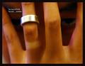
| 05/01/2005 12:00:55 AM |
Fidelityby ergoComment: Wierd but, this shot is rather 'dark' and 'scary'.. with the eyes in the background. Lighting is quite wrong as there are spots of white, blue and red everywhere. Ring is not sharp enought to make it out properly. text is funny, if a bit non-existant. There's this beige spot on the lower left that bugs me quite a bit too. 5 |
| Photographer found comment helpful. |
| 04/30/2005 11:58:51 PM |
Gruenby graphicfunkComment: Very strong and rich lighting on this picture. The gold effect of the watch is very stunning. I'm not very keen on the background colour tho; the monochrome effect seems to take lots away. Text is good if perharps a bit too intrusive for my taste, its colour is a good choice. I have a few hickups about the bracelet tho, there are wierd lighting spots (reflection?) which kind of take away from the nice leather effect. Very good selection of 'time' (that was my big mistake in this challenge) as it doesn't obstruct the name or important informations on the watch. Good work! 7 |
| Photographer found comment helpful. |
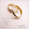
| 04/30/2005 11:56:16 PM |
Grandma's Atticby tfarrell23Comment: Nice work! Sharpness of the rings are nice, and the DOF is good as well! (5.6?). Text is a bit wierd, probably suffered too much from the compression, but that's ok, in a mag, it wouldn't show like that so its forgivable ;) All i can say is thank god for Macro..(?!). 7 |
| Photographer found comment helpful. |
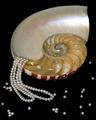
| 04/30/2005 11:54:58 PM |
Treasures of the Sulu Seaby flip89Comment: Cute idea. Lighting on the pearls is neat, but doesn't give much to go on. The Shell decoration takes too much place in the picture in my opinion. 6 |
| Photographer found comment helpful. |
| 04/30/2005 11:53:12 PM |
Glamor girlby sissiComment: Very nice composition. The look is original and the DOF is nice as well. I'm not sure why you choose not to put the jewels in focus, but it does well in showing the 'size', but not the 'quality' of th eproduct. Model is interesting and very glamourous. One thing i don't like is the right eye with the glasses effect (kind of buggy). Other then that, nice work, just wished i'd see the jewels better. 8 |
| Photographer found comment helpful. |
| 04/30/2005 11:51:20 PM |
Native American jewelryby dragonladyComment: Interesting idea. Composition is rather weaks, i feel it cuts away from the mood of the shot by 'cutting' the bowl the jewels stand on. Lighting is not very effective either, especially on the bracelet on the left. Nice sharpness tho. Keep at it! 6 |
| Photographer found comment helpful. |
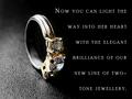
| 04/30/2005 11:50:11 PM |
Round Brilliant Two-Tone Ringby mocabelaComment: Interesting way to show the ring. Lighting is interesting, especially the way it splits the picture in half. Text is unfortunatly way too much to read and takes too much space, taking lots away from the jewel itself. Not sure on the texturized background tho, kind of takes away from the lustrate and shinny ring. 6 |
| Photographer found comment helpful. |
Home -
Challenges -
Community -
League -
Photos -
Cameras -
Lenses -
Learn -
Prints! -
Help -
Terms of Use -
Privacy -
Top ^
DPChallenge, and website content and design, Copyright © 2001-2024 Challenging Technologies, LLC.
All digital photo copyrights belong to the photographers and may not be used without permission.
Current Server Time: 04/23/2024 09:00:44 AM EDT.