| Image |
Comment |
| 08/23/2005 11:39:17 AM |
'After the Long Day' meets 'Soft Sun'by CorySmithComment: Excellent joke about DrJones's recent entry. On a serious note, while the whites are very good, the blacks could've used more contrast and toning. (Burning tool would help here). Composition is a bit off as all sides are of different lenght in relation to the model. I also find the lighting to be a little too bright. Would've wished for more details on the face/helmet as well. 7 |
 Photographer found comment helpful. Photographer found comment helpful. |
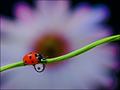
| 07/11/2005 06:45:20 PM |
Three in One Macro by FalcComment: Simply... Amazing. I can't say anything.. other then i love macro, and this shot makes me want to purchase the 100mm... oh yes... only question is... is that lens good for portrait as well?! |
| Photographer found comment helpful. |
| 05/02/2005 12:06:07 AM |
|
| Photographer found comment helpful. |
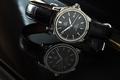
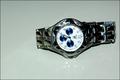
| 05/01/2005 12:00:47 PM |
Omega DeVille Automatic Chronometerby fplouffeComment: Nice Lighting. I'M not very keen on the white board reflection we see on half the face of the watch tho. Sharpness is good, composition seems off a bit tho, i get a feeling of waste space on the left. The yellow line on the far right is buggy as well. Some text couldl've helped this. 7 |
| Photographer found comment helpful. |
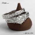
| 05/01/2005 12:13:24 AM |
Because You LOVE herby RayEthierComment: Interesting curvy composition and presentation. DOF is good and intriguig, colour is sharp and appealing. I'd wish for a little bit more sharpness on the ring, perhaps some more contrast as well. Text is a bit too flashy for my taste, but is non intrusive, which is good. A frame (black or dark) would do very well here. 7 |
| Photographer found comment helpful. |
| 05/01/2005 12:08:13 AM |
on sale 1,000by gtp1164Comment: Lighting is harsh and uncontroled, reflection is quite weak and doesn't seem planned. Time displayed is not flattering for the watch make. Composition is boring. no background doesn't help. Keep at it. 4 |
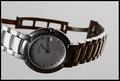
| 05/01/2005 12:06:53 AM |
The only one I wearby GautiComment: Would've been fun to have more light on the face of the watch. Lighting itself ain't bad, but ain't special either. Grey background makes the pic quite stale. DOF is good tho. 6 |
| Photographer found comment helpful. |
| 05/01/2005 12:05:09 AM |
The Groom's Kitby WobbleComment: Lighting is a bit too unidirectional. Makes wierd shadows. Composition is ok, althought the upper dark thing gets in the way. 6 |
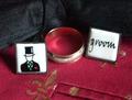
| 05/01/2005 12:04:34 AM |
Gorcon's Fine Jewelryby Dr.ConfuserComment: LOL, well another trekker on DPC, cool. Authentic, that i'd have to see! Cool shot, although there really is nothing 'special' about it unfortunatly. I'd loved to see a very hard 'Klingon Empire' themed setting with the jewel (metal, rust, red, dirty...). 6 |
| Photographer found comment helpful. |
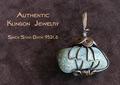
| 05/01/2005 12:03:15 AM |
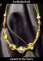
Amberby DustDevilComment: Lighting is very harsh and the jewels are not very sharp. Text is simple but not very interesting. (like the little dots). 5 |
| Photographer found comment helpful. |
Home -
Challenges -
Community -
League -
Photos -
Cameras -
Lenses -
Learn -
Prints! -
Help -
Terms of Use -
Privacy -
Top ^
DPChallenge, and website content and design, Copyright © 2001-2024 Challenging Technologies, LLC.
All digital photo copyrights belong to the photographers and may not be used without permission.
Current Server Time: 04/25/2024 08:38:35 AM EDT.