| Image |
Comment |
| 09/25/2004 09:06:35 AM |
|
| 09/25/2004 12:39:10 AM |
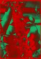
painful touchby zzzabaComment by samtrundle: Normally I find psychadelic adjustments like this a bit over the top, but for some reason its really working in this image. I don't think I could look at it for more than 30 seconds at a stretch but I like it. |
| 09/24/2004 08:17:08 PM |
painful touchby zzzabaComment by t_korecki: wow interesting photo! gr8 idea overall and pretty good execution, only thing i might change would be to crop the photo tighter around the fingers only as i dont feel the rest of it adds to the photo however i tighter fit i believe would add to it though thats just a personal opinion gr8 work and deffinitely one of the more interesting ones in this series :) |
| 09/24/2004 07:11:11 PM |
painful touchby zzzabaComment by Kylie: Very good concept for the challenge, but the color contrast is a bit too extreme for my tastes. |
| 09/24/2004 04:50:14 PM |
painful touchby zzzabaComment by mhoogendyk: This is just so creative. My first impression is Christmas (green and red). Then, when I get looking closer, it's almost madness - ripping, tearing thorns being squeezed by real fingers depicted in an almost Infra-red and negative fashion. The result is very ghostly, unreal and scary. But, fascinating to study. Great image. Good luck with the challenge. |
| 09/23/2004 01:05:37 PM |
painful touchby zzzabaComment by Neuferland: Oh, this might have worked if it was inverted and made to look like a bad xray. I can hardly make out the details on the plant or the hands without really taking the time to look. But the colors and post processing don't really make me want to look that hard. Sorry, a 2 |
| 09/22/2004 04:05:46 PM |
|
| 09/22/2004 02:06:25 PM |
|
| 09/22/2004 10:46:43 AM |
painful touchby zzzabaComment by Falc: Really don't like the colours, but it does at least represent touch, which some of the others don't. |
| 08/21/2004 03:48:08 PM |
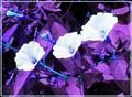
three neon lampsby zzzabaComment by Kylie: Very nice neon blues and violets. The whites are too exposed for my personal taste, and what appears to be post processing grain. I really like the electric blue of the veins. |
Home -
Challenges -
Community -
League -
Photos -
Cameras -
Lenses -
Learn -
Prints! -
Help -
Terms of Use -
Privacy -
Top ^
DPChallenge, and website content and design, Copyright © 2001-2024 Challenging Technologies, LLC.
All digital photo copyrights belong to the photographers and may not be used without permission.
Current Server Time: 04/24/2024 09:29:52 AM EDT.