| Image |
Comment |
| 08/05/2003 03:39:49 PM |
|
 Photographer found comment helpful. Photographer found comment helpful. |
| 08/05/2003 09:47:00 AM |
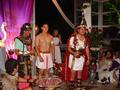
The Fall of the Roman Empire (1964, Anthony Mann)by amonteforteComment by robsmith: My voting criteria for this challenge are:
1. Did you capture a scene from the movie (as the challenge brief states) or did you enter a picture and fit a title to it.
2. How close a rendition is your image to the movie.
3. How does the image stand up in its own right.
In this case:
1. Not convinced that you organised a Roman themed party just to take a photo for the challenge but what do I know.
2. Well set up to look right for the period.
3. The lighting and exposure is good, but I just don't find anything in the image to hold my attention.
Overall a good picture which meets the challenge. 6 |
| Photographer found comment helpful. |
| 05/31/2003 09:47:10 PM |
Black & Copper Baroqueby amonteforteComment by LindaLee: I find this shot oddly interesting. I wasn't sure, at first, if I liked it, and have had to come back several times to give it another look. The composition is quite visually appealing, and your concept is quite unique (at least to me). The one little thing that really makes this shot for me is the spikes of hair hanging across her face. Don't know why, I guess it is just something a little unexpected and it adds some "kick" to the shot. |
| Photographer found comment helpful. |
| 05/31/2003 01:19:37 PM |
Black & Copper Baroqueby amonteforteComment by SharQ: Very nice, but not at all sure about the reflection from the flash. The off-centreness is cool though, as is the bodypainting and the hair hanging across her face. Good work. (8) |
| Photographer found comment helpful. |
| 05/31/2003 11:34:21 AM |
Black & Copper Baroqueby amonteforteComment by LarsPaysen: Looks like sweaty work under the lights :) Interesting composition, and great skin tones on the exposure. It doesn't look much like a traditional duotone to me, but that's a wohle other argument. |
| Photographer found comment helpful. |
| 05/30/2003 06:04:05 PM |
|
| Photographer found comment helpful. |
| 05/30/2003 04:24:03 PM |
Black & Copper Baroqueby amonteforteComment by alanfreed: Is this the same woman who posed for "The Naked Chef" several weeks back? Whatever the case, gotta like this! My only beef is the somewhat harsh flash on the oily skin on the arms. Or am I just upset that the arms are in the way? :) |
| Photographer found comment helpful. |
| 05/30/2003 07:42:30 AM |
Black & Copper Baroqueby amonteforteComment by JPR: Wooah, awesome. Where do you come up with such models? If only i could be so lucky. I especially like the strands of hair coming down over the lips and the fact that the head is cut off. I bet that will bother other people, but i think it gives it a nice modern look, or post post modern or contemporary or baroque or whatever people call it these days. would be great in a body art magazine or billboard, etc. The only thing i don't like are the harsh highlights on the arms, especially the black one, although I realize that they are to give the skin a polished, oiled, bronzed look. 9 |
| Photographer found comment helpful. |
| 01/17/2003 06:49:48 PM |
Forbidden Snackby amonteforteComment by jenarom: Near perfect copy of the original! Very funny! Lighting is great and almost identical. Pose is exactly the same. Got a laugh with the hotdog. Good luck in winning the challenge! |
| Photographer found comment helpful. |
| 01/17/2003 12:57:49 PM |
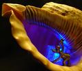
Ice Shell Miningby amonteforteComment by BAMartin: Critique Club Critique
(1) COMPOSITION (CONTENT) Very powerful composition. You have put together all of the emements of a very strong composition: leading lines, strong diagonals, rule of thirds, bright vibrant colors... I could go on and on.
(2) BACKGROUND I love the background that you have used, the wonderful texture of the top side of the shell is a perfect contrast to the smoothness of the bottom part of the shell.
(3) CAMERA WORK ,TECHNICAL Exposure seems a right on to me. The lighting is so perfect here, I can not begin to tell you how to improve this.
(4) DIGITAL PROCESSING ,TECHNICAL Good processing. The colors are wonderful, they seem to just "pop". I sm very glad you did not put a border on this, that would have distracted from the overall compositiion.
(5)MEETING THE CHALLENGE This photo does a very good job of meeting the challenge. I love the humor that you injected into the subject.
(6) MY OPINION ON THE PHOTO A very beautiful photo. I would love to see this hanging in a childs room, both the subject and the bright clean colors would make it perfect. |
| Photographer found comment helpful. |
Home -
Challenges -
Community -
League -
Photos -
Cameras -
Lenses -
Learn -
Prints! -
Help -
Terms of Use -
Privacy -
Top ^
DPChallenge, and website content and design, Copyright © 2001-2024 Challenging Technologies, LLC.
All digital photo copyrights belong to the photographers and may not be used without permission.
Current Server Time: 04/24/2024 10:14:15 PM EDT.