| Image |
Comment |
| 04/10/2008 05:49:54 PM |
|
 Photographer found comment helpful. Photographer found comment helpful. |
| 04/09/2008 06:19:34 PM |
|
| Photographer found comment helpful. |
| 04/09/2008 12:39:27 PM |
|
| Photographer found comment helpful. |
| 04/09/2008 11:19:09 AM |
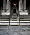
new york public libraryby k4ffyComment by ivale28: I really like the high contrast - gives this a great sense of depth. The details of this shot make it very interesting to look at - the wear on the steps, the rust spots by the railing. |
| Photographer found comment helpful. |
| 04/09/2008 11:17:18 AM |
winter witheringby k4ffyComment by citymars: Very nice photo! Funny that for once you get points taken off for being in focus. Yes, I'm afraid this photo isn't blurry enough. |
| Photographer found comment helpful. |
| 04/09/2008 11:05:30 AM |
new york public libraryby k4ffyComment by jeger: Love the symmetry. I would be tempted to crop out the diagonal lines in the foreground as they lead the viewers eyes away from the rest of the photograph. |
| Photographer found comment helpful. |
| 04/04/2008 12:05:07 PM |
cityblockby k4ffyComment by poser: I like the tilt it gives it a different feel then just the same old same straight on. |
| Photographer found comment helpful. |
| 04/01/2008 10:44:29 AM |
cityblockby k4ffyComment by tootsweet: Interesting choice of tilt and crop. This one is a bit counterintuitive. Usually, I prefer to see things more complete, but by showing just a piece of it, you communicate the massiveness better than by showing the entire thing. Well done. |
| Photographer found comment helpful. |
| 04/01/2008 09:45:41 AM |
|
| Photographer found comment helpful. |
| 03/31/2008 08:29:23 PM |
cityblockby k4ffyComment by SkyeMari: this picture has an interesting angle and crop, so it almost disrupts the pattern. |
| Photographer found comment helpful. |
Home -
Challenges -
Community -
League -
Photos -
Cameras -
Lenses -
Learn -
Prints! -
Help -
Terms of Use -
Privacy -
Top ^
DPChallenge, and website content and design, Copyright © 2001-2024 Challenging Technologies, LLC.
All digital photo copyrights belong to the photographers and may not be used without permission.
Current Server Time: 04/23/2024 10:37:34 PM EDT.