|
|
| Image |
Comment |
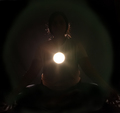
| 06/19/2006 01:48:17 PM | Enlighteningby DigiFotoBuddyComment: Hello from Álex, CTP MkII
First Impression: very clever idea but IMO the realization could be improved
Composition: good, in this case the centered composition works well
Subject: very good concept for the challenge, with an original idea
Technical: the main flaw IMO is technical. If you had achieved a good silhouette, this shoot will deserved a very high score.
Improvement: a better lighting to make the silhouette more perfect
Summary: very intelligent idea.
Álex
|  Photographer found comment helpful. Photographer found comment helpful. |
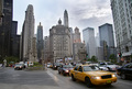
| 06/19/2006 01:11:31 PM | City Architectureby DigiFotoBuddyComment: Hello from Álex, CTP MkII
First Impression: wonderful wide shot
Composition: good, like it
Subject: OK for me, but probably too wide for some people on this challenge. By wide I mean that some people, for comments I've seen in others shots, including mine was expecting more shots on details. But I think this shot is perfect for the challenge.
Technical: very good: great DOF, with everything in focus, very natural colors.
Improvement: I'm not sure if correcting the deformation in the perspective of the lateral buildings would help or not, just an idea...
Summary: Well done, maybe chicago deserves a visit...
Álex
| | Photographer found comment helpful. |
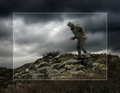
| 06/11/2006 05:52:14 AM | Fool On The Hillby GunnsiComment: Hello from Álex, CTP MkII
First Impression: wonderful hill and sky. By the way, you choosed a good title, it arrived to the first place...
Composition: very well balanced.
Subject: perfect for the challenge.
Technical: great PP of the sky and the hill. The man and the hill are too oversharpened for me (I know what I'm talking, people killed me in architecture because I oversharpened the building).
Improvement: Don't oversharpen so much.
Summary: nice topic and place. Congrats for your 2nd personal best.
Álex
| | Photographer found comment helpful. |
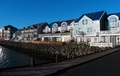
| 06/10/2006 12:03:51 PM | New "Old" housesby GunnsiComment: Hello from Álex, CTP MkII
First Impression: good sky and nice houses.
Composition: nice.
Subject: accurate for me, but it seems people like more bridges and solitary buildings.
Technical: the color of the sky is great, but it seems the rest of the image is a bit too blue. Focus is not very sharp.
Improvement: Get rid of that blue dominant. Focus.
Summary: Keep shooting.
Álex
| | Photographer found comment helpful. |
| 06/10/2006 11:45:51 AM | Desvasidizedby blackenedwhiteComment: Hello from Álex, CTP MkII
First Impression: GREEEEAAAT. Wonderful photo and superb PP.
Composition: very good, off centered.
Subject: absolutely great for the challenge. You achieve a very interesting look.
Technical: impressive. The colors are very nice, and the textures are really good. Focus is accurate. Lighting is excellent (and this is a ñighting challenge).
Improvement: understand this is a great picture and I like it a lot, but to find things to improve, I would say I don't really like the zipper(?), it's a bit distracting.
Summary: Congrats for your PB and keep shooting.
Álex
| | Photographer found comment helpful. |
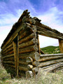
| 06/10/2006 11:33:33 AM | Humble Homesteadby RebeccaComment: Hello from Álex, CTP MkII
First Impression: great wide angle. Very good perspective.
Composition: OK. Maybe a little centered in the middle of the photo the intersection of both walls.
Subject: appropiate for the challenge, i like it, but some voters maybe were expecting other thing in the challenge
Technical: the colors are a bit harshed IMO, surely the shot was at midday, and the light is too strong, so the texture and details are not very clear. Colors are fine.
Improvement: Try to shoot at other time of the day (morning or before sunset). Try another angle, shooting more from the right, so the intersection of the walls is not so centered.
Summary: Good shot with a nice perspective.
Álex
| | Photographer found comment helpful. |
| 06/10/2006 11:20:46 AM | Here Comes the Sunby RebeccaComment: Hello from Álex, CTP MkII
First Impression: WOW. Very nice skyscape. And the title selected is absolutely smart.
Composition: well composed and good proportions of sky and sea. Maybe the bottom right is a bit too dark and it seems lightly unbalanced.
Subject: I think the subject is alright for the challenge.
Technical: very good in technical aspects. The colors are great except in the "dark side". Focus is OK. It makes some little jpeg artifacts, at least on my monitor.
Improvement: maybe process the dark zone to make it a little bit more detailed
Summary: really great shot. Don't worry about scoring, because it depends on what voters expected to see in the challenge.
Álex
| | Photographer found comment helpful. |
| 06/07/2006 01:45:51 PM | Engrossedby margiemuComment: Hello from Álex, CTP MkII
First Impression: Very clever shot.
Composition: OK, but maybe is too space up the subjects and subject is too centered, but not sure
Subject: very appropiate for the challenge. I think is original that the single light source is on the hands of the subject and the reflection is what lighten the scene.
Technical: very good IMO, very natural colors, good focus and lighting.
Improvement: maybe the composition, as told. I'm not sure, but you could have tried to crop leavin more black space on the left and so centered off the subject.
Summary: Intelligent idea and good realization, congrats on your third highest score
Álex
| | Photographer found comment helpful. |
| 06/07/2006 01:28:43 PM | "Sitting in his nowhere land"by yankoComment: Hello from Álex, CTP MkII
First Impression: What a week, my friend, two shots with more than 6.5 and both on top 20. Impressive job. I hope you don't decide to abandone us now that you're on the top...LOL.
Composition: very good composition. Maybe on the right is too tight to the bench, and a little bit of free space could help.
Subject: accurate for the challenge.
Technical: you have done a really good job on the PP, achieving a quite interesting photo.
Improvement: I don't really love the BG. The reflection on the door is too distracting IMO. And the white of the jersey is a bit blown out (maybe that's just on my monitor)
Summary: Very good job in meeting the challenge with a photo that maybe without the PP wouldn't be quite interesting.
Álex
| | Photographer found comment helpful. |
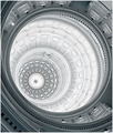
| 06/07/2006 01:16:16 PM | Texas State Capitol Buildingby yankoComment: Hello from Álex, CTP MkII
First Impression: WOW. Congrats on your new PB, once again. And on a top 20. Wonderful shot.
Composition: absolutely dynamic, off centered, quite interesting.
Subject: Obviously, great selection for the challenge.
Technical: Lovely tonality (is a duotone or just is so white and blue?). The focus is very good.
Improvement: Sorry, no ideas on this one.
Summary: GRRRRREAT.
Álex
| | Photographer found comment helpful. |
Home -
Challenges -
Community -
League -
Photos -
Cameras -
Lenses -
Learn -
Prints! -
Help -
Terms of Use -
Privacy -
Top ^
DPChallenge, and website content and design, Copyright © 2001-2024 Challenging Technologies, LLC.
All digital photo copyrights belong to the photographers and may not be used without permission.
Current Server Time: 04/25/2024 04:32:41 AM EDT.
|