| Image |
Comment |
| 01/15/2006 04:39:07 AM |
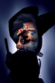
Zdenkaby IvanAntolicComment: Wow, this photo is quite freaky! I'd hate to wake up and see that first thing in the morning!
Otherwise, I love the photo! It made me feel something (even if it was a gross kind of fear!) and the lighting to me is perfect! |
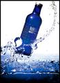
| 01/15/2006 04:36:59 AM |
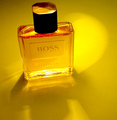
The Bossby manic35Comment: Well, what to say?
IMO I don't like the subject matter - it doesn't spark any emotion in me or make me sit up to say wow!
I thnk the angle could have been done differently to make it more of an advertisment photo if you know what I mean. More of a straight on photo rather than looking down on the bottle may have done it for me. |
 Photographer found comment helpful. Photographer found comment helpful. |
| 01/15/2006 04:33:57 AM |
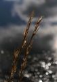
Grass on Water's Edgeby glad2badadComment: Composition seems a little off to me. Not sure why though! Maybe a bit more cropping from the top left?
Nice photo though but a little too dark, ie: not enough contrast/underexposed. |
| Photographer found comment helpful. |
| 01/15/2006 04:30:26 AM |
Laughterby debbybrisComment: Sweet photo. Lovely fun emotion but to me a little over exposed on the right. |
| Photographer found comment helpful. |
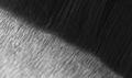
| 01/13/2006 08:24:56 AM |
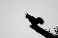
The Shape of a Squirrelby mannjuditComment: Critique Club Comment
COMPOSITION
This photo IMO could have been composed better. For example, the rule of thirds - your squirrel is neither centered nor is it in one of the thirds - it is just, well, there! That's quite distracting for me.
BACKGROUND
Your background is very bland which in some cases can be good but it is just too much for me here. Maybe a tighter crop would have worked better or as has been suggested, a whiter background.
CAMERA WORK
Well, the shape of the squirrel is definitely there and the silouhette is done nicely, I just think that there could have been a few changes to help enhance the photo!
MY OPINION
This is not the sort of photo thaat I would personally go out and buy to hang on my wall. It needs that 'WOW' factor and IMO it just doesn't have anything special about it. Keep trying though and if you have any questions or comments about my critique feel free to PM me. |
| 10/31/2005 11:10:32 PM |
Short &Stubby...Long & Smoothby angela_packardComment: Critique Club Comment
COMPOSITION
Well I must admit, when I first saw this photo I was saying to myself, "What!?" So IMO it met the challenge well.
The problem that I am seeing with this photo is that while it meets the challenge it is just not holding my attention at all.
The way your photo is composed is making my eyes wander all over it really looking for a centre of interest, and yet nothing is catching my attention. The lines of the "long and smooth" just seem to be clashing at the wrong angle with the "short and stubby". It's almost as though you tried to line them up but didn't quite get it.
BACKGROUND
There is pretty much only a foreground in this photo which I'm not thinking is such a good thing. Maybe even a slightly bulky frame would have made this photo stand out more.
CAMERA WORK
I think your DOF was a little off as I didn't like the fact that the bottom left was so blurry. In fact, nothing really seems to be sharply in focus.
MY OPINION
Well, I'm afraid there hasn't been much great news with this photograph!
As I stated earlier, it did make me say "What!?" but more to the point it didn't make me say "Wow!". Message edited by author 2005-10-31 23:28:35. |
| Photographer found comment helpful. |
| 10/02/2005 02:51:09 PM |
Into The Lightby buzzrockComment: Critique Club Comment
COMPOSITION
I like the ring of blue and the haze around the blue light. The haze seems to lead my eyes around the light nicely and without it I am sure that it would not have had nearly the same effect.
I also like the fact that the ring is in the center of the photo as I think to have put it to one side may have taken away from the effect.
BACKGROUND
IMO I really like the way that this photo almost seems to fade into the black background.
CAMERA WORK
I think the focus is almost perfect for this photo. The only thing I wish wasn't so clear was the highlights on the circle itself. IMO they seem a little bright to me.
MY OPINION
I think that this is an interesting photo but I must say that it is not something that I would like to look at for hours on end.
As for meeting the challenge (which is a big part of what this site is all about) IMO I don't really think of a destination when I look at this image. Your title helped a lot but I still don't think it quite got it there.
Otherwise, well done! |
| Photographer found comment helpful. |
| 10/02/2005 02:27:48 PM |
Cold Fusionby RedOakComment: Very well captured! The water is just perfect! Well done! |
| Photographer found comment helpful. |
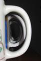
| 09/25/2005 03:29:59 PM |
MUGGEDby ktm7Comment: Critique Club Comment
COMPOSITION
This photograph is really not say much to me. I'm sorry to say but it really looks as though it was simply put together for the challenge and not a carefully thought out and implemented photo.
As has been said before, the shadows are really distracting from the ultimate point of the photo and I think also the colours of the mugs. Perhaps it would have been more effective to use uniform mugs?
Also something just seems to be off about the whole composition - there seems to be either too much or too little black space on the right.
Your DOF also seems to be off with the first mug being blurred. IMO it would have been more effective to have the first mug in focus and have the mugs blurring as they go on.
BACKGROUND
The black background was a good idea and it adds to the image rather than distracting the viewer. As I said before though, there either seems to be too much of it or too little of it.
CAMERA WORK
The subject is not focused properly and I don't find the image to be sharp and effective.
The lighting could have been used a lot more effectively as well.
MY OPINION
I know this is beginning to sound quite harsh but I am hoping that you will take this the way it is meant - constructive criticism. Don't forget that it is only my opinion!
If I were to see an edited and redone version of this photo I would like to see better lighting to take the shadows off the handles, all of the mugs the same colour and pattern and a shift in the focus to have the first mug in focus rather than the last. |
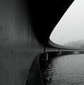
| 09/25/2005 02:57:13 PM |
Vanishing pointby WGN1Comment: Critique Club Comment
COMPOSITION
IMO the composition of this photo is almost perfect. There seems to be no wasted space - that is, every part of this photograph only adds to the overall effect and I can't see anything that detracts from your shot.
The leading lines are used extremely well and the contrast you got from the black and white was amazing.
BACKGROUND
The background of this photo really adds a great effect! I love the fog as it seems to enhance the vanishing point and it adds a bit of a dreamy and sureal factor to the photo.
CAMERA WORK
Well done with the camera work - the texture, the focus and exposure all seem to be just right.
MY OPINION
Well, I can't really say any more on this one except for congratulations on a job well done! I think this photo would make a great print! |
| Photographer found comment helpful. |
Home -
Challenges -
Community -
League -
Photos -
Cameras -
Lenses -
Learn -
Prints! -
Help -
Terms of Use -
Privacy -
Top ^
DPChallenge, and website content and design, Copyright © 2001-2024 Challenging Technologies, LLC.
All digital photo copyrights belong to the photographers and may not be used without permission.
Current Server Time: 04/16/2024 01:05:31 PM EDT.