| Image |
Comment |
| 01/31/2003 05:58:57 PM |
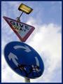
Tag! You're it.by DezComment by timj351: Critique Club critique
While the perpective certainly makes this photo an interesting one I feel a little uncomfortable with how much the left edge is being crowded. I would like to see the angle of the pole exaggerated even more so that the round sign is positioned on the right side with the top of the post in its same location to create an even more dynamic look and feel to the image. This positioning would also create triangular shapes in the negative space that would compliment the triangular sign. The reflection of the light bothers me a little as well and maybe the use of a polarizer filter could have reduced the reflection. You chose a good background that adds to the dramatic effect. The colors are good and overall the photo is very sharp and clean. The border does a nice job of presenting your photo without overpowering it. All and all you did a nice job with this photo.
Tim Jensen |
 Photographer found comment helpful. Photographer found comment helpful. |
| 01/28/2003 01:42:41 AM |
Tag! You're it.by DezComment by vestanpance: I'm really surprised that this one didn't do better. Ironic really that the grafitti that so many people didn't like was the whole point of the photo!! It was a shame that the reflection of the light was there though. |
| Photographer found comment helpful. |
| 01/26/2003 04:25:17 AM |
Tag! You're it.by DezComment by vestanpance: Nice viewpoint. The only thing I don't like about this photo is the reflection of the light on the Give Way sign, it's a shame that the light was on. |
| Photographer found comment helpful. |
| 01/24/2003 01:33:30 PM |
|
| Photographer found comment helpful. |
| 01/24/2003 09:45:44 AM |
Tag! You're it.by DezComment by joshua: the signs are too dark, the reflection of the light isn't a plus, the graffiti also takes away. this is a good example of how to use perspective to make your photo stand out against the sky |
| Photographer found comment helpful. |
| 01/23/2003 09:50:04 PM |
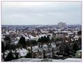
Suburbia in the Snowby DezComment by crabappl3: Critique Club Comment:
Less is more... I really like the clarity of the houses in the shot. I really like the row right in front, and the shadows on them. I wonder if a cropt that excludes all the sky except enough for the tall building and a crop of your roof top so that this is a 16 x 9 format, would add a more dynamic feel to this shot? I see that you adjusted levels, but have you concidered doing curves, contrast and hues? You might be surpised what these tools can do to help an over cast shot. I have several that I almost tossed until I learned what PS can do for me. I'm not saying every picture needs it, and this may not, but with the tighter crop and some more contrast you could really make the view wonder what is happening in the houses with the cars in from of them.
Your sharpening is good and save for web. This is a nice photo that with maybe another camera angle to remove some of the foreground, could be a great shot.
-danny |
| Photographer found comment helpful. |
| 01/23/2003 03:29:34 AM |
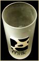
Not a dropby DezComment by lisae: Nice glass. I really enjoy the textures I can see here, and the camera angle is cool. The black background is nice too. The DOF you used is interesting... not sure if it works or not. Actually, I think it does, because it pulls the eyes down to that cow print image on the glass. I have a feeling that I'd have liked some more negative space around the image... maybe above the glass? The tight frame just makes it a bit bland to me. |
| Photographer found comment helpful. |
| 01/22/2003 05:48:05 PM |
Not a dropby DezComment by Jacko: Intersting angle. The glass seems foggy. Did you place it in the freezer. Nice background. |
| Photographer found comment helpful. |
| 01/22/2003 05:03:45 PM |
Not a dropby DezComment by Patella: I dig the concept and the lighting. My "nit" is that the back of the glass is not as evenly "frosted" as the front appears to be -- lots of little nicks for one, and then just not as smoothly "frosted" either -- almost as if it's got fingerprints or something that were then frosted over. I'm not explaing myself well. Still one of my more favorite shots... |
| Photographer found comment helpful. |
| 01/22/2003 04:23:59 PM |
|
| Photographer found comment helpful. |
Home -
Challenges -
Community -
League -
Photos -
Cameras -
Lenses -
Learn -
Prints! -
Help -
Terms of Use -
Privacy -
Top ^
DPChallenge, and website content and design, Copyright © 2001-2024 Challenging Technologies, LLC.
All digital photo copyrights belong to the photographers and may not be used without permission.
Current Server Time: 04/19/2024 11:24:24 AM EDT.