| Image |
Comment |
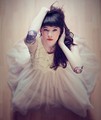
| 09/06/2012 09:27:20 AM |
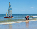
Sitting Pretty by PaulComment: Saw this on 1X.com today. Congratulations for the ribbon and the 1X add. |
 Photographer found comment helpful. Photographer found comment helpful. |
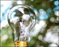
| 08/13/2012 11:51:27 AM |
_as bright as the light of day resized 1080227by montrealmaggieComment: Interesting composition. I really like the bokeh and the noise in the background. The light is well focused, so the bulb stands in sharp contrast and draws my eye. It is so crisp that the imperfections in the bulb's manufacture are visible. The circle on the top and the distortions in the glass along the left side are a bit of a distraction. The reflections in the glass are generally pleasing, but there is something going on in the middle that makes me wonder what is actually being reflected. It looks like a beautiful cloudy sky is being obscured by some sort of a giant sea urchin. (I would like to see a better reflection of that urchin although it might not be best for this photo.) Great capture. Good luck with the scoring. Just commenting...not voting right now. |
| Photographer found comment helpful. |
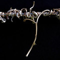
| 08/13/2012 11:40:29 AM |
Hanging in there till the very end.by jjbeguinComment: I love the textures in these vines. The light captures the veins in the major stems and the hint of green moss adds a touch of color. I might have tried to clean up a few of the hair-like strands on the right. The black background is a good choice. Not sure I see a simile in this photo or the title, which may hurt your score. Just commenting. |
| Photographer found comment helpful. |
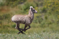
| 08/13/2012 11:36:02 AM |
Run Like the Windby hahn23Comment: This is a very crisp stop-motion. These tend to take a combination of skill, luck, and patience (or a huge lens). The focus appears to be dead-on to me. I also like the aperture choice to lock on the foreground but blur the backdrop. For consideration: You might have tried for a bit of panning motion in the background to give more of the impression of movement. Everything is so stopped, the animal (deer?) almost appears to be suspended there in the air. Also, the placement in the frame seems very central. It might be nice to play with the crop to get a bit more running room ahead of him, placing him a a bit more to the left of the frame. The same is generally true for the horizontal, but to add height would be to diminish the presence of the deer, so I'd experiment with it, but I can see where you'd be less inclined to make that change. Overall, a very nice shot. Great capture! |
| Photographer found comment helpful. |
| 08/09/2012 09:46:45 AM |
The Launch Supervision Committeeby jomariComment: Great potential. It is harsh lighting as already noted. Composition-wise, I have a few quibbles. The single person off to the right does not seem to be a part of the committee and should be cropped, IMO. Also, the horizon is very near the center in the frame. You don't always need to follow the rule of thirds, but here is a case where it would be better. To crop some of the foreground water would be to bring the boat and committee closer to the viewer. Also, adding a layer to tweak the blue and giving a bit more sky to the whole thing would enhance the picture. |
| Photographer found comment helpful. |
| 07/19/2012 09:16:30 AM |
Storm Blown by JunieMoonComment: I really like this picture! It looks like an oil painting. I love the wispiness of the flowers and the way they move off to the right across a power point in the frame. To my eye there are just a few detractors here. The last full flower along the top right has an unfortunate stem that could be cloned out along the left side of the petals. There is a similar hard looking stem on the left that runs left to right and is counter to the pattern of the others. The highlights are blown out on the last full flower in the top right. I would maybe have tried to mute that somehow in post. The partial flower in the corner has the same issue, but it is not important to the photo, so I might have just cropped that one out. Great colors and composition. Good eye for spotting this as a photo opportunity and making something ordinary into something extraordinary. |
| Photographer found comment helpful. |
| 07/18/2012 12:32:56 PM |
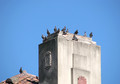
Who Needs You Guys, Anyway?by GeneralEComment: This one made me stop and think. I like the concept of a loner bird, but frankly, I didn't get it at first. My eye was initially drawn to the high point. All those pigeons and the flaking paint on top of a dingy gray pillar. They are on top, but what good has come of their conquest? It is interesting to think about a bird or a person who doesn't seek what everyone else seeks and who maybe doesn't need their approval. So many people want to be at the top, and will climb any peak because it is there. Of course, many more never make it to the top. Some see no value in the attempt while others plod along like lemmings without giving a thought to the wisdom of the effort. The person who can be happy where he finds himself is the truly independent one. Interesting photo. You said all that and more without words, and I used all these words and said so little. |
| Photographer found comment helpful. |
| 07/18/2012 12:20:44 PM |
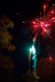
OOOH! Colors!by RileyBearComment: I went out for fireworks pics this year, too. Was this really taken at 1/125? I think you might do well to lower the ISO and use a shutter speed of a few seconds. When I went out, I used a wired remote release, which made it easy to click and hold while the displays developed. These are good colors, but I think you have too much exposure in a few hot spots. Lowering the ISO would help in that regard. The fireworks themselves are plenty bright enough to expose properly at much lower ISO levels. |
| Photographer found comment helpful. |
| 07/18/2012 12:13:41 PM |
Independence......Now in cake flavorby FtWorthphotogComment: I love that cake! To improve the photo, I might have tried to eat a bit more from the right side to open up the viewing angle, allowing us to see more of the flag impression on the left. Also, there is a bit too much white in this for my taste. If the plate were a different color (blue maybe), I think it would have helped. As it is, the frosting and the plate on the right are too much white. Oddly, it doesn't feel that way on the left side where there are more reds and blues. I do like that plate detail, though, and it would have been a loss if a different surface was used. |
| Photographer found comment helpful. |
| 07/18/2012 12:07:31 PM |
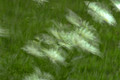
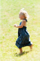
Free as the Windby JuliBocComment: Oh, the freedom! Carefree and running through the grass with the wind in her hair, this child captures the essence of summer. The yellows add to that summer feel, but maybe they also lend the a sense of too much sunshine. It looks like it may be hot. Less yellow and more green would make the setting more lush, I think. Also, the look on her face seems a bit concerned. Perhaps it is the heat or the anxiety that comes from running at breakneck speed through the grass, but that expression is may be just a little too accurate. A more idyllic smile would push this result up considerably. Overall, great concept and well executed. Just suggesting a couple of tweaks that would make it better to my eye. |
| Photographer found comment helpful. |
Home -
Challenges -
Community -
League -
Photos -
Cameras -
Lenses -
Learn -
Prints! -
Help -
Terms of Use -
Privacy -
Top ^
DPChallenge, and website content and design, Copyright © 2001-2024 Challenging Technologies, LLC.
All digital photo copyrights belong to the photographers and may not be used without permission.
Current Server Time: 04/19/2024 12:55:53 AM EDT.