| Image |
Comment |
| 07/06/2013 10:35:10 AM |
|
| 07/06/2013 09:22:39 AM |
|
| 02/02/2013 03:15:18 PM |
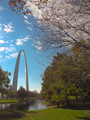
Gatewayby myqylComment by Teafran: I've been within two feet of where this shot was taken. :>) I like the overall ambiance this generates but the colors seem weak - the amount of "punch" that this image should generate just doesn't exist. Still, the image invokes a sense of peace and tranquility. Nice effort. |
 Photographer found comment helpful. Photographer found comment helpful. |
| 02/02/2013 11:08:50 AM |
Gatewayby myqylComment by bvy: Love the way all the elements fit together in this. Nice soft pastels too. |
| Photographer found comment helpful. |
| 02/01/2013 11:51:41 AM |
Gatewayby myqylComment by bmartuch: Very well composed image. You should show this to the chamber of comerice |
| Photographer found comment helpful. |
| 01/14/2013 07:26:55 PM |
|
| 01/08/2013 10:38:13 AM |
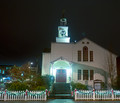
Lightby myqylComment by myqyl: dtremain :
I will try re-edits with your suggestions. I tried to do lens corrections (you should see the before distortion :) ) but will play around and try again.
I was most interested in your comment about the focus being the fence. I hadn't really considered WHAT the focus was and that may very well be a large part of my problem. |
| 01/08/2013 10:22:03 AM |
Lightby myqylComment by dtremain: FWIW - You\'ve picked a tough scene to edit - a night shot with bright lights, but not enough distance to blend the lights into a pattern. First, I agree with  giantmike giantmike that the left side of the photo really is distracting. My impression is that your subject was really the lit fence, and your choices were made in order to show the fence. IMO, this image wants to be more about the church - so, I\'d suggest a tight crop; maybe even a fill-the-frame. Next, the church is distorted by the lens and perspective, so a bit of distortion correction may be helpful (so the left and right sides don\'t slope in opposite directions - especially towards the top). Horizontally, it is pretty close to level, but might be a bit better. Finally, on an image like this, you kind-of have to make a choice between pp for the lights (typically leaving the back & buildings dark) or for the building (typically resulting in blown out areas in & around the lights) - maybe others would have suggestions on how to resolve that dilemma...
Edmonds, WA, huh? What a beautiful area to do photography in! I have family in the Everett, Snohomish area. |
| 01/02/2013 01:59:49 PM |
|
| Photographer found comment helpful. |
| 12/16/2012 01:40:27 PM |
|
Home -
Challenges -
Community -
League -
Photos -
Cameras -
Lenses -
Learn -
Prints! -
Help -
Terms of Use -
Privacy -
Top ^
DPChallenge, and website content and design, Copyright © 2001-2024 Challenging Technologies, LLC.
All digital photo copyrights belong to the photographers and may not be used without permission.
Current Server Time: 04/25/2024 01:22:24 PM EDT.