| Image |
Comment |
| 05/18/2003 12:24:03 AM |
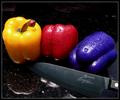
Primarily Peppersby kirbicComment by dsa157: I think this is excellently composed. I'll be interested in learning how you did the blue pepper. My one complaint is that I think the elements are too crowded in the frame - yellow and blue but up to the edge too closely. If they had more room to breathe this would be a stronger composition. |
 Photographer found comment helpful. Photographer found comment helpful. |
| 05/16/2003 11:03:35 PM |
|
| Photographer found comment helpful. |
| 05/16/2003 05:34:24 PM |
|
| Photographer found comment helpful. |
| 05/16/2003 12:04:41 PM |
|
| Photographer found comment helpful. |
| 05/16/2003 10:17:25 AM |
|
| Photographer found comment helpful. |
| 05/15/2003 10:42:02 PM |
|
| Photographer found comment helpful. |
| 05/15/2003 06:13:48 PM |
|
| Photographer found comment helpful. |
| 05/14/2003 12:45:47 PM |
Primarily Peppersby kirbicComment by frisca: too bad the hue shift caused weird blue things on the base of the yellow pepper's stem. Great shot thought, and love the addition of the knife! |
| Photographer found comment helpful. |
| 05/13/2003 11:40:30 PM |
|
| Photographer found comment helpful. |
| 05/13/2003 06:01:18 PM |
Primarily Peppersby kirbicComment by labrynthe: your shot has good design elements, simple but effective, one suggestion though is, i think it's much better if u used a knife without any text on it as it distracts the focus from the main subject due to it's placement in the foreground.....
one question... how the hell did u make the pepper blue?? :) |
| Photographer found comment helpful. |
Home -
Challenges -
Community -
League -
Photos -
Cameras -
Lenses -
Learn -
Prints! -
Help -
Terms of Use -
Privacy -
Top ^
DPChallenge, and website content and design, Copyright © 2001-2024 Challenging Technologies, LLC.
All digital photo copyrights belong to the photographers and may not be used without permission.
Current Server Time: 04/19/2024 11:04:51 PM EDT.