| Image |
Comment |
| 09/29/2004 04:31:48 PM |
A tasty Thai treat served up on chopsticks by mrorange002Comment: Excellent color and arrangement. I think maybe such a striking image would have greater effect if there was a bit deeper depth of field. The far side of the mouth seems a bit too soft for the otherwise attention-grabbing photo. Great job nonetheless. |
 Photographer found comment helpful. Photographer found comment helpful. |
| 09/29/2004 04:26:51 PM |
|
| Photographer found comment helpful. |
| 09/02/2004 11:49:35 PM |
Sun Breakby ZoomdakComment: Rediculously amazing. The DOF is flawless. The colors are enchanting. The mist is magical. The little dots on the beach look like people, giving the whole scene a sense of majestic proportion. If I could give this picture a 11, I would. This photo is going straight to my favorites list. |
| Photographer found comment helpful. |
| 09/02/2004 11:40:39 PM |
At the Libraryby basia03Comment: Cool frames within frames winthin frames... I like how you tilted the photo, but I think it might look a bit better if you cropped out the big boring white triangle on the upper right. |
| Photographer found comment helpful. |
| 09/02/2004 11:36:59 PM |
Big Brotherby ShamyComment: Very cool picture. The only thing I see that might be improved is the light shining on the face seems too strong. It washes out the color of the skin. Maybe use a tinted light? I would have preferred some deeper colored eyes for this picture like a rich blue or green. Most of the picture is gray aluminum, so for the subject to really stand out, you'd want a more pure color than the greyish eyes and almost white skin.... unless you were going for consistency with the color of the frame. I personally think that strong contrast between the frame and the subject would work better here. |
| Photographer found comment helpful. |
| 09/02/2004 11:29:29 PM |
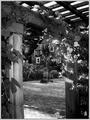
Under The Archby lizzyc3Comment: I'd love to see what the color version looks like. I feel like the type of subject (flora) and the complex detail of the picture would lend itself to be better represented in color. In B&W, the stuff on the upper right coner of the door frame has too much going on for my eyes and it just becomes a big complicated blob of distraction without colors to help the brain figure out what's what. |
| Photographer found comment helpful. |
| 09/02/2004 11:16:35 PM |
Trapped in angerby AmasonComment: The contrast between the seriousness of the person's face and the light-heartedness of the picture is delightful. The lighting on the ripped areas is a bit too strong for me. It makes the shreds seem to glow against their shadows and it takes some attention away from the main subject, the face. Still a great pic. |
| Photographer found comment helpful. |
| 09/02/2004 11:09:17 PM |
Framed Playmoby ZiggiComment: I don't know why but I just like this photo. Maybe it's the simple yet effective colors. Maybe it's how the frame leads the eye to the Playmo. Maybe I just have a thing for Playmos. I'm not sure exactly what the photographer is trying to convey in this image. Regardless, it looks good and it looks professional. |
| Photographer found comment helpful. |
| 09/02/2004 11:05:54 PM |
time warpby stormshadowComment: Love the contrasting colors and the crispness of the reflections. Very imaginative image. |
| Photographer found comment helpful. |
| 09/02/2004 11:04:30 PM |
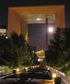
Moon rayby GabrielComment: This picture has a lot of cool elements to it, but I feel like it might be too much... too many eyecatching things vying for attention and leaving the viewer (me at least) unclear about the main subject or idea of the picture. I think cropping all of the extra sky outside of the big arch might help so that the arch becomes the actual framing border of the picture might help simplify things. |
| Photographer found comment helpful. |
Home -
Challenges -
Community -
League -
Photos -
Cameras -
Lenses -
Learn -
Prints! -
Help -
Terms of Use -
Privacy -
Top ^
DPChallenge, and website content and design, Copyright © 2001-2024 Challenging Technologies, LLC.
All digital photo copyrights belong to the photographers and may not be used without permission.
Current Server Time: 04/20/2024 01:16:20 AM EDT.