| Image |
Comment |
| 03/16/2005 12:40:15 PM |
|
| 03/13/2005 09:37:41 PM |
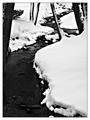
Leaningby Kha0SComment by K-Rob: I really like the lines and shapes in this picture but I feel that the highlights are a too white and extremely close to being blwon out. That's actually part of what makes AA what he is but there is too much of it here. - 7 |
| 03/13/2005 10:54:49 AM |
|
| 03/10/2005 03:40:12 PM |
Leaningby Kha0SComment by Mr_Pants: A great composition. I feel, however, that it could be a touch sharper. |
| 03/10/2005 12:23:45 PM |
|
| 03/08/2005 08:27:14 AM |
Leaningby Kha0SComment by eugene: i would have gotten closer to the ground and taken the picture upwards more, include more of the tree tops. |
| 03/07/2005 08:09:31 AM |
Leaningby Kha0SComment by love: you got the white and the black but the varied grays are not there... |
| 03/07/2005 06:02:23 AM |
Leaningby Kha0SComment by garlic: The subject and composition works fine for me. Like the editing. |
| 02/21/2005 11:46:17 PM |
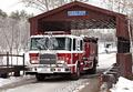
To The Rescueby Kha0SComment by Kathy: The Station House getting a framed picture from you? Nice Pictorial History for them. |
| 02/20/2005 11:54:42 PM |
|
 Photographer found comment helpful. Photographer found comment helpful. |
Home -
Challenges -
Community -
League -
Photos -
Cameras -
Lenses -
Learn -
Prints! -
Help -
Terms of Use -
Privacy -
Top ^
DPChallenge, and website content and design, Copyright © 2001-2024 Challenging Technologies, LLC.
All digital photo copyrights belong to the photographers and may not be used without permission.
Current Server Time: 04/23/2024 02:53:38 AM EDT.