| Image |
Comment |
| 08/27/2002 10:12:00 PM |
Footsby seby20Comment: Wonderful composition -- I love the lighting, and the variety of textures here. |
| 08/27/2002 10:03:00 PM |
Constant Companionby syamjonimiComment: I like the complementary blues in your composition. Also like the position of the doll -- very nice! |
| 08/29/2002 01:11:00 PM |
|
| 08/27/2002 10:07:00 PM |
I Remember Simpler Timesby mullany1957Comment: Creative idea -- I might like the composition better if your angle were lower (looking up at an angle to see the billboard). The area around the billboard really isn't adding anything to the composition....that's why I mention that it might be good to experiment with how the billboard fills the frame. |
| 08/26/2002 12:44:00 PM |
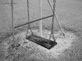
...by prodigal havocComment: Very nice use of black and white. I especially like the even gray of the grass. The bars immediately behind the swing bother me a little bit. I might try reframing the seat/chains to see if a composition is possible that does not include these background bars. |
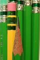
| 08/20/2002 10:58:00 PM |
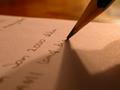
Pencil Holderby normwComment: Wonderful composition and use of color. Background is very effective and works well to place emphasis on the point of the pencil. (I think you're right, great minds do think alike! ;-) LanSnake |
| 08/20/2002 10:37:00 PM |
Writing draftby prkembyComment: I like the variety of shadows in this photo and also how the depth of field draws the eye directly to the point of the pencil. |
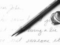
| 08/23/2002 07:11:00 PM |
pencil, hi key studyby lecookComment: Nice composition and excellent use of black and white. Also like the hi key effect.....not quite sure why the lettering is more faded on the left? Is that due to the exposure setting? I'd be interested in learning more about how you used lighting for this study, as you faced similar problems that I had to deal with for this week's photo. Very nice and one of my favorites this week. 9 LanSnake |
| 08/20/2002 11:04:00 PM |
A Sharp Pointby AgamemnonComment: Interesting composition and use of color. I like how you've used the vertical elements -- the pencil in the foreground somehow gets lost a little, by blending into the background elements. A different lighting treatment might help to separate the elements in the photo, or experiment with depth of field to make the front pencil obviously separate from the rest. |
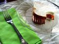
| 08/23/2002 01:09:00 PM |
Lunchby millerComment: This is my favorite photograph of the week. I initially rated it a 9, but will now bump it up to 10. On Tuesday I was eating lunch while voting, and your photo appeared on my screen just as I was biting into a sandwich. I almost choked! Very creative idea, wonderful composition. The white bread seems to lose a little detail because of the exposure, but overall giving you extra points for the creative idea and the composition. LanSnake |
 Photographer found comment helpful. Photographer found comment helpful. |
Home -
Challenges -
Community -
League -
Photos -
Cameras -
Lenses -
Learn -
Prints! -
Help -
Terms of Use -
Privacy -
Top ^
DPChallenge, and website content and design, Copyright © 2001-2024 Challenging Technologies, LLC.
All digital photo copyrights belong to the photographers and may not be used without permission.
Current Server Time: 04/25/2024 01:36:25 AM EDT.