| Image |
Comment |
| 01/21/2003 05:47:22 PM |
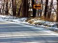
Left Curveby AaronComment by Swashbuckler: Neat shot, good color, but the focus seems just a little off. I get the feel of the curve, but I'm still left wanting more of it. (That probably means stopping and getting out of the car, sorry if that wasn't possible.) 6 Swash |
 Photographer found comment helpful. Photographer found comment helpful. |
| 01/20/2003 04:15:10 PM |
Left Curveby AaronComment by dougmc1: Great Shadows!! You might want to look at cropping a little bit off the bottom to increase the WOW. |
| Photographer found comment helpful. |
| 01/20/2003 02:56:20 AM |
|
| Photographer found comment helpful. |
| 01/20/2003 12:46:12 AM |
|
| Photographer found comment helpful. |
| 01/15/2003 07:07:04 PM |
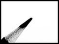
Contrastby AaronComment by magnetic9999: CRITIQUE CLUB REVIEW
Question. Did you shoot this in 'whiteboard' mode? Just wondering how it came out the camera looking like that :). Was it a conversion post shoot to black and white?
Graphic design wise, this is excellent. Stark , reduced to essential elements. My eye wants the pencil to project farther into the frame tho, and maybe not QUITE at such a steep angle.
I think it could have been improved a bit if you had moved your lighting in such a way that you got a bit more of a high light off the pencil point. Would have given it more 3 dimensionality.
Your DOF is narrow, and I also wonder what it would have looked like with a smaller aperature (more of the pencil in focus). If you are using a tripod, then you shouldnt have a prob with a slower shutter speed.
Great pic! |
| Photographer found comment helpful. |
| 01/10/2003 10:44:45 PM |
Contrastby AaronComment by RedRuthann: So I'm a sucker for the simple and good use of -dare I say...negative space. Very clean-technically. I believe that the choice of boarder adds to this image. Excellent! 10
Ruthann |
| Photographer found comment helpful. |
| 01/09/2003 10:03:15 PM |
Contrastby AaronComment by Anachronite: doesnt seem to meet the challenege... feel free to email me and explain, as otherwise it's a good photo.. thanks |
| Photographer found comment helpful. |
| 01/09/2003 03:08:12 PM |
Contrastby AaronComment by BadPigg: I cant see how this fits the subject of strange. Great shot though. |
| Photographer found comment helpful. |
| 01/09/2003 12:39:56 AM |
|
| Photographer found comment helpful. |
| 01/08/2003 09:04:27 PM |
|
| Photographer found comment helpful. |
Home -
Challenges -
Community -
League -
Photos -
Cameras -
Lenses -
Learn -
Prints! -
Help -
Terms of Use -
Privacy -
Top ^
DPChallenge, and website content and design, Copyright © 2001-2024 Challenging Technologies, LLC.
All digital photo copyrights belong to the photographers and may not be used without permission.
Current Server Time: 04/23/2024 11:30:37 AM EDT.