| Image |
Comment |
| 06/17/2003 07:09:56 AM |
|
| 06/17/2003 02:08:19 AM |
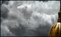
Turbulenceby AaronComment by Pedro: i'm not one to mark people down for not meeting the challenge (and won't here), but a comment re:composition - the dominating feature of this photo is the clouds...the building almost seems in the way to me. a bit of a distraction. it's nice and all...but your title tells me you feel the same way about your nasty clouds.
i like it...but your subject isn't off-centre, since the subject is the clouds. does that make sense? |
| 06/16/2003 03:44:46 PM |
Turbulenceby AaronComment by STEINR: the title of this photo suggest that this is a picture of the clouds, which is centered, and not the dome, which then becomes incidental in this shot, but i like this and will give you a nice score |
| 06/16/2003 03:29:18 PM |
|
| 06/16/2003 03:10:54 PM |
Turbulenceby AaronComment by Mitonski: Whoah now this really *is* off centre, a bit too much so for my taste though, doesn't allow me to see any more detail to that interesting structure. Nice cloudcover, good luck. |
| 06/16/2003 10:32:01 AM |
Turbulenceby AaronComment by alanfreed: Cool shot! I'm assuming you desaturated all of the colors except for the yellows in the building. Makes for an interesting, dramatic shot. My only nitpick would be that the desaturation kinda added the element of excessive grain to the sky, but it's still interesting. |
| 06/16/2003 03:46:03 AM |
Turbulenceby AaronComment by JPR: Now this I like alot. Something that pushes the boundaries with the challenge topic and turns out something artistically as well as photographically intriguing, clear, and concise. Excellent work. Love the clouds, they look like a fresco painting. Good luck. |
| 06/07/2003 01:53:10 PM |
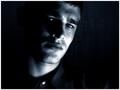
Pensiveby AaronComment by indigo997: Hmmm... My main issue with this picture was the lighting, but your other comments suggest that atleast those who commented mostly liked it. I don't like blown out areas. They just draw the eye and distract from the rest of the shot. Perhaps you did it on purpose, but did you try diffusing the light with some cloth or bouncing it off something so that it wouldn't be so harsh in those places?
Other than that.. I like this shot. I like the crop and composition. I like how there's more space on one side than the other. I like how the darkness envelopes the subject. A tad more light on that one eye would be nice.
I also don't like the white button, but it isn't a big deal.
Overall it's a strong picture that went up against some very great shots. I personally think that it would've done better without the hot spots. Focus looks pretty good to me. The most important thing with portraits is to have the eyes in focus and they seem to be.
|
 Photographer found comment helpful. Photographer found comment helpful. |
| 06/03/2003 05:21:02 AM |
|
| 05/31/2003 10:50:59 PM |
Pensiveby AaronComment by GeneralE: Nice job making a portrait usinf a "cold" color...I think it's harder to make look good. |
Home -
Challenges -
Community -
League -
Photos -
Cameras -
Lenses -
Learn -
Prints! -
Help -
Terms of Use -
Privacy -
Top ^
DPChallenge, and website content and design, Copyright © 2001-2024 Challenging Technologies, LLC.
All digital photo copyrights belong to the photographers and may not be used without permission.
Current Server Time: 04/18/2024 08:56:08 AM EDT.