| Image |
Comment |
| 12/01/2004 12:38:04 AM |
Seven flags a flyin'by jmleliiComment: I like this shot, but it suffers from too many major elements clamoring for attention, the clouds, the buildings... the flags sort of get lost in the mix. Nice exposure and colors. |
 Photographer found comment helpful. Photographer found comment helpful. |
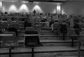
| 12/01/2004 12:36:33 AM |
LUCKY MOVEby ellulsComment: I guess this meets the challenge, but the main subject seems to be 2 dice, not the seven houses (or are those hotels, i forget) I like the crisp focus on the dice and the shallow DoF, but find the crop of the board a little too tight/cuts off elements. |
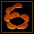
| 12/01/2004 12:33:36 AM |
Seven Eggsby BudComment: Love the lines and textures. Almost looks like an abstract. |
| Photographer found comment helpful. |
| 12/01/2004 12:32:17 AM |
|
| Photographer found comment helpful. |
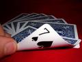
| 12/01/2004 12:31:19 AM |
7 Card Drawby bigfishComment: I like the idea for this shot, but it suffers from a shallow DoF with focus in the wrong spot. The 7 of spades should have been the sharpest element in the shot. Also, shots smaller than the 640 max usually take a score hit. |
| Photographer found comment helpful. |
| 12/01/2004 12:19:56 AM |
The Cliqueby SkipComment: I like this shot - it makes me think of scifi. Are those tictacs? I like the choice of focus here, too bad its a basic challenge, those spots (dirt, sensor dust?) would have been nice to clone out. |
| Photographer found comment helpful. |
| 12/01/2004 12:18:13 AM |
|
| Photographer found comment helpful. |
| 12/01/2004 12:15:18 AM |
7 A.M.by ShadowrainComment: I'm having a little difficulty seeing the 7 in the shot, but i'll take your word for it. Either way, I like this shot and the gritty feel it conveys. |
| Photographer found comment helpful. |
| 12/01/2004 12:13:20 AM |
Oxymorangeby glodaComment: Nice. I usually don't like borders, but it works here. I especially like the lighting and the mottled look it gives the segments. |
| Photographer found comment helpful. |
| 12/01/2004 12:11:53 AM |
How about a massage?by laserComment: Interesting subject, but the colors seem a bit blown out. There are some shadows up and to the left of the blue that are a little distracting, and some white speckles down the right hand side that take away from the image. |
Home -
Challenges -
Community -
League -
Photos -
Cameras -
Lenses -
Learn -
Prints! -
Help -
Terms of Use -
Privacy -
Top ^
DPChallenge, and website content and design, Copyright © 2001-2024 Challenging Technologies, LLC.
All digital photo copyrights belong to the photographers and may not be used without permission.
Current Server Time: 04/19/2024 02:25:11 PM EDT.