| Image |
Comment |
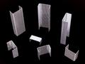
| 12/01/2004 12:56:51 AM |
Towersby Geo_GriffinComment: i like the idea, and the thumbnail looked great, but at full size, i'm seeing a lot of moire and what looks like gritty sharpening. maybe this is a severe crop of a much larger image? also, the center staples are almost completely blown out to white. unless that was intentional, i think it takes away from the shot. |
 Photographer found comment helpful. Photographer found comment helpful. |
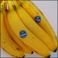
| 12/01/2004 12:54:37 AM |
"Banana Bunch"by sfarrell23Comment: maybe it's just me, but the stickers seem over saturated. alsmost like they're vibrating. also, given the style of the shot, more even lighting would have called out the bananas even more. nice though. |
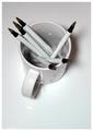
| 12/01/2004 12:52:58 AM |
|
| Photographer found comment helpful. |
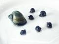
| 12/01/2004 12:51:27 AM |
A Snails Paceby CarelessComment: wow, look at that s-car go! i like the subject and composition, but somehow the water drops and plate texture take away from the shot for me. |
| 12/01/2004 12:49:51 AM |
Roll of the Diceby AmeliaJadeComment: wow, i haven't seen dice like that in about 20 years. fun shot, but unless the shallow DoF is intentional, I would have used a smaller aperture (larger f-stop number) to get all of the dice in sharp focus. |
| 12/01/2004 12:47:48 AM |
seven stepsby brunasComment: I really like this shot, but it's really hard to see into those shadows (maybe just my monitor) so, after the first three, this shot doesn't really scream "steps" as the most important element. Really nice though. |
| Photographer found comment helpful. |
| 12/01/2004 12:45:48 AM |
Ripe Persimmonsby bryanbrazilComment: I like it, but it looks like you were using mixed light (natural + electric) and didn't quite get the color balance right. Maybe it's just my eyes, but this shot looks like one I took of my cat in mixed light, and I had a hard time correcting the white balance. |
| Photographer found comment helpful. |
| 12/01/2004 12:43:42 AM |
Stories of the Streetby zeuszenComment: Can't really see the 7 here. I find the shot interesting, but seems too dark. Maybe I'm missing something. |
| 12/01/2004 12:42:17 AM |
7 Habits of Highly Effective Writersby nikon_girlComment: I like the idea for this shot, but think you could have tried playing with different angles to increase subject isolation and drama. Also, the slight color casts seem unintentional, i think this shot could have worked better as a straight grayscale. |
| Photographer found comment helpful. |
| 12/01/2004 12:39:31 AM |
7 little treesby pitsamanComment: wow! nice. i only see 6, but who's counting? :) i love the textures and color. did you use a polarizing filter? |
| Photographer found comment helpful. |
Home -
Challenges -
Community -
League -
Photos -
Cameras -
Lenses -
Learn -
Prints! -
Help -
Terms of Use -
Privacy -
Top ^
DPChallenge, and website content and design, Copyright © 2001-2024 Challenging Technologies, LLC.
All digital photo copyrights belong to the photographers and may not be used without permission.
Current Server Time: 04/24/2024 06:42:44 PM EDT.